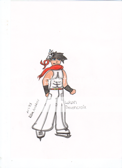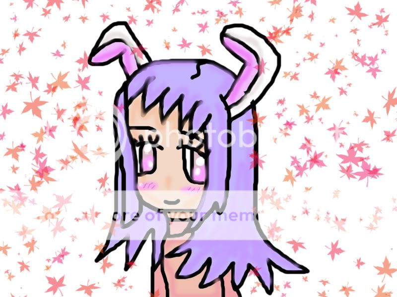


- Title: zero
- Artist: krono99
- Description: my 2nd pic of zero from vampire knight in colour my own colours , hope its good
- Date: 11/29/2009
- Tags: zero
- Report Post
Comments (5 Comments)

- lustrii - 06/06/2011
-
The shoulders aren't long enough, and the face is squished, his left arm is strange the, but other than the sheet falling behind him, as it looks like a sheet. The shading technique is epic. 8D
Keep practicing. - Report As Spam

- Archangel Thaeos - 12/02/2009
- yeah ditto, I would say that the face is a little too short or small, and the pants are a little off. But it is very interesting how you did the shadows. However, I'm a little confused by the dased lines. Are they to show the jacket/shirt thing falling? i would get rid of them. Just my opinion though. Good work btw!
- Report As Spam

- worldofbooks96 - 12/01/2009
- good. i like how you shaded by drawing emphsis to the shadows by outlining them smile I'd work a bit more on your proportions (which is hard) and face, specifically the size of the eyes and the shape of the mouth and lower lip. Still good job and i <3 Zero!
- Report As Spam

- GunslingerLovely - 11/30/2009
- like the fact your using shading, gives it more life but somethings off with Zeros face IDK what it is maybe the lips or the one eye is a bit too long but well done over all and since your a guy drawing Zero you score even higher in my books lol
- Report As Spam

- z4nkenkou - 11/30/2009
- Interesting shading, it is well done, though the face, and the pants could use some work, the pants aren't actually going in the same direction as the body and the face.
- Report As Spam