- by hollypup10 |
- Painting And Drawing
- | Submitted on 11/09/2009 |
- Skip
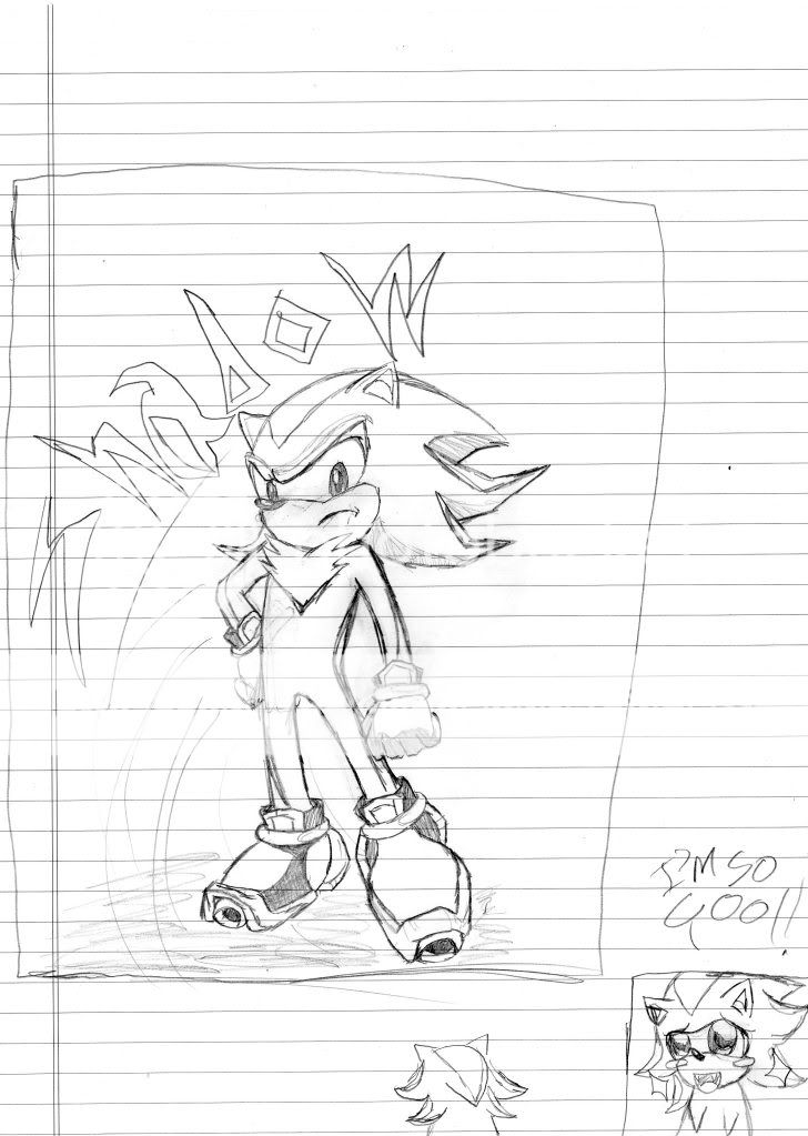
- Title: Dude with the Cape
- Artist: hollypup10
- Description: a drawing i did today. i think it came out really nicely. finally, i got the hands correct on the FIRST try!!! thats like, a new record!! no, the legs are not too short, i think i should have added another belt to the guy, but o well. looks great all the same! please rate and comment!
- Date: 11/09/2009
- Tags: dude with cape
- Report Post
Comments (7 Comments)
- Hunny Owns You - 11/16/2009
-
I see no distinction between the thumb and the pinky finger, and thus the hands are not necessarily "correct" in my terms.
Your muscle structure appears a bit deformed (as does the stance), and the face head does not appear to comply with the neck.
There is so much more to say, but such little time.
I wish to see improvement. - Report As Spam
- Willis2715 - 11/16/2009
- thats really impressive 5/5
- Report As Spam
- ChubbieBunniez - 11/14/2009
- that looks nice
- Report As Spam
- hollypup10 - 11/12/2009
- thats a good point O_O
- Report As Spam
- Captain Critique - 11/12/2009
- I really like it too! I'm just kinda wondering why the lines on the inside of the coat and outside line up almost perfectly, but it's not that big a deal x3 4/5
- Report As Spam
- Aatu Azai - 11/10/2009
- Omfg. This is really good. Only thing I wish you had added was wind effect. But other than that its really good! ^^ 4/5
- Report As Spam
- hollypup10 - 11/09/2009
- im not sure why its saying its not able to vote.... does it say that for every one?
- Report As Spam


