- by ageing-superhero |
- Painting And Drawing
- | Submitted on 09/06/2009 |
- Skip
Comments (5 Comments)
- greenkazoo123 - 09/07/2009
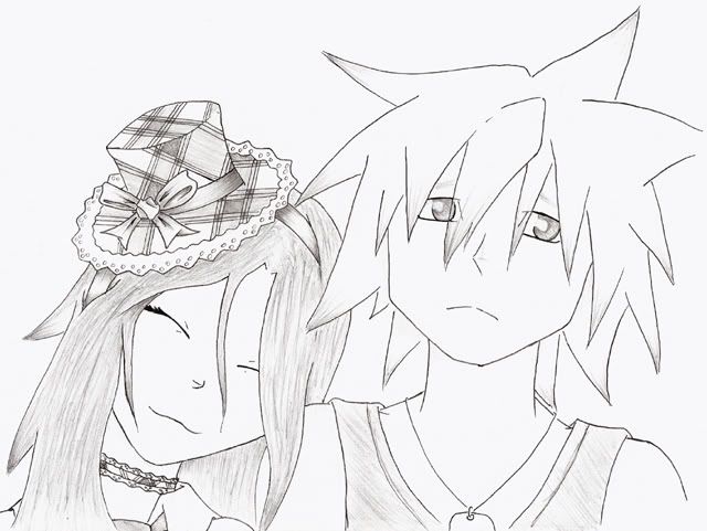
- Wow. Its really, really good. I think they bith great, but it feels like there's something missing on the boy. I can't figure out what, but its still really good.
- Report As Spam
- ageing-superhero - 09/06/2009
- yeh he is shaded more but my scanner sucks and didnt pick it up at all and he looks sad cos shes really clingy...silly boy hes got a lolita on his arm he should be happy lol
- Report As Spam
- Lelouchy - 09/06/2009
-
You should shade him more, more det on the hair and also why does he look so sad *puss in boots eyes*
- Report As Spam
- ageing-superhero - 09/06/2009
- i didnt know how to do detail on him girls are so much easier >.<
- Report As Spam
- twilight nirvana - 09/06/2009
- it's really good, but you wanted to work on your drawing of guys and the girl seems more like your foucs. theres little detail on him.
- Report As Spam


