Comments (4 Comments)
- kerochan24 - 04/29/2009
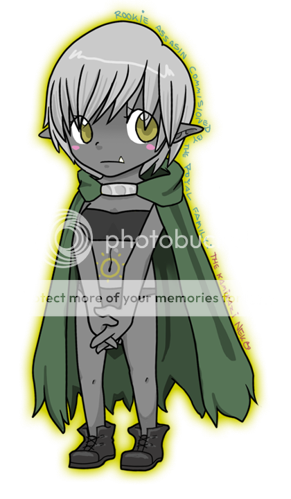
- sooooooo cute...cute idea thats right..
- Report As Spam
- Sai4tw - 04/28/2009
- How cute. X3
- Report As Spam
- dancinjlg - 04/28/2009
- Cute idea!
- Report As Spam
- Shigan5940 - 04/27/2009
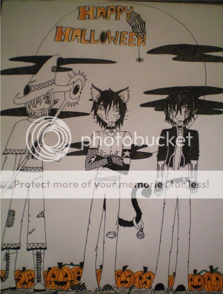
- The figures need more detail, but otherwise the picture goes with what it should. It is dark like it should be so the darkness complements the light white of the page behind, and the text is not in an obscuring area. 3/5
- Report As Spam


