- by Zinra Yaminaki |
- Painting And Drawing
- | Submitted on 12/12/2008 |
- Skip
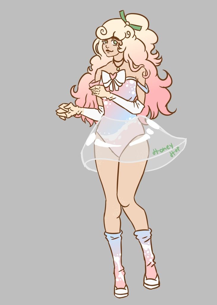
- Title: Kira
- Artist: Zinra Yaminaki
-
Description:
just another drawing .
CONSTRUCTIVE CRITISISM PLEASE - Date: 12/12/2008
- Tags: kira
- Report Post
Comments (6 Comments)
- -GracedWithPoetry- - 04/24/2010
-
Legs are too big,
Skirt should be bigger,
Boobs are WAAAY too big,
Hair should be more detailed. - Report As Spam
- rainbow_speedy_snails - 02/25/2009
-
more detailed hair, less pointy collar bones, shading under....chest
but pretty good - Report As Spam
- cptflint - 02/22/2009
- nb, needs beter body part proportions. slighlty smaller head, longer skirt (just a little) the skirt doesn't need to hug around, other wise it looks like the front is shorter then the back. more difined figure would help. 3/5
- Report As Spam
- NightLux_Blu - 12/14/2008
- Looks like the top of the head is too big. What a lot of my friends do is look at pictures from anime. Not the worst thing ever, though. 3/5.
- Report As Spam
- Zinra Yaminaki - 12/12/2008
- Thank you im not sure how to do the folds in the cloths but ill work on it and so what let them hate me
- Report As Spam
- may vegitable - 12/12/2008
-
i think its pretty good, tho the skirt is too short, and you could add some clothing folds.
and i think by naming it kira, alot of people will think of the popular anime names deathnote, and they might be mad at you for making kira a girl, when he isnt in the anime - Report As Spam


