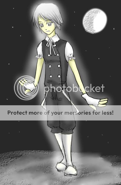
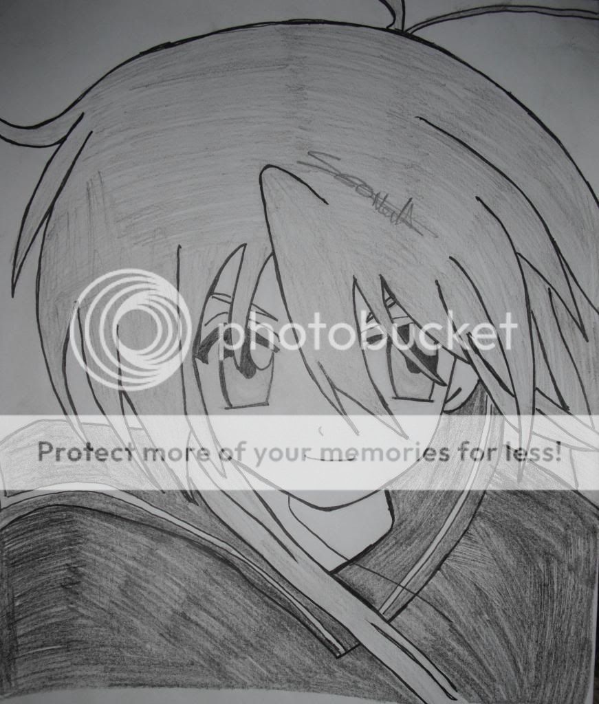
- Title: ian watkins from lostprophets
- Artist: ViSsiE-ed
- Description: just another half drawn pic.. the head and lips look awkward :| <narrow headed and pouty lips> (>.<) *camera phone quality*
- Date: 12/01/2008
- Tags: watkins from lostprophets
- Report Post
Comments (7 Comments)

- MAYGUSTA - 04/23/2012
-
Ignore Material-Girl900's concept of irony - that is merely coincidence.
It's a great image, I would just extend the back of the head out more. - Report As Spam

- CookieApocalypse - 07/02/2011
- ironically im listening to them right now>.< very well draw!!!!!
- Report As Spam

- Skater Dude The Pirate - 03/10/2011
- i cant explain that because it is so good. awesome job, love it. :3
- Report As Spam

- Amani_Rose - 05/14/2009
- The lips don't look bad to me. I think the whole thing is great. The shading is beyond excellent. Very nice work!
- Report As Spam

- oOaeon KillerOo - 12/03/2008
- he has bad split end ... no im kidding 5/5
- Report As Spam

- iHOMOEROTIC - 12/02/2008
- Shading is GRAET. Very nice detail. Though I agree with you, the lips are alittle awkward. Maybe if they were alittle bit lower or the chin were higher up? Very nice though, 4/5
- Report As Spam

- I gave u BLOOD___BLOOD - 12/01/2008
- wow cool pic the detail with the shading is great loks like him a lot >.<
- Report As Spam