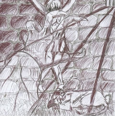
- Title: The Dungeon
- Artist: wind_star
- Description:
- Date: 11/27/2008
- Tags:
- Report Post
Comments (7 Comments)
- hvaosrdtreb - 01/02/2009
- And for the light rays, they shouldn't have been a solid black line. Lastly, it appears to be grass growing out of the ground. I'm not sure if that was intentional or not.
- Report As Spam
- hvaosrdtreb - 01/02/2009
- For the creature, you should have defined his jowels a bit more, and his snout is a bit... trail off-y. The hand is okay, but it only has four fingers. Not sure if that was intentional. And the first two fingers look like they're both bent and pointing east. The thumb's nail looks ingrown. For the boy, he's alright, but he's difficult to see. I suggest going over the very outside edge of him (the part that the hand is layered over) so that you can see him a bit stronger through the hand.
- Report As Spam
- littlepandadog - 11/29/2008
-
it's hard to see anything 3/5
- Report As Spam
- Musical Beanbags - 11/29/2008
- It's gloomy and torture-ry (?), but the hand looks like a ghost.
- Report As Spam
- Kana Korin - 11/29/2008
-
O_O Wow It's really creepy and depressing 4/5 I agree that the pen shading is a bit over done - Report As Spam
- Frost_Bite79 - 11/28/2008
- Wow! That's really good =]
- Report As Spam
- SiCKittie - 11/28/2008
- I think the pen shading is a bit much.
- Report As Spam


