- Title: Claud
- Artist: Noa
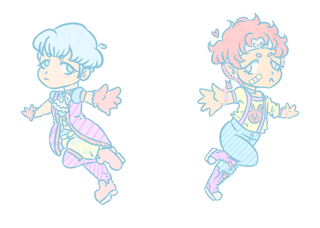
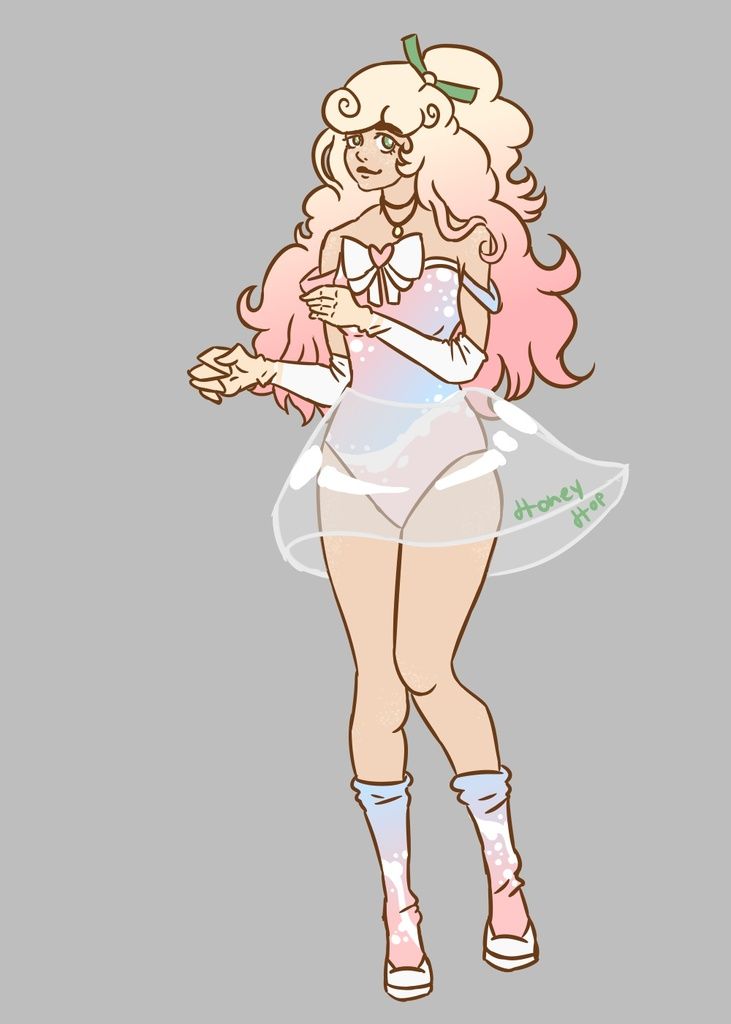
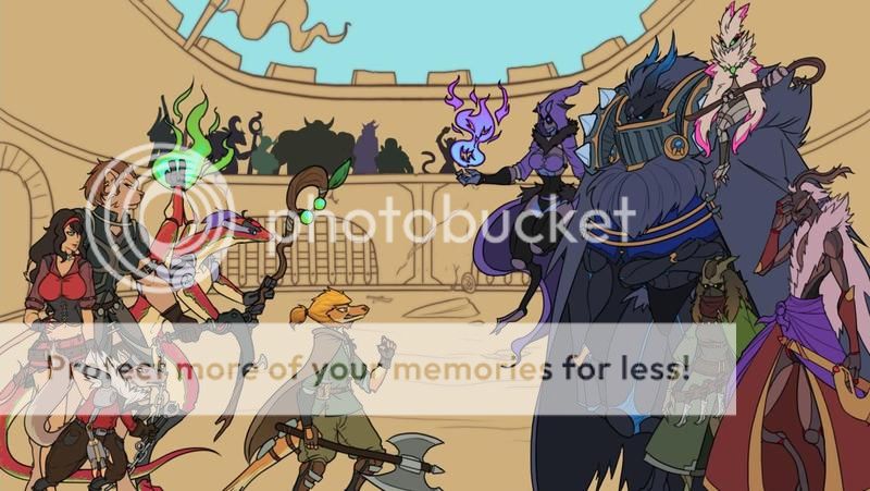
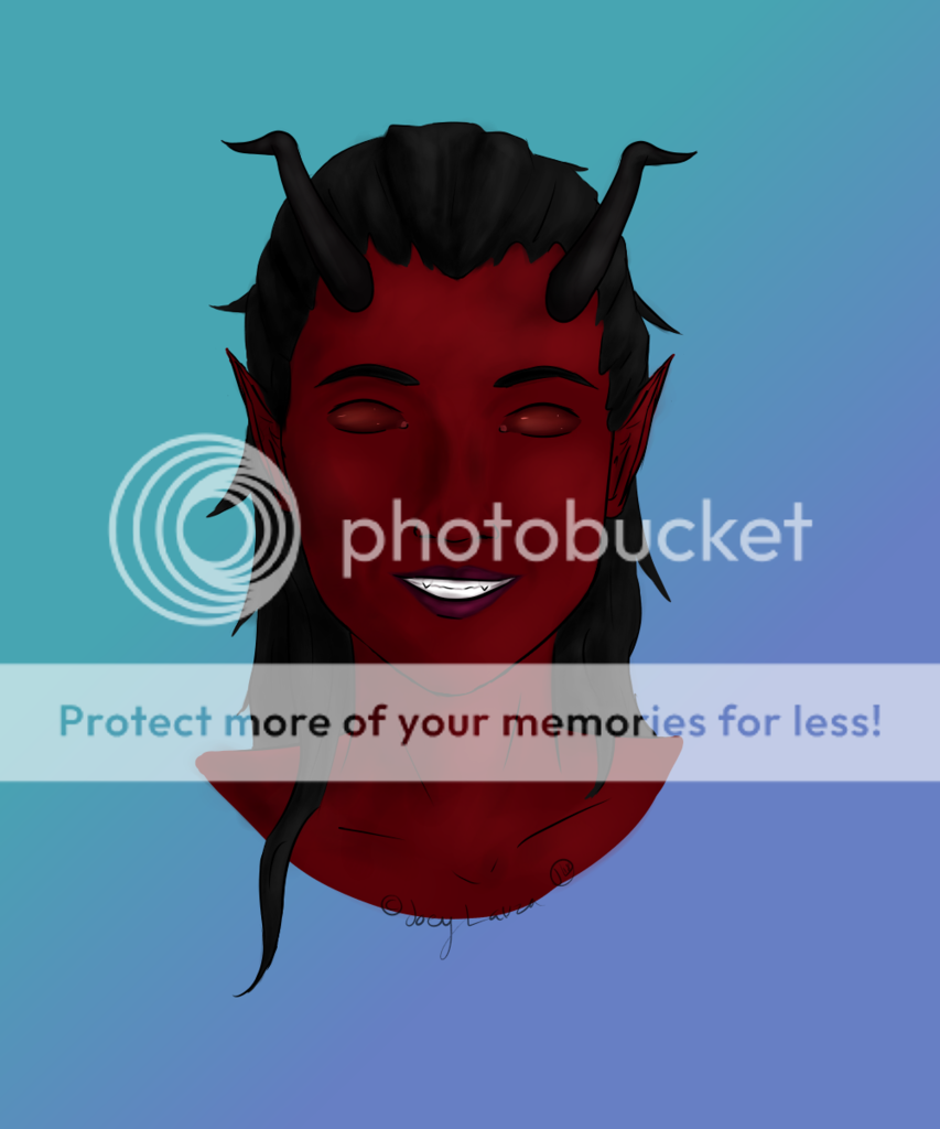
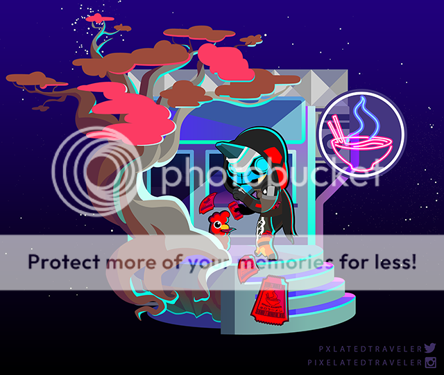
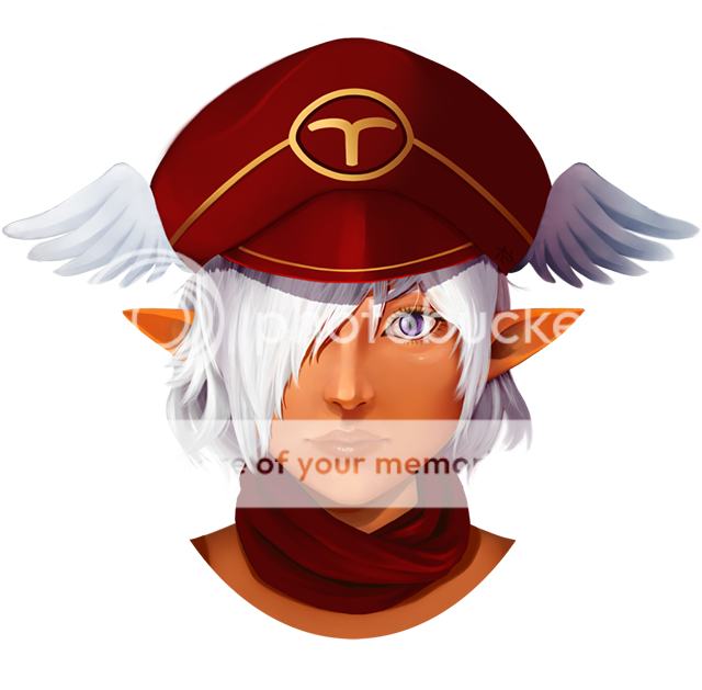
- Description: A commission for Maiji. Her request was for me to redesign Claud and yeah, this design was at first a doodle but I think it came out pretty nice XD;;
- Date: 04/20/2004
- Tags: staroceanex
- Report Post
Comments (7 Comments)
- Miaa4ever - 11/07/2006
-
wow, nice. I like the little bread sitting in the
corner there. It helps give you a better picture
of what's going on with the character. I also like
the rock texture. Very good. - Report As Spam
- italian_pyro - 11/07/2006
- very very very very very nice lol 10/10
- Report As Spam
- GlitchMK - 11/05/2006
-
KIK a** DETAIL, i like the septor or w/e hes
holding - Report As Spam
- kirkbymoorside - 11/05/2006
- Pretty cool. 9/10
- Report As Spam
- paper_haart - 10/25/2006
- This is good! 10/10
- Report As Spam
- -xVanillax- - 10/24/2006
-
hmm he doesnt look like claud.. at all.. but oke..
if it wasnt named or something it would be cool - Report As Spam
- darkness7322 - 10/15/2006
-
try and talk about exactly what you like about the
picture; is it the hair? the eyes? the
background?
if you are critiquing, start with
something you like about the picture, then mention
specifically what you don't like. (eg. the hair is
too long, eyes are too big). - Report As Spam


