- by Agrias leonhart |
- Painting And Drawing
- | Submitted on 07/16/2008 |
- Skip


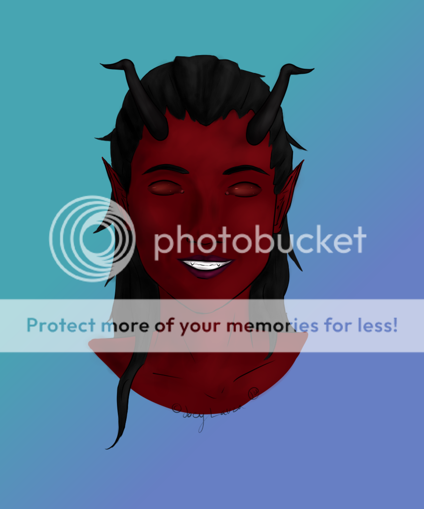
- Title: Armor Girl
- Artist: Agrias leonhart
- Description: This drawing was done about a year ago. One of my best i'd say.
- Date: 07/16/2008
- Tags: armorgirl
- Report Post
Comments (7 Comments)

- demon strait outta_hell - 07/17/2008
- O.o?
- Report As Spam

- marutine - 07/17/2008
- i like you're shadowing but...the weird eyes really creep me out...
- Report As Spam

- DarkWyvernwings - 07/17/2008
- All you can really see are her breasts and after looking at them for a moment you see that they aren't in good shape (propotion or shape wise). Not bad, perhaps a darker color for the breasts would have made it better so we werent' so drawn to them.
- Report As Spam

- iiAmanda - 07/17/2008
-
here breast are wayyyyyyyyyyyyyyyyyyyyyyy to big and her right eye is bigger than her left and im not going to talk about the bad stuff anymore
lets focus on the good
i love her hair seriously it is very well drawn hair, i love the rose also - Report As Spam

- Maj. Kirai - 07/17/2008
- Hmm. Are her breasts supposed to be the focal point? The center of attention? Because they really are. The first thing my eyes were drawn to was her chestplate. I'm guessing it's because they are very round, very yellow, and, well, big. xD Next time, make sure the center of attention is always the thing that stands out the most. Keep it up!
- Report As Spam

- bannabobo - 07/16/2008
- that is good
- Report As Spam

- fairywaif - 07/16/2008
- The proportions are very off. The eyes are gorgeous, but the right one is WAY larger than the right. The breasts needs to be made smaller. Other than that, there is amazing detail, color and shadowing here. Good work!
- Report As Spam