|
|
|
|
|
|
|
|
|
 Posted: Tue Jul 10, 2007 6:32 pm Posted: Tue Jul 10, 2007 6:32 pm
 |
|
|
 |
o k i :: tablet sketchbook
-----------------------------------
My name is Okiyami and I'd like to be a mentee (I have yet to get back my guild acceptance letter, but hopefully I'll get it by tomorrow XD). This is my (general) thread for artworks and free for critics to... critique as much as they like (and still stay inside the rules).
art: dA
style: anime style; simple backgrounds with mostly static poses
ed: currently in high school
help:
-----{1}habitual mistakes. I'm the most interested in this: in all the artwork I'll post in this thread, do you see any mistakes I just seem to repeat over and over and over again? I often miss these, and, sure, each picture has its own faults and strengths, but I'm more interested in my "mistake" trends.
-----{2}angled views. "Birds eye view" and "Ants" views are things I tend to avoid, but need to practice on (aerial perspective). Mistakes in these areas are huge.
-----{3}messy linearts and anatomy. I tend to not clean my linearts before coloring things in and my anatomy is WAY out of wack. I need help here, too.
general: thanks for critiquing/reviewing/looking at this thread! Anything is helpful, really. I'll post different pics in different bubbles... hopefully, someone responds...
----------------------------------- |
|
|
|
|
|
 |
|
|
|
|
|
|
|
|
|
|
|
|
|
|
|
|
|
|
|
|
|
|
|
|
|
|
|
|
|
|
|
|
|
|
|
|
|
|
|
|
|
|
|
|
|
Posted: Wed Jul 11, 2007 6:40 am
|
|
|
|
|
|
|
|
|
|
|
Posted: Wed Jul 11, 2007 8:39 am
|
|
|
|
|
|
|
|
|
|
|
|
|
Posted: Thu Jul 12, 2007 12:37 pm
|
|
|
|
|
|
|
|
|
|
|
Posted: Thu Jul 12, 2007 1:49 pm
|
|
|
|
Minnx I'm no artist and I really love your art, there are only a few small things I can maybe see that you might change.
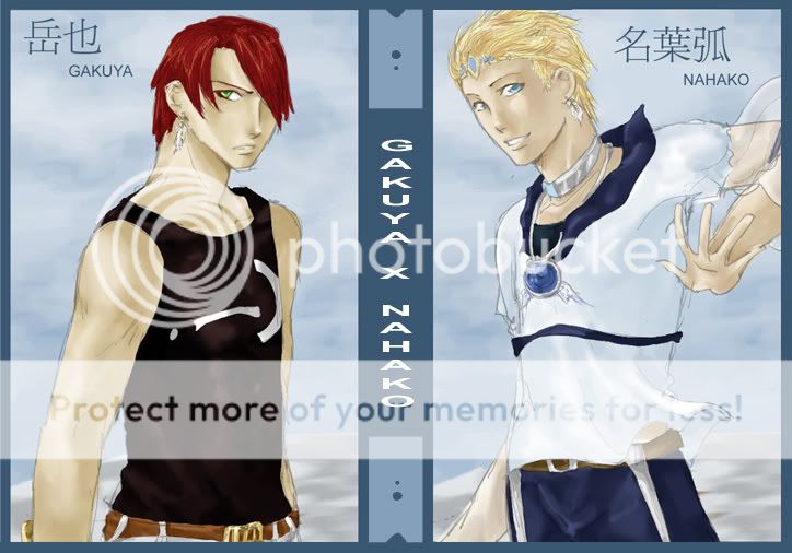
For the first pic, I think the red-haired guy could have some more hair on the back of his head and a tiny bit more on the top of his head. And since he's muscular, his upper chest could stick out more because it looks like you can see some of his muscles through his shirt so it would make him look more accurate if his upper chest stuck out more because it kinda looks like he's slimmer.
And maybe his right shoulder could be bigger or stick out more because his left shoulder looks more broad. Which looks very good by the way, I like how you drew the muscles in his arms and made them in the shirt.
The blonde guy on the right looks really good, I like his hair and the shading and light is his face. The only thing I think is a bit off is his hand. Maybe it's the direction it's facing or the size.
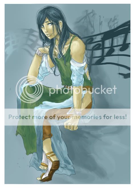
The second pic is really good, I can't see anything wrong with it, but the left foot looks a little awkward. So I would try to see how it looks with his foot facing forward.
But I really love your art, it's gorgeous! Sorry for the uber-long comment.
XD That's fine. Only two people have critiqued so far... makes me sad sad . Anyway, I couldn't get that hand right no matter how much I tried. I think it's the position and size, and in general I tried to divert the attention from there by making it at the side sweatdrop .
That foot is a disaster waiting to happen XP. I cannot do back-upraised feet. Not my forte.
Thanks for the critique! |
 |
|
|
|
|
|
|
|
|
|
|
|
|
|
|
|
|
|
|
|
|
|
Posted: Thu Jul 12, 2007 1:56 pm
|
|
|
|
Okiyami Minnx I'm no artist and I really love your art, there are only a few small things I can maybe see that you might change.
For the first pic, I think the red-haired guy could have some more hair on the back of his head and a tiny bit more on the top of his head. And since he's muscular, his upper chest could stick out more because it looks like you can see some of his muscles through his shirt so it would make him look more accurate if his upper chest stuck out more because it kinda looks like he's slimmer.
And maybe his right shoulder could be bigger or stick out more because his left shoulder looks more broad. Which looks very good by the way, I like how you drew the muscles in his arms and made them in the shirt.
The blonde guy on the right looks really good, I like his hair and the shading and light is his face. The only thing I think is a bit off is his hand. Maybe it's the direction it's facing or the size.
The second pic is really good, I can't see anything wrong with it, but the left foot looks a little awkward. So I would try to see how it looks with his foot facing forward.
But I really love your art, it's gorgeous! Sorry for the uber-long comment. XD That's fine. Only two people have critiqued so far... makes me sad sad . Anyway, I couldn't get that hand right no matter how much I tried. I think it's the position and size, and in general I tried to divert the attention from there by making it at the side sweatdrop . That foot is a disaster waiting to happen XP. I cannot do back-upraised feet. Not my forte. Thanks for the critique!
The way you drew it is fine, it's just it looks like the leg is facing forward and the foot is sideways, so maybe instead of changing the direction of the foot, change the leg a little?
I'm surprised nobody comments your works, they're awesome. |
|
|
|
|
|
|
|
|
|
|
|
|
|
|
|
|
|
|
|
|
Posted: Thu Aug 23, 2007 11:04 pm
|
|
|
|
I'm not a mentor, but the guidelines said anyone's available to give comments so... >.>;;
On the whole, you seem to have a good grasp of the human anatomy and realistic proportions, which is a step up, I guess; not a lot of people can do that well ^^; Your knowledge of clothing drapery and wrinkles are also pretty good.
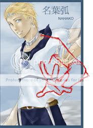
As you mentioned though, you do have some problems concerning the perspective; notably in this picture. Nahako's outstretched hand appears to be a little bit too small and out of proportion to the rest of his body, and his posing seems slightly odd; it's like he's straining to pull his arm back so he can "reach out".
Hope you don't mind me doing this ^^;
I've done a rough sketch over your original artwork to suggest an alternative. I know in "real life" the hand won't be that big, but in drawing a bit of exaggeration here and there normally helps the picture to stand out more. I've also angled his arm slightly down and a bit more in front of him.
Also, a small note on Gakuya:
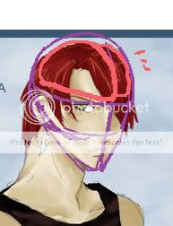
Take note of the size of his cranium; it should have a little more space at the top to accommodate the size of the brain.
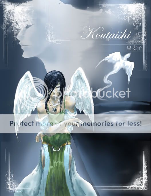
I don't have much to say on this and this, however; they seem fine for the most part. A minor detail you should take note of however are the size of the wrists. The former's right wrist (our left) doesn't match her other wrist; it seems a bit too wide and heavy. Same comments for the latter image.
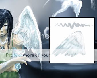
An overall comment for all images are the use of your tablet and your CGing techniques in general. While you do seem to have a good sense of color and lighting (I like the profile face in the third picture ^_^ ) you should be careful with how you "stroke" the brush. All three images have very broken, un-confident lines and your CGing appears at first glance to be done with a mouse rather than a tablet. (This might be due to your tablet settings not being adjusted properly.)
Here I've doodled a rough example of a suggestion of how to tackle the wings. A lot of brushing has to do with how much pressure you put on the pen. See the line doodle at the top? If your tablet pen doesn't do lines like that (thinner is light pressure, thicker is heavy pressure) then you might need to adjust your tablet pen's sensitivity pressure.
Also take care with how you CG wings; look at real life references to see how feathers are shaded/drawn. In my case I've just done away with a standard cartoon-y type wing structure (I got lazy. razz ) Take note of how the feathers at the top cast shadows on the lower layer of feathers, and etc. I shaded this from the bottom up, starting with a dark shadow base color, layering a lighter layer of feathers, and then repeating the process as I worked up. (This is a very quick and cheap example; actual time and effort would probably yield better results >>; )
These are just my small comments. ^^; Overall I think your artwork's okay, and you DO have a lot of the basics down (anatomy, proportion, etc.) which most people lack, so that's a plus point. ^_^ I'm sure you'll get better with more practice and time. biggrin I hope my post helped.
|
|
|
|
|
|
|
|
|
|
|
|
|
|
|
|
|
|
|
|
|
|
|
|