|
|
|
|
|
|
|
|
|
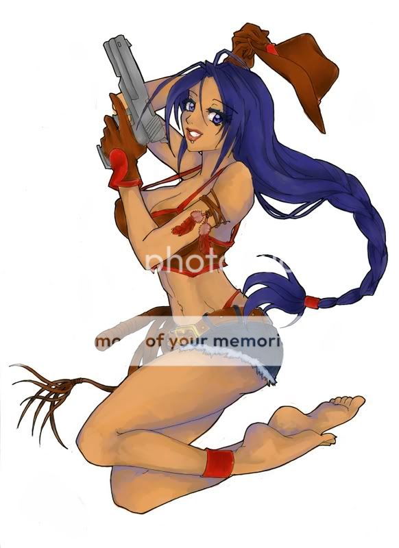
 Posted: Tue Apr 10, 2007 8:20 pm Posted: Tue Apr 10, 2007 8:20 pm
 |
|
|
 |
Here's where I'll post my most recent CG's, WiP's, etc...
For critique and tips and what not. I'd really, really love help.
Comments are great, and they give me that warm, fuzzy, fresh-from-the-dryer-sock feeling, sure...But I really want to improve.
So yeah. ^^;
Disclaimer:Most of the Line-art used will NOT be mine. All of this line-art will have either been found in the Line-art-jam, or borrowed from the artist with their express consent to colour and display it.
I'll always post the artist's name above the picture, along with their website if they're not on gaia.
That's okay, right? |
|
|
|
|
|
 |
|
|
|
|
|
|
|
|
|
|
|
|
|
|
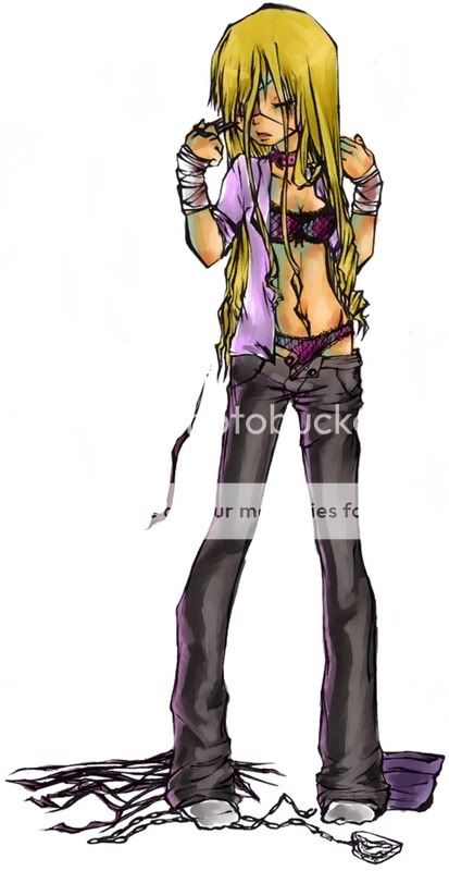
Posted: Tue Apr 10, 2007 8:21 pm
|
|
|
|
|
|
|
|
|
|
|
|
|
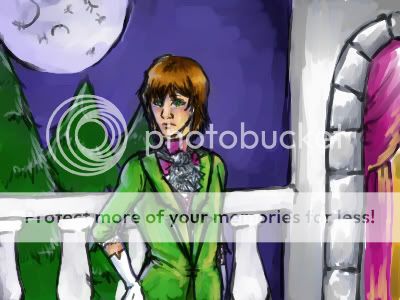
Posted: Tue Apr 10, 2007 8:23 pm
|
|
|
|
|
|
|
|
|
|
|
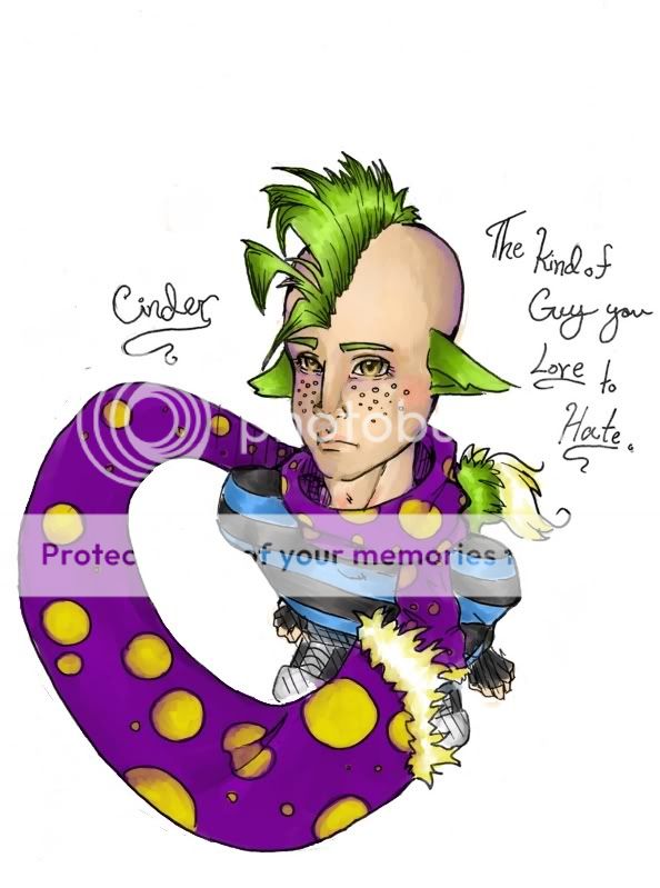
Posted: Wed Apr 11, 2007 1:43 am
|
|
|
|
|
|
|
|
|
|
|
|
|
Posted: Wed Apr 11, 2007 2:34 pm
|
|
|
|
|
|
|
|
|
|
|
|
|
|
|
|
|
|
|
|
|
|
Posted: Fri Apr 13, 2007 9:28 am
|
|
|
|
|
|
|
|
|
|
|
Posted: Mon Apr 16, 2007 5:35 pm
|
|
|
|
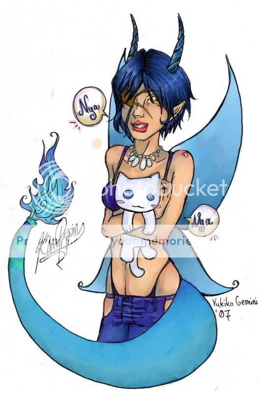
It made perfect sense.~
Yes, I see what you mean about his arm--I didn't even notice that until you pointed it out, so thank you. x3;;
I have trouble keeping things in proportion when I'm drawing on my tablet, for some reason.
As for the background, um...Yeah. I half assed it...only half on purpose >.<;;
I usually do backgrounds first and paint/shade/detail them before I even start on the line-art.
But I wasn't planning to do a background for this one, but changed my mind once I was through with the line-art.
I get your point, though.
I have alot of trouble blending when it comes to skies, but I'll quickly admit that I should've put more effort into the sky.
Still, the main point of the drawing was the character, rather than the background, thus explaining my disinterest with the background.
...That sounds like an excuse.
A really long, really lame one.
So I'll remedy.
Next time, I'll put more effort into it.
Thank you for your critique, it's very helpful. ^^ |
 |
|
|
|
|
|
|
|
|
|
|
|
|
|
|
|
|
|
|
|
|
|
|
|
|
|
|
|
|
|
|
Posted: Tue May 29, 2007 8:11 pm
|
|
|
|
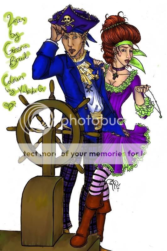
I'm pleased with this one, even if the lines aren't mine...I love them. <3
Which is why I commish'd this fellow after finding out he was taking commisions. ^^
And I've devised a new process to help myself work further, even if I don't get any comments. xD; Ahah.
What I like: The girl's hair, the guy's outfit, the wood...ship...part...thing, their skin.
What I don't like: the girl's stockings, the lack-luster of the jewels [small lines make it practically impossible for the kind of detail I would've liked to use], the little out-of-lines here and there, how the lighting seems a little shabby, the lack-luster of the girl's nails [same issue as before, though this one possibly could be helped].
What I want to work on: Skin tones. I feel there could be some more high-lights on their skin [or at least the guy's] to make it seem more alive.
Also, lighting. I have a lot of trouble identifying and utilizing light-sources without real-life subjects, I feel...the light source is ambiguous and vague in this picture. I meant for it to be coming from the front/viewer.
What I feel I've improved on: Shading skin-tones with complementary colours to achieve a deeper shadowed effect. Now, if only I could incorporate this into clothing, as well...
Tips, comments, and critiques are all welcome and loved...I know it may be a bit difficult to critique CG work, but still. I'd like some help, if anyone can offer it.
Even simple things like...What colours I could've chosen differently to better the flow of the picture, or how the shadows could've better emphasized the character's expression or physical attributes.
Stuff like that.
<3
|
|
|
|
|
|
|
|
|
|
|
|
|
|
|
|
|
|
|
|
|
|
|
Posted: Wed Jun 06, 2007 11:06 pm
|
|
|
|
I'll attempt to critique, even though you're probably better at cg'ing then I am.
I can't help you much with the lighting issue, but I do think that you need more cast shadows to add more depth...for example, since the light is coming from the viewer, you could add cast shadows ((shadows with harder edges)) near their collars, behind the guy's jacket, on his shirt, etc. If you wanted to make the shading even more intense, you could add cast shadows on the girl's face, caused by her nose, or on her ribbons, caused by her face...
Also, after looking at the style you used for this, and getting an idea of the feel you were going for, I think you could use blend more colors in the clothes. I think you addressed this in "What I feel I've improved on". I do agree that your skin is quite gorgeous, especially since you added to different shades. You should use this idea on your clothes...like..a pink or red tinge on her dress and a purple one on his jacket. You could also add a purple tinge to her green frill, because of the reflected colors...
Umm...xP I'm so bad at this.
Oh yeah, one last thing. For her boots, to create a sense that it's more leathery, I would make highlights brighter, and have one or two really bright reflections ((in the form of dots or lines...)) I actually think it looks good now; just increase the contrast?
|
|
|
|
|
|
|
|
|
|
|
|
|
|
|
|
|
|
|
|
|
Posted: Sat Jun 16, 2007 1:55 am
|
|
|
|
|
|
|
|
|
|
|
|
|
|
|
|
|
|
|
|
|
|
Posted: Wed Jul 18, 2007 6:41 pm
|
|
|
|
|
|
|
|
|
|
|
|
|
Posted: Wed Jul 18, 2007 8:00 pm
|
|
|
|
|
|
|
|
|
|
|
|
|