|
|
|
|
|
|
|
|
|
|
|
|
|
|
|
|
|
|
 Posted: Fri Feb 23, 2007 1:42 pm Posted: Fri Feb 23, 2007 1:42 pm
|
|
|
|
|
|
|
|
|
|
|
|
|
 Posted: Fri Feb 23, 2007 8:31 pm Posted: Fri Feb 23, 2007 8:31 pm
 |
 |
 |
 |
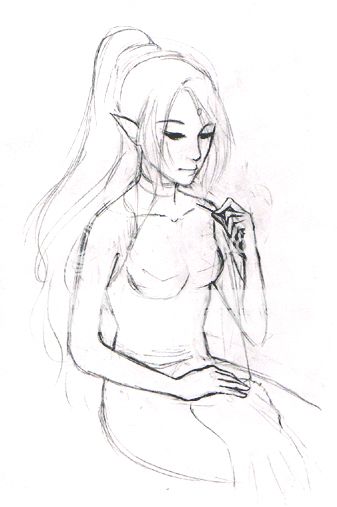
I really love her hair and face : D Her right elbow looks funny because it's so rounded instead of coming to a point. The torso also looks a bit akward because it's in between being hunched over and sitting straight and looks unbalanced... I'm not sure which you were going for but she looks like she's sitting straight from waist up... I think if you made her butt come down and to the left a bit more it would look more natural. Her breast to our right is also placed too high on her chest and smaller than the other one. The inner elbow (where it bends) on the arm with the needle could come down a bit and be thicker... ... and lastly I wish her torso is a bit longer XD;; It's not necessary but it's more visually pleasing that way. Like Eejbeej said already, drawing a sewing picture is a great idea and you've got it down pretty well ;D... I'm sorta just nit-picking. @__@ sorry for spewing so much... here's a drawover to show what I mean http://img.photobucket.com/albums/v198/nini206/junk/sewingdrawover.jpg Can't wait to see how it progresses. |
 |
 |
 |
 |
|
 |
 |
|
|
|
|
|
|
|
|
|
|
|
|
|
 Posted: Mon Feb 26, 2007 1:16 pm Posted: Mon Feb 26, 2007 1:16 pm
 |
 |
 |
 |
This is kind of difficult to do from the office, but here's what I can do from here.
First, this image is very peaceful and calm. If that was your intention, you conveyed it extremely well. The facial expression speaks of a quiet concentration that I can relate to when I do something I enjoy. In fact, the last time I think I had that feeling, I was sitting with my lover, just quiet and happy. It really speaks to me. Your line quality is also very clean, clear, varied, very beautiful and expressive.
Here's my nitpicks:
Anatomy:
Her body is very wooden in the torso and noodley in the arms. I notice in some areas you have the torso shapes with straight structural lines, but then other places that's lost to indescriptive curves. It's like gesture and structure are fighting for visual dominance. Before I get into that at all though, what process do you usually use to tack the figure in place before you do your linework? Maybe there's something that can help solidify that forum, while still allowing the expressive lines that you so very well.
Pose:
She's looking at her hand and not what she's sewing. That's the very first thing I noticed after the feeling I got from it. Normally, action is lead with the eyes. You look to the right before you turn your head to the right. (Turning without something that you're focusing on makes the eye movement much more subtle.) Since her attention is on her work, her eyes should be directly on what she's doing. Also, when one pulls the needle you normally, pull away from the face to the side, keeping your eye and other hand on the stitch for control. (I used to make cloths for my sister's dolls and I ment my own clothes.)
In order to keep the work on her lap, she'd most likely have to lean forward and bend her neck (which wouldbecome uncomfortable after a while) or she could rest back in the seat a bit and bend her neck. The most logical thing would be to rest the object on something like a pillow on her lap to bring it to navel height, taking some strain off her neck. A decorative pillow would also make a nice prop, adding to the "aliveness" of the drawing. I know this is just a sketch, but I would love to see her intergrated into a room or maybe enjoying some time in a sunny afternoon outside while she gets a little work done.
Your linework is very beautiful and expressive.
|
 |
 |
 |
 |
|
 |
 |
|
|
|

Errol McGillivray Captain
|
|
|
|
|
|
|
|
|
|
|
|
|
|
|
|
|
|
|
|
|
 Posted: Mon Feb 26, 2007 3:44 pm Posted: Mon Feb 26, 2007 3:44 pm
|

Errol McGillivray Captain
|
|
|
|
|
|
|
|
|
|
|
|
 Posted: Mon Feb 26, 2007 3:56 pm Posted: Mon Feb 26, 2007 3:56 pm
|
|
|
|
|
|
|
|
|
|
|
 Posted: Mon Feb 26, 2007 4:04 pm Posted: Mon Feb 26, 2007 4:04 pm
|

Errol McGillivray Captain
|
|
|
|
|
|
|
|
|
|
|
|
 Posted: Mon Feb 26, 2007 9:14 pm Posted: Mon Feb 26, 2007 9:14 pm
|
|
|
|
|
|
|
|
|
|
|
 Posted: Tue Feb 27, 2007 8:25 pm Posted: Tue Feb 27, 2007 8:25 pm
 |
 |
 |
 |
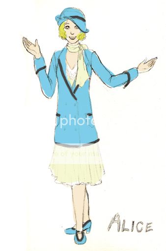
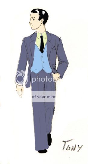
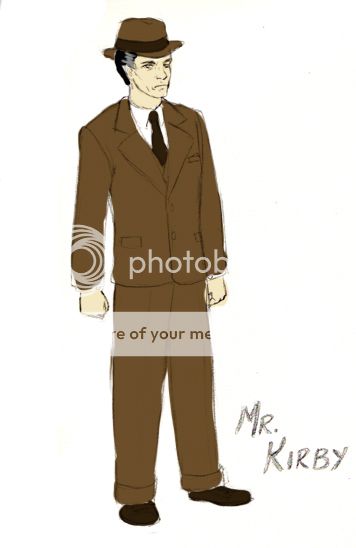
Hey hey hey~. :3 While I make the changes on the sewing picture, I thought I'd show you guys a project I'm working on for a class of mine.
We're reading the play You Can't Take It With You and our assignment was to do three character designs from the play. Our designs are supposed to convey the characters' age, status, etc, but also the relationship between the characters to some extent. The characters I chose were:
- Alice: Young woman working as a secretary at a business firm. Dating Tony. The "normal one" in a family of weirdos.
- Tony: Vice president at his father's firm. Dating Alice, later proposes to her.
- Mr. Kirby: Tony's father and the president of the business firm. Stuffy and businesslike, later realizes the error of his ways.
These are going to be watercolor paintings because I have to physically hand them in, so please no suggestions that have to do with digital media. (I digitally slapped some color on there so I could get feedback about my color schemes before I actually paint.) I would appreciate comments about the harmony of the costumes as a whole, color schemes, etc. Comments about anatomy are okay, but that's not really what I'm looking for now.
FYI, the time period this is set in is the 1930's, so please no comments about how I should make Tony's vest longer or show Alice's curves more. I'm trying to keep things historically accurate..
Aaand one more thing: Alice has to be wearing blue because it says so in the play. The other character's color schemes are negotiable, though.
  
Edit: After talking with my teacher today, I've decided to change Kirby's design a lot. I'm going to:
- Desaturate his suit to a warm gray color and add pinstripes
- Add expensive-looking cufflinks and a pocketwatch
- Add glasses (probably round frames)
- Add a sketch of what he looks like without his hat - he's balding and graying
I'll probably make his color scheme more similar to Tony's suit, only much more desaturated since the business world has sort of sucked the life out of him.
|
 |
 |
 |
 |
|
 |
 |
|
|
|
|
|
|
|
|
|
|
|
|
|

Errol McGillivray Captain
|
 Posted: Thu Mar 01, 2007 8:20 am Posted: Thu Mar 01, 2007 8:20 am
|
|
|
|
|
|
|
|
|
|
|
 Posted: Thu Mar 01, 2007 5:09 pm Posted: Thu Mar 01, 2007 5:09 pm
 |
 |
 |
 |
Hm, I can't find my sourcebooks for anything. It may seem like there's not much point in talking about the figures, because this is about the costumes, but characterization helps bring out your costume choices.
It's a good idea to depict the characters with simple props sometimes. Since Alice is a secretary, you could have her holding a file to her chest, or have her sitting down with her hands mocking typing, but of course remove the desk so you can see the outfit. legs closed and leaning a bit to one side if she's proper and crossed if she's flirty. Things like that can bring the outfits to life because they suit the characters. I haven't read the play, but are their casual or sporty activites they do during the play? Unless the play takes place completely in one set of costumes, it's good to show something more casual or nightwear as well. If there's a party scene, then do that one with a champagne flute in her hand. Stuff like that. You've got some nice muting going on, but I think it would be nice to vary the colors a bit. I know she has to wear blue, but does he? (Once again, I didn't read the play, so I have no idea.)
I'm not gonna lie. This is WAY better then when I took the class. (Mostly, cause I had my anime head shoved up my a** at the time. I was young and stupid. What can I say?)
The hair fits very well too. What did you use to put the outfits together? Picking and choosing from different cuts of the time, or referencing a picture for the outfit design and choosing your own colors? (Just curious.)
I would definately have line sketches included of the characters without hats and close ups of accessories. (As the teacher said, add time pieces, and other things that they would have. Alice needs a handbag too.)
Looks good. I can't wait to see more. Costume design was fun. Well, I had fun with the medieval piece because I got to design all kinds of jewelry to scale.
|
 |
 |
 |
 |
|
 |
 |
|
|
|

Errol McGillivray Captain
|
|
|
|
|
|
|
|
|
|
|
|
|
|
|
|
|
|
|
|
|
 Posted: Fri Mar 02, 2007 6:19 pm Posted: Fri Mar 02, 2007 6:19 pm
|

Errol McGillivray Captain
|
|
|
|
|
|
|
|
|
|

Errol McGillivray Captain
|
 Posted: Tue Mar 06, 2007 2:57 pm Posted: Tue Mar 06, 2007 2:57 pm
|
|
|
|
|
|
 |
|
|
|
|
|
|

