|
|
|
|
|
|
|
|
|
|
|
|
|
|
|
|
|
|
|
|
|
|
|
|
|
|
|

Errol McGillivray Captain
|
 Posted: Fri Apr 02, 2010 3:33 am Posted: Fri Apr 02, 2010 3:33 am
|
|
|
|
|
|
|
|
|
|
|
Posted: Fri Apr 02, 2010 10:08 pm
|
|
|
|
|
|
|
|
|
|
|
|
|
|
|
|
|
|
|
|
|
|
Posted: Tue Apr 06, 2010 4:35 am
 |
|
|
|
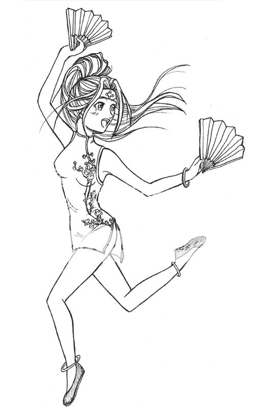
Hey, I think it's a pretty cute drawing. There are always places to improve upon, though! xP
Light source - from what I've gathered, she's slightly back lit and slightly front lit (though only one shadow is appearing). I'd suggest being a little bit more consistent with it, such as on the legs, arms, etc. It may help to map out the shadows/highlights beforehand or at least keep them in mind as you are doing the drawing.
Anatomy - I think you have the basic gist correct, but you could benefit from cross referencing and from studying the human figure a bit more. Right now she has a bit of that anorexic anime girl look about her. Particularly the torso feels a bit too long and thin, but also the folds in the cloth make me think she's a bit emaciated. Her head is a bit off center, too, I feel, and her left shoulder (our right) is extremely broad when compared with her head/neck.
Clothing - This is a person pet peeve of mine, but see if you can't contour the stockings around the volume of her legs. As is, they are just something of a flat and uniform pattern. They make her legs look flat, despite the highlights you've put in. It's a little more work, but I personally think it pays off. Also, with her swimming suit / body suit / whatever... you should look into studying how that type of fabric bends and reflects.
http://www.dangerstyle.com/images/4183.jpg
<< A random image search on google turned this up. Notice how in the back view of the model the fabric is stretched on one side and a bit slack on the other. If you wanted this effect, you should direct the fabric folds a bit lower and only on one side.
Anyhow... that's about all I have time for right now. Good luck with your art.
Edit: As for drawing volumes, what that means is to draw in 2-D as if you were seeing that figure in 3-D. For example, if you were using guidelines to get your anatomy in the right place, you would attempt to draw "spheres" instead of "circles". Yes, on the page they will look the same (at first), but mapping it out it can help. It's great for helping out with things like highlights, shadows, and even perspective. Techniques to enhance volume include shading along the contour of the body, adding shadows, etc. If you have any questions, let me know. I'm not sure i'm explaining properly. smile
|
 |
|
|
|
|
|
|
|
|
|
|
|
|
|
|
|
|
|
|
|
|
|
Posted: Tue Apr 06, 2010 8:03 am
|
|
|
 |
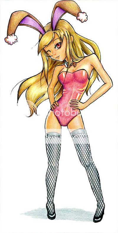
syrella Hey, I think it's a pretty cute drawing. There are always places to improve upon, though! xP........
:O Thanks loads for the thoughtful in-depth crit, syrella! heart That's EXACTLY what I joined this guild for.
The 'cloth ribs' seem to be the first thing that people spot. Hahaha. That'd teach me not to color on the fly next time. ^^;
Agree wholeheartedly with lightning. Just a beginner with colors, I am. When I sketch, I do say to myself, 'okay, this's where the light source will come from'...but after I ink the sketch and erase out all the markings, I get confused and forget... D:
D'oh! Silly me.
Was trying for more of a satin-y effect with the suit shading..though I agree looks nowhere like it.
I think I understand alittle of what volume means. Adding depth and distance to objects, right? Highlights, shadows, backlighting, etc.
Thanks again for your help! Will do more anatomy/color studies |
|
|
|
|
|
|
|
|
|
|
|
|
|
|
|
|
|
|
|
|
Posted: Tue Apr 06, 2010 9:00 am
|
|
|
|
I'm very glad you're investing in more dynamic poses, rather than static, stiff poses. It adds to the fun, playful style in which you draw your figures. It's great that you've learned to use the values in colors to shade, rather than just adding black.
You need something in the background other than white, especially given the color the figures are rendered in. Sometimes, addressing the negative space is just as important in describing figures as is addressing the positive space. Usually more neutral colors can be used for the background to help identify the picture frame, and to put the character or figure within a context of space rather than a white void. A white background makes your bright colors and highlights not as intense as they could be if you were to have, let's say, a graduated blue-gray.
As for the lighting issue, I just think your reflective light is too strong. Remember: light source > reflective light
|
|
|
|
|
|
|
|
|
|
|
|
|
|
|
|
|
|
|
|
|
|
|
Posted: Wed Apr 07, 2010 6:24 am
|
|
|
|
Raen Check I'm very glad you're investing in more dynamic poses, rather than static, stiff poses. It adds to the fun, playful style in which you draw your figures. It's great that you've learned to use the values in colors to shade, rather than just adding black. You need something in the background other than white, especially given the color the figures are rendered in. Sometimes, addressing the negative space is just as important in describing figures as is addressing the positive space. Usually more neutral colors can be used for the background to help identify the picture frame, and to put the character or figure within a context of space rather than a white void. A white background makes your bright colors and highlights not as intense as they could be if you were to have, let's say, a graduated blue-gray. As for the lighting issue, I just think your reflective light is too strong. Remember: light source > reflective light
That....sounds logical. lol. Don't have any formal art training, so had to lookup 'negative' and 'positive' spaces. But I think I get what you mean.
Will experiment with backgrounds next up =)
Thanks for the comments and tip, Raen Check! |
|
|
|
|
|
|
|
|
|
|
|
|
|
|
|
|
|
|
|
|
|
|
|
|
|
|
|
|
|
|
|
|
|
|
|
|
|
|
|
|
Posted: Thu Apr 22, 2010 6:29 pm
|
|
|
|
|
|
|
|
|
|
|
|
|
Posted: Thu Apr 22, 2010 9:28 pm
|
|
|
|
|
|
|
|
|
|
|
Posted: Fri Apr 23, 2010 7:07 am
|
|
|
|
|
|
|
|
|
|
|
|
|
Posted: Sat Apr 24, 2010 5:14 am
|
|
|
|
|
|
|
|
|
|
|
|
|


 New finished work!