|
|
|
|
|
|
|
|
|
|
|
|
|
|
|
|
|
|
 Posted: Tue Feb 16, 2010 5:22 am Posted: Tue Feb 16, 2010 5:22 am
 |
|
|
|
Hey, I noticed no one has responded yet so I thought I would try.
I think you've got an interesting style going on here-- I like the combination of black ink and the pale pinks. It has a very Japanese feel (emphasized by the kanji too) and the brush strokes are fun. I think what you need to focus on, at least stylistically, is refining it more.
You need to learn when and where to use clean strokes vs those dry, rough edges. Sometimes with rough edges, you can fall into the trap of having your art look "unsure". A clean, dark lines usually says "I'm here! And I'm supposed to be here too! So deal with it." xD Whereas the messy one can be interpreted as the opposite. Perhaps more like: "Hi... I might be here, but I'm not totally sure where I'm supposed to be..."
Ok, ok... enough of that. Haha.
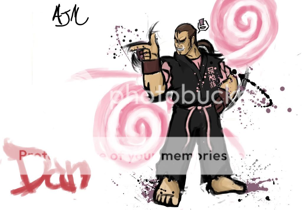
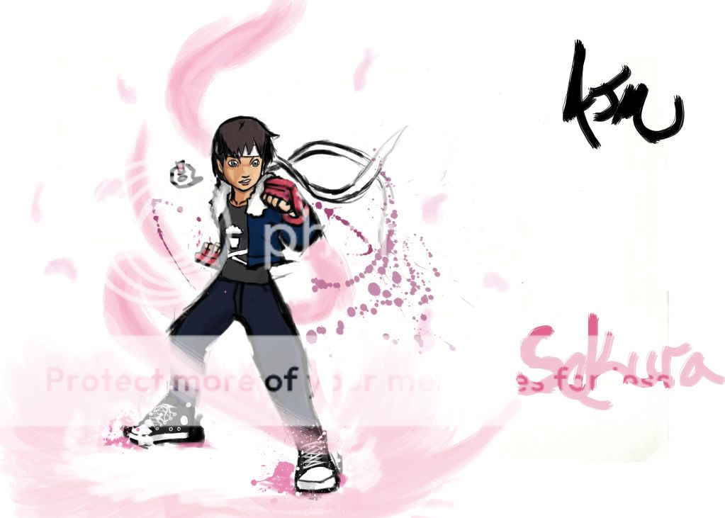
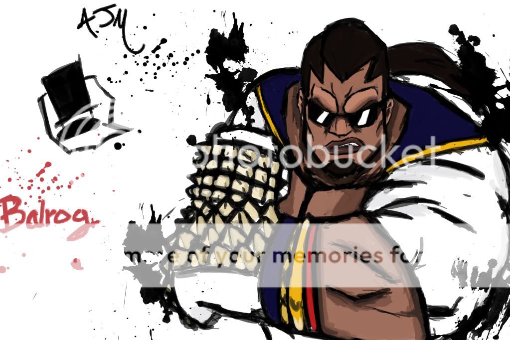
Examples of areas that I think could use some cleaning up: For Balrog, some of the work on his arm seems a bit jagged and, though less noticeable, the lines on his face could also use a bit more refining I think. Same thing with Sakura's legs and Dan's feet/hands. Particularly the lines around Dan's hands I was confused about. I think it's supposed to be "motion" lines, but they just felt out of place to me. o-o
The other issues, which I'm sure other folks would be happy to point out to you are the anatomy ones. Generally speaking, I don't think yours is too horrible, but of course, there's always room for improvement. For the image of Sakura, her legs are very hard for me to read/understand. Her stomach/abdomen is at one angle, and then suddenly her hips look to me like they are almost straight on. For a pose like this, you need just a bit more foreshortening of her leg too I think.
For the one of Dan, I think you need to also work on conveying volume a bit. He's a big, muscular fellow, correct? But right now, his torso and even his hand is reading as flat to me. Look into different ways of shading to make it look a bit more 3D and less lifeless.
I think that's about it for now... One final thing about the image of Balrog-- I think this one is probably one of your stronger ones, actually. It has an intensity to it that I think your other two images are lacking. Especially if you're working on that fighting character style, you want your art to convey strength and power. xD Or humor, possibly, too. And to do that, you need to be bold and 'in your face' kinda. Keep practicing with expressions and composition too. smile
http://www.artofokami.com/
<< Ok and may be slightly off-topic, but you might get some inspiration from looking through this art gallery. xD It's from the game Okami and it immediately struck me as having a similar style as to what (I suspect) you're going for. Feel free to correct me if I'm wrong, though.
On a side note, are you using Painter? xD I <3 that program personally, though it has some annoyances.
Good luck!
|
 |
|
|
|
|
 |
|
|
|
|
|
|
|
|
|
|
|
|
|
|
|
|
|