Please critique in order for me to grow as an artist.
Posted: Fri Dec 11, 2009 1:26 am
What's the medium? Your inspiration?
Sazarac
Offline
Grinsender-Damon
Offline
Posted: Tue Dec 22, 2009 2:38 pm
Sazarac
What's the medium? Your inspiration?
Sailor Moon and Gimp the paint program.
Posted: Tue Dec 22, 2009 7:08 pm
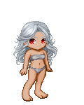
The upper part of her legs look warped. Basically the gap near her 'area' is unnecessary. Also, the legs are facing in a different direction to her upperbody. I would symbolise the 'twisting' more with lines in the clothing.
FrozenVendetta
Offline
Faithom Artist
Heckler
Offline
Posted: Wed Dec 23, 2009 5:20 pm
Face - it's not that noticeable but the way her nose/mouth is drawing makes it seem like she was looking slightly to her left [which means the ears are drawn incorrectly] also the short distance between her nose and mouth in combination with the distance between her eyes and nose and the way the jaw is drawn makes it seem like her head is tilting forward slightly? But then her eye brows and ears disagree w/ that appearance which makes the face look a little awkward to me. The way the hair is falling also is a little unnatural because the way it's curved in the back make it seem as if it's blowing in the wind, but the hair along her face does not indicate such a fact.
This is also kind of a little thing but the curve along her back to her waist makes it seem like her left shoulder [on our right side] should be a little bit more in.
And then her ring finger on her right hand - the way it ends seem really abrupt which makes the finger seem slightly cut off. The placement of the thumb is also a bit awkwardly drawn in relation to the rest of the hand [my main problem is the curve on the bottom of the hand]
And then as Nighsongbyrd mentions her upper leg is warped. I think you are misplacing her hips because the legs are unnecessarily long and slightly misshapen. The curvature of the boot tops is incorrect considering her posture as is the shading on her knee. I'm also a little confused as to where the lighting source is[are] because your shading for light is somewhat inconsistent.
XD
Sorry for such a long critique. It's a lot of little things and I wanted to be thorough - the biggest thing that you probably need to fix is the hip/leg area.
Posted: Thu Dec 24, 2009 8:32 am
Well, from what hasn't been mentionned; Your character's value is the same as the background, which makes it blend in to much; You should either make your background paler or your character darker.
An arrow is also about an arm long, making your's too small. Getting some reference will really add to the credibility of your piece.
Other then that, you could use a bit more contrast between your light and shaded areas. smile