Welcome to Gaia! ::

Gaian Art Mentors

Back to Guilds

Where artists are paired in a mentor/mentee fashion to share their knowledge. 

Tags: artists, mentor, mentee, learning, drawing 

Reply Sketchbooks [Get crits here! Open to everyone]
critique on my style

Quick Reply

Enter both words below, separated by a space:

Can't read the text? Click here

Submit

Tavis Harts

12,975 Points
  • Full closet 200
  • Elocutionist 200
  • Dressed Up 200
PostPosted: Tue Oct 27, 2009 3:14 pm


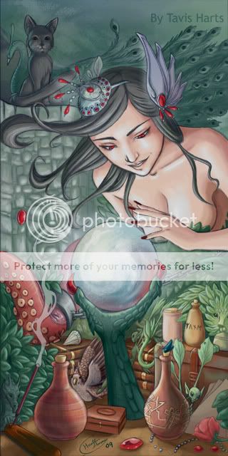
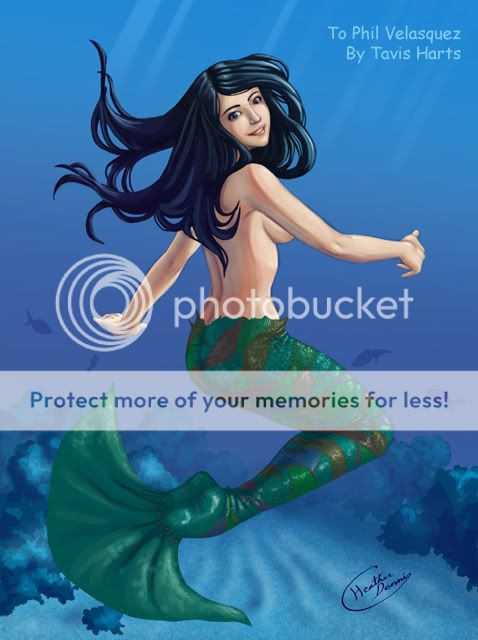
I will be honest, I'm probably not going to change these any. One was a finished commission and the other.... well theres just too much detail to change.

I just wanted an overall idea of any major problems I might have so I can work on fixing them. :3
User Image
User Image

(if you need to see more of my work you can visit http://tavisharts.deviantart.com I realize looking through my work I need to work a bit more on color theory to make things pop out. sweatdrop But you might be able to find a few other things I missed)
PostPosted: Tue Oct 27, 2009 3:58 pm


The first one's breasts hang wrong. It's not very obvious until you look at the leaf thing covering where her n****e should be, as it's much too high and too far out.

That and the fact that you have a tendency to space people's eyes really far apart. Eyes should be about one eye's width apart, yours tend to be 1.5-5 eyes' widths apart.

Otherwise, though, I must say I do like your style, especially the way you render muscle.

The Titanium Spork


Tavis Harts

12,975 Points
  • Full closet 200
  • Elocutionist 200
  • Dressed Up 200
PostPosted: Sun Nov 01, 2009 2:53 pm


Thanks for the critique.

Yeah, I have been drawing eyes a bit farther apart than I should be. XD I actually hadn't noticed so thanks for pointing that out. I'll see about fixing that.
PostPosted: Fri Nov 06, 2009 11:48 pm


Your blending is very good, but I would reccomend taking some of your pictures into grayscale and checking the contrast. Low contrast is fine, but for dramatic images like the top one, higher contrast means higher drama. So darks darker and lights lighter. You can do this easily in photoshop by putting a color layer over your image, filling it with white, then making a new overlay layer over the top and painting black to create shadows/white to create highlights. Sometimes this means sacrificing detail, but the human eye is great at filling in detail with only hints to work off of. Giving the viewer every detail clearly can sometimes detract from the interest of the piece.

Also you're using a lot of colors at similar saturation. Play with pushing saturation far down for less important elements (or things that are further away) and use high saturation for prominent elements or foreground objects. Remember you've got the full range of values to work, but once you're at 100% or 0% there's no way to push it further. So think around 50% and go from there.

Badeye

Shirtless Friend

Reply
Sketchbooks [Get crits here! Open to everyone]

 
Manage Your Items
Other Stuff
Get GCash
Offers
Get Items
More Items
Where Everyone Hangs Out
Other Community Areas
Virtual Spaces
Fun Stuff
Gaia's Games
Mini-Games
Play with GCash
Play with Platinum