|
|
|
|
|
|
|
|
|
|
|
|
|
|
|
|
|
|
 Posted: Mon Oct 05, 2009 11:31 am Posted: Mon Oct 05, 2009 11:31 am
|
|
|
|
|
|
|
|
|
|
|
|
|
Posted: Tue Oct 06, 2009 4:43 am
|
|
|
|
|
|
|
|
|
|
|
|
|
|
|
|
|
|
|
|
|
|
Posted: Sun Oct 11, 2009 6:16 am
|
|
|
|
|
|
|
|
|
|
|
|
|
|
|
|
|
|
|
|
|
|
Posted: Sun Dec 20, 2009 5:54 am
 |
|
|
 |
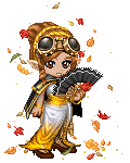
Okay, here's my latest work. It's Sailor Uranus from, well, Sailor Moon! XD I drew her for a contest, though I don't think I'll win anything. I'd be surprised if I do, for sure.
Things I'd like to hear about are the anatomy, the overall flow of the piece, and also, how the shading went. What can improve on? XD I know there's something funky about the arm and also the hand, but I haven't been able to fix it properly. I suck at hands still. D:
It's basically one of my first times coloring on the computer (in any serious manner), and also one of my first times with "cell shading" style. I ended up looking up a bunch of tutorials on lineart and also coloring. It took way longer than I'm willing to admit. T.T I should've been studying for classes more.
http://i228.photobucket.com/albums/ee320/jibrienne/sailor_uranus_colored.png
|
|
|
|
|
|
 |
|
|
|
|
|
|
|
|
|
|
|
|
|
|
|
|
|
|
|
|
|
|
|
Errol McGillivray Captain
|
Posted: Sat Jan 30, 2010 11:47 pm
|
|
|
|
|
|
|
|
|
|
|
Posted: Sun Jan 31, 2010 7:45 am
|
|
|
|
|
|
|
|
|
|
|
|
|
Posted: Mon Feb 01, 2010 10:27 am
|
|
|
|
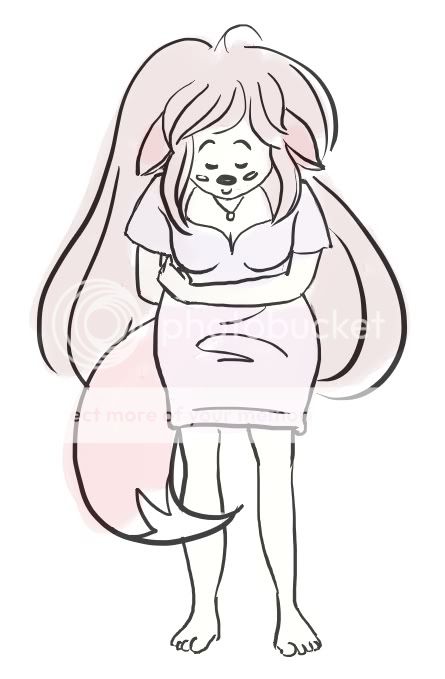
ice cream drop
OK, here's the newest version. I tried to follow most of the suggestions, though I didn't include all of them. For one, I decided to change the "lunch" into an ice cream cone. I figured that one, it's easier to draw... but two, I was also hoping to connect her a bit more to the food on the ground. Rather than just sort of passively walking in on a dropped lunch, it's now specifically her ice cream cone... and it's ruined now.
I also tried fixing up the expression a bit. To me she definitely looks upset now, which is better than last time. Maybe not quite as expressive as I'd like quite yet, though. The person requesting this doesn't want huge anime eyes, so I'm trying to steer away from that at least. Anything else I could do to improve it?
For the body language, I'm thinking I might droop the ice cream cone in her hand a bit more and also droop the shoulders just a wee bit more.
Can anyone think of anything else? xD
|
|
|
|
|
|
|
|
|
|
|
|
|
|
|
|
|
|
|
|
|
|
|
|
|
|
|
|
|
|
|
|
|
|
|
|
|
|
|
|
|
|
|
|
|
|
|
|
|
|
|
|
Posted: Fri Apr 16, 2010 4:15 am
|
|
|
|
|
|
|
|
|
|
|
|
|