Welcome to Gaia! ::

Gaian Art Mentors

Back to Guilds

Where artists are paired in a mentor/mentee fashion to share their knowledge. 

Tags: artists, mentor, mentee, learning, drawing 

Reply Sketchbooks [Get crits here! Open to everyone]
iZince's Art (UP: Sept. 5 Anatomy help?)

Quick Reply

Enter both words below, separated by a space:

Can't read the text? Click here

Submit

iZince

Bashful Ladykiller

PostPosted: Mon Aug 24, 2009 7:47 pm


Hey everyone!

I'm a 16-17 years old self-taught anime artist. Mediums that I prefer are pencil crayons and markers. I also draw digitally on SAI and Photoshop. I started drawing (or doodling) since I was a kid and I started to try my hand on digital drawing since around year 2000. I've just recently, in terms of months, became serious about pushing myself to become a better artist.

I would like to learn how to make my art less dull and more eye-catching and know what's missing in my works. Of course, and to learn from any mistakes. I also want to learn more about realism & perspective drawings.

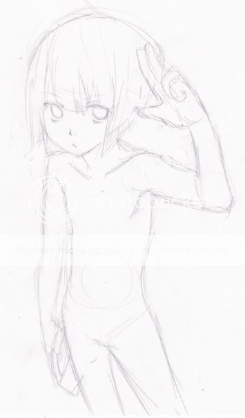
By far, this one is my biggest CG; however, I'm sure there is something wrong that impacts this piece in a negative way. Does anything put you off when you see it? What do you think?

User Image

To clear up the confusion, yes the signature says Alice and yes my avatar is male; but don't let the pixel fool you! XD
PostPosted: Wed Aug 26, 2009 2:37 pm


New work from last night:

User Image

Critiques on either or both please? XD

Aug. 27, 2009:

User Image

iZince

Bashful Ladykiller


Errol McGillivray
Captain

PostPosted: Sat Aug 29, 2009 9:09 am


I think that your work would be more eye catching if you put more focus on composition.

The first one has a lot going on, but it all kind of falls back and flattens out because of how you chose to use colour. The bottom is very brown. And then the characters are also wearing brown. They get lost. The place where the eye goes is the top left because you have the most contrast.

The eye focuses on contrast. Most of the colour you have is cool, then you have the one area of warm colour. Also, you have a crisp line of light and dark in the same area. Curves also meet straight lines there too. Try and choose your elements and lay them down carefully, seeing where contrast leads the eye.

In the second one, she lacks perspective, which would make things more dynamic. I would stagger her feet to create perspective. That little change would give the viewer more information on how much space she takes up in her world.
PostPosted: Sun Aug 30, 2009 4:07 am


Wow! That really opened up my eyes! Thank you so much! It was very informative and helpful. mrgreen

iZince

Bashful Ladykiller


iZince

Bashful Ladykiller

PostPosted: Mon Aug 31, 2009 1:50 pm


New WIP work:
User Image
I'm trying perspective here but the body doesn't look right. QAQ;
I want the viewer to look at him from the top.


New finished work: (Sept.5, 2009)
User Image
Reply
Sketchbooks [Get crits here! Open to everyone]

 
Manage Your Items
Other Stuff
Get GCash
Offers
Get Items
More Items
Where Everyone Hangs Out
Other Community Areas
Virtual Spaces
Fun Stuff
Gaia's Games
Mini-Games
Play with GCash
Play with Platinum