I don't scan most of the time. I take photos too. No one can tell.
First, no flash when you use pencil or any other reflective tool or surface. Right now, we can't really tell you anything about your values because they're washed out by the flash.
If you're taking the picture at night and need the flash, stay back away from the picture and use the zoom. It's harder to deal with because you're going to move a little as you try, but you won't get the light smacking into your work and flying back at the lens.
If you have a digital camera make sure it's set for indoor. Indoor light is yellow. If you use that setting, it filters that out to white and you don't need the flash because the indoor lighting will be enough.
Stick the page up on the wall at eye level with yourself. Just a tiny bit of tape on the corners. Don't stick at the middles because the page will curl with gravity.
Step back enough so that the picture is all in the viewfinder without using the zoom. (Use the macro setting if it's small so you don't get blurring.)
You'll get photos that people will mistake for scans.
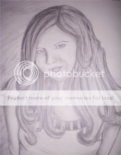
example (need DA acct to see) I find this to be a lot more versatile and cleaner than scanning actually. I don't even scan my sketchbook anymore in most cases. (Now that I have a camera again.) Give it a try and see the difference it makes in your presentation.
An easy to see, clean presentation shows you care about what you're doing and care about the people that are viewing. (Never hurts. Hehe.)