|
|
|
|
|
|
|
 Posted: Thu May 07, 2009 4:39 pm Posted: Thu May 07, 2009 4:39 pm
OH HAY, ALL. Greetings and Salutations! Here's a little bit about me before we get this show on the road, hm? :3
My real name is Victoria.
I'm 19 years old and I've been drawing since I was old enough to hold a crayon.
I got accepted to SCAD and Ringling College of Art and Design but could not attend either because of money issues. I'm going to Flagler College instead to get my Bachelor's degree in Fine Arts.
I have planned out my entire career's life span to revolve around art... I take it pretty seriously.
I draw mostly anime-esque pieces but I can do realism and abstract as well.
I prefer drawing with ink. When I do use digital media to draw, it's very basic because I don't like complicated things. >:C Cross hatching is my favorite shading technique. I like to paint with acrylics. And I love bold colored backgrounds. Contrast is lovely.
ANYHOOT. Here's my dA:
OH BBY
Well... go on. My mind is an open window!
|
 |
|
|
|
|
|
|
|
|
|
|
|
|
|
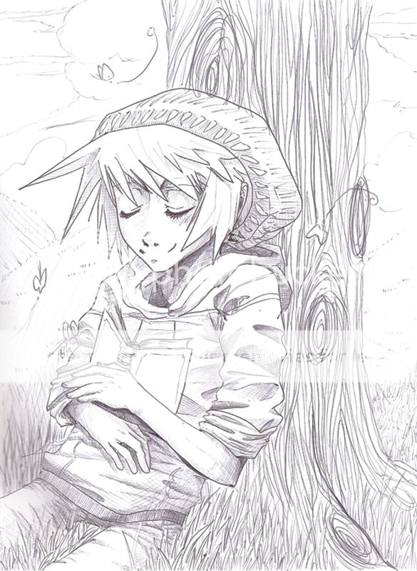
Posted: Thu May 07, 2009 5:04 pm
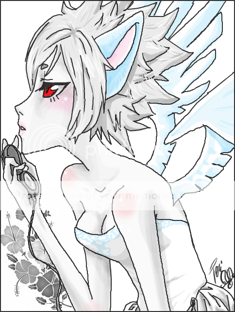
OH MAN. I just realized what was wrong with the first piece up there. xD
Her hand's kinda small... BOO. Like, when I was drawing it, I noticed something off... but I couldn't put my finger on it... and now I see...
Ah, well.
|
|
|
|
|
|
|
|
|
|
|
|
|
|
|
|
|
|
Posted: Fri May 08, 2009 12:17 am
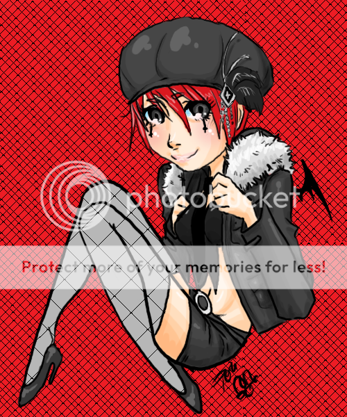
Ooo, your skill in perspective is admirable.
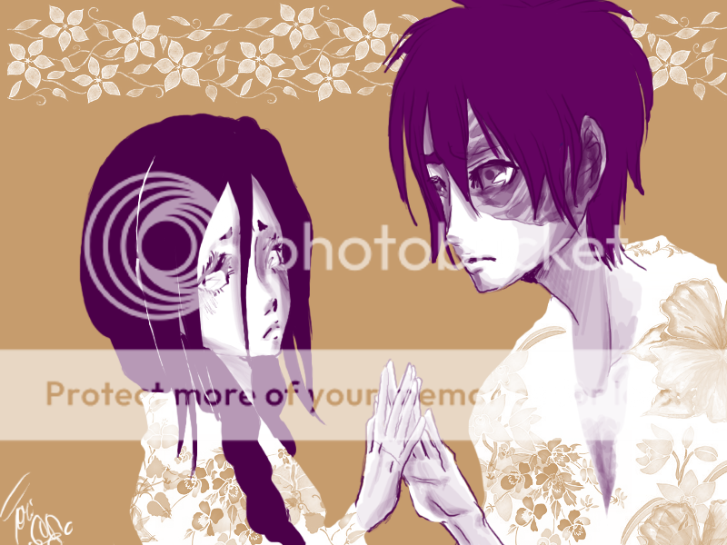
I really like the monochrome piece as well, (the purple with the brown background) it looks simple, but the shading adds depth and the touch of flowers in their clothing really sets the piece apart from the others. Also, the one below it, is rather lovely. You really made the piece look relaxed.
xD You already pointed out what I would have commented on; in the first picture, I think the hand looks a little small compared to the rest of the drawing. I think her neck might be a little too thin as well, but over all I really like that image too.
|
|
|
|
|
|
|
|
|
|
|
|
|
|
|
Posted: Fri May 08, 2009 1:26 am
Thank youuu :333
Yeah... The first one... I blame the program I used xDDD It lags with my tablet. That's why I just did the line art on that and then colored it in photoshop. =/ It was just too difficult to deal with.
|
|
|
|
|
|
|
|
|
|
|
|
|
|
|
|
|
|
Posted: Fri May 08, 2009 10:04 pm
xD Ugh, yeah. My tablet and photoshop make my computer go "OH, GAWD." Sai usually doesn't kill my laptop as much when I use my tablet.
ninja And you're welcome~
|
|
|
|
|
|
|
|
|
|
|
|
|
|
|
Posted: Sat May 09, 2009 2:05 pm
|
|
|
|
|
|
|
|
|
|
|
|
|
Posted: Sat May 09, 2009 5:30 pm
Easy Paint Tool Sai--a ridiculously epic painting program. :'D
As for actual commentary--your line art is so amazingly clean. :'O I also love how they're not always black. ;D The only thing is you might want to add line value~
Also, for the last piece, the tree looks a tad flat in comparison to the character. Perhaps it's due to the lack of shading on it or the business of the lines.
|
|
|
|
|
|
|
|
|
|
|
|
|
|
|
Posted: Sat May 09, 2009 7:44 pm
Line value isn't exactly my style... but thank you.
And yeah... Backgrounds... my one weakness!!! :3
|
|
|
|
|
|
|
|
|
|
|
|
|
|
|
|
|
|
Posted: Sat May 09, 2009 7:48 pm
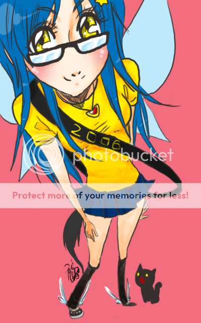
TWO NEWEST PIECES UHHMMM... Did these on Tegaki E, the website. I've been trying to master that type of program for a while now. My tablet lags like a mofo, but it's a lot more self-satisfying when I'm done with a piece on there because it's a challenge. Also, one layered things are hard when you're trying to get the depth of a figure. HM.
anyway... I am pretty pleased with them... Even though I forgot to put the beauty mark under the first one's eye xD;;;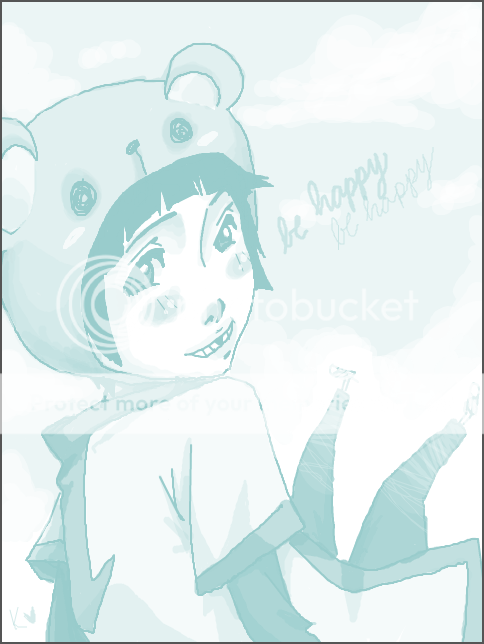 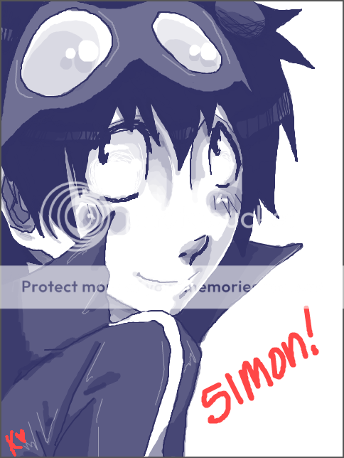
|
|
|
|
|
|
|
|
|
|
|
|
|
|
|
Posted: Sun May 10, 2009 5:08 pm
ooh XD I never had the patience for tegaki, but I have some friends who swear by it rofl
Cute style though! :3~
be happy:
I think the bear hat doesn't quite match up with the angle of her face but that's a small nitpick XD...
simon:
xD his goggles don't quite match up with line of his face either... and shoulder is kinda smallish
But both are cute and well done ;3~~
Hope to see more!
|
|
|
|
|
|
|
|
|
|
|
|
|
|
|
|
|
|
Posted: Mon May 11, 2009 4:33 pm
Yaaa... I have problems with hats and the like, as you can see xD
Tegaki's definitely a challenge... but I like that about it xDD
Especially since you can change the opacity of the paint tool thing, it's a lot more fun.
And thanks :3
ALSO. Latest piece xDD I did another on Tegaki E.
UHHMMM... 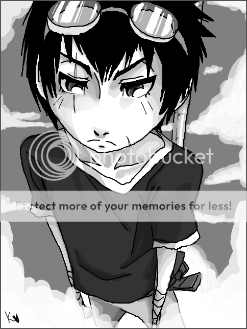
|
|
|
|
|
|
|
|
|
|
|
|
|
|
|
Posted: Wed May 13, 2009 1:37 am
WIP.
Ok, so this is something I started today.
I know the body is small for her head... I started it and I stopped and I didn't like where it was going but I didn't want to start all over again. So, this is what I ask you guys... Should I keep the same pose and just make it more proportionate or should I just go a whole different route. I just really love how her face came out and I don't want to trash the whole thing because I can't think of something to do with the rest of it, ya dig?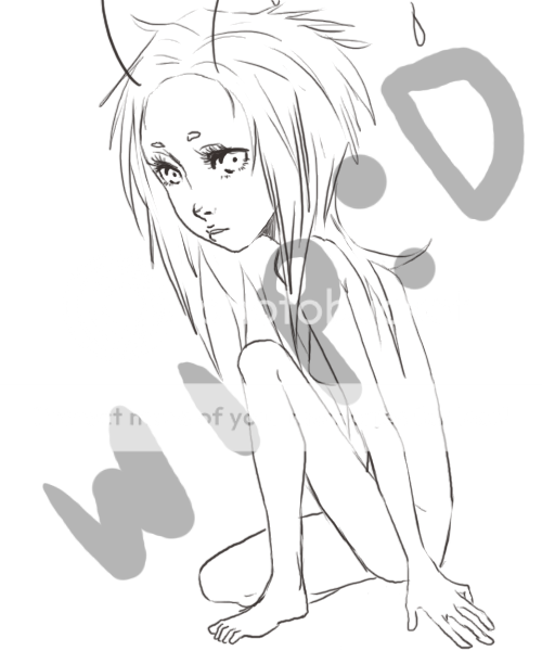
|
|
|
|
|
|
|
|
|
|
|
|
|
|
|
|
|
|
Posted: Thu May 14, 2009 12:37 am
|
|
|
|
|
|
|
|
|
|
Posted: Thu May 14, 2009 2:19 pm
Hmm.. she looks kind of anorexic to me. The thumb is also too short for the rest of the hand. I can understand why the cheeks are rosey but why are her shoulders, knees, elbows, and back? Other than that your work is fantastic I love how expressive the eys are.
|
|
|
|
|
|
|
|
|
|
|
|
|
|
|
|
|
|
Posted: Thu May 14, 2009 6:14 pm
I'm pretty sure her body is just small for her head but I didn't want to re-draw it so I just went with it and focused more on making the shading the most striking part of the piece.
Uhm... the whole shoulders and knees and such being rosey is kind of a style. I've seen other people do it when they color pieces and I think it's charming so I do it sometimes...
|
|
|
|
|
|
|
|
|
|
|
|
|
|