|
|
|
|
|
|
|
|
|
 Posted: Thu May 01, 2008 4:46 pm Posted: Thu May 01, 2008 4:46 pm
 |
|
|
 |
Hi! I'm Limely, and this is the thread where I'll post my wips, sketches and stuff in general.
About me:
I've been drawing since I was a wee sprout, and drawing is as natural to me as breathing and eating. I don't have any education in the field yet, but I've applied for an art high school for next year, hoping I'll be accepted. So what you get here is the raw, self-taught skills of a fifteen years old Norwegian girl...
My favourite medium is water-colours, and I'm working on my digital stuffs. It's coming along okay.
I'm a very quick learner, and I improve rather fast, I think, probably because I practise a lot.
When I'm not drawing, I'm very active in my local music-stage. I play the violin, cornet, drums and Irish tin whistle. I love music, go figure.
I embrace and love upon crits. :3 |
|
|
|
|
|
 |
|
|
|
|
|
|
|
|
|
|
|
|
|
|
Posted: Thu May 01, 2008 4:47 pm
|
|
|
|
|
|
|
|
|
|
|
|
|
Posted: Thu May 01, 2008 9:08 pm
|
|
|
|
|
|
|
|
|
|
|
Posted: Thu May 01, 2008 11:20 pm
|
|
|
|
|
|
|
|
|
|
|
|
|
Posted: Sun May 04, 2008 10:55 pm
|
|
|
|
|
|
|
|
|
|
|
Posted: Sun May 04, 2008 11:46 pm
|
|
|
|
|
|
|
|
|
|
|
|
|
Posted: Mon May 05, 2008 11:14 am
|
|
|
|
Anetra_Pendragon Limely Errr, I'd like to know who you refer to as "black" though, since I've never really thought of any of them as "black..." It confuzzles me a bit, haha. xD;;
I'd guess probably the bald gentleman, given that his eyes most closely resemble the described ailment (left shaped more like a circle, right more oval).
I came to that conclusion too, after a while. x3;
Pyro Philebas I love the way you drew the facial expressions, most of the manga/anime artists seem to lack that. I wonder why? Anyways, It makes me like your art more because those expressions make them seem alive. I would critique, but I don't know what to critique.
Thanks for the comment, nevertheless. (:
That's true, and quite an interesting subject, though I'll have to word myself carefully, since it might also be rather touchy...
I don't think the "fault" lies in the style, but rather the focus of the artist. A lot of manga-style artists focus more on drawing beautiful people, often doll-like, and these can sometimes lack feelings, sorta. Not that that's a bad thing, they simply choose to focus on something else. I'd have to say that's a lot more aestetically pleasing than my "style". I often tend to draw not-so-pretty people, which might make them seem more real and more life-like and expressive (even though they are quite deformed) since most people are in fact flawed...
Nevertheless, I've been playing around a lot with expressions, and it's my favourite thing to draw, so I'm glad I'm able to convey them. (:
|
|
|
|
|
|
|
|
|
|
|
|
|
|
|
|
|
|
|
|
|
Posted: Mon May 05, 2008 12:10 pm
|
|
|
|
|
|
|
|
|
|
|
|
|
Posted: Mon May 05, 2008 12:19 pm
|
|
|
|
Anyways, here's some wips: without the sketch and with the sketch beneath. It's been a while since I've been digipainting now. But I got my stupid Trust-tablet working properly, so I decided to try some more. It's fun, even with a tablet this shitty, so I'm saving up for a Wacom currently... ANYWAYS! I'm only going to colour the guy who I've started on, because I'm lazy. I want to make his shirt look like a woolen, knitted shirt, sorta. Any ideas on how I could convey that? Well, so long. I'll be working on his hair... And silly me forgot to scroll him into view properly. Gawd. |
|
|
|
|
|
|
|
|
|
|
|
|
|
|
|
|
|
|
|
|
Posted: Mon May 05, 2008 12:20 pm
|
|
|
|
|
|
|
|
|
|
|
|
|
Posted: Fri May 23, 2008 8:09 am
|
|
|
|
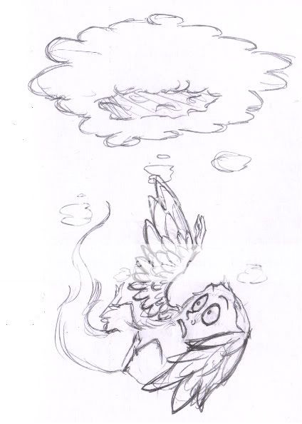
Hay thar, need some serious help with this one:

First of all, a little about the image...
It's an entry for a fanart-contest for the game Rayman I intend to participate in (since it was pretty much me who made the contest happen so I should participate. <_<). The theme was New Dawn, so I decided to picture Rayman and a couple of friends the morning after their victory over the evil Admiral Razorbeard and the Robo-Pirates.
The huge, bug-like helmet thingy we see there would be the head of the evil admiral's ultimate killer machine the Grolgoth, which was the last boss in the game. I put it there to show what time the image takes place in. Same goes for the mast in the water, it's supposed to be a sinking pirate ship.
I want to picture the peace, relief and happiness the creatures feel now that the pirates have been defeated.
Things I was planning to add...
I want a little creature dancing on top of the mast. He'd be waving to the fairy sitting ashore, and she's going to wave back once I draw her arm in...
The snake in the water I'm not so sure if I'll keep, but if I do, he'll have more coils sticking out of the water...
I also want a little frog-like creature running away with the foot of the guy in the hammock (fully possible, since he technically is limbless :B) laughing. Which is why he only has one foot as of yet. This one I think I'm gonna draw somewhere in the right corner.
How I plan to finish it...
I'm either going to paint this digitaly or paint it with aquarelles. I don't know yet.
The sun will have a very subtle glow, and the image will have a overall blue/purple hue, though there'll be different colours all over.
Anyways, I need input on the compisition, flow, and generally anything that comes to your minds. I want this to turn out very good. (:
|
|
|
|
|
|
|
|
|
|
|
|
|
|
|
|
|
|
|
|
|
Posted: Fri May 23, 2008 9:37 am
|
|
|
|
Nifty start! heart (I'm not out of town yet! *plants feet on the ground*)
I have absolutely no knowledge of this game, so I can't help you on any of the characterization aspects. Seems to me you're just fine there, though, so alls the best.
Here's what I've got for you-
Composition:
If you make the image smaller and take a peek at it you'll notice that most of the long bits are headed in one direct, to the right. This makes the whole thing seem a bit unbalanced. Here's my crude illustration:
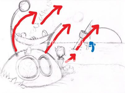
Flipping the pirate's mast so it's heading the other direction (pointing to the left) would greatly help this, I think. 3nodding
Flipping the mast would also give you a 'frame' for your character, reinforcing him/her as the focal point.
Colors:
Your previous work has showed a great talent for color picking, so I won't go into too much detail here.
You want to give the image a feeling of "peace, relief and happiness" and one of the easiest ways to do this is simply by picking a color scheme that people associate with those feelings. Your idea of a purple hue is great, but the blue might have people a little confused. Some soft yellows and pinks and lots of lighting might work out better. 3nodding
It might also be a good idea to look into what colors are actually in sunrises. There are loads of pinks and yellows, but when the sun is this high in the sky, it tends not to have too much purple in it. But, if the game has a lot of purple and you don't care much for reality, that's good too. heart
A good idea would be to do a couple of color studies on the sketch to figure out which direction you want to go in. 3nodding
You have a great start to it though. Make sure you post the next few steps - I can't wait to see them. 3nodding If you have any other concerns that I didn't touch on, please post them and let me know. 3nodding I'm happy to help in any way I can.
It kinda makes me want to play this game... xd
|
 |
|
|
|
|
|
|
|
|
|
|
|
|
|
|
|
|
|
|
|
|
|
Posted: Fri May 23, 2008 1:06 pm
|
|
|
|
|
|
|
|
|
|
|
Posted: Fri May 23, 2008 7:30 pm
|
Errol McGillivray Captain
|
|
|
|
|
|
|
|
|
|
|
|
Posted: Fri May 23, 2008 11:16 pm
|
|
|
|
|
|
|
|
|
|
|
|
|