|
|
|
|
|
|
|
|
|
|
|
|
|
|
|
|
|
|
 Posted: Wed Mar 19, 2008 9:14 pm Posted: Wed Mar 19, 2008 9:14 pm
|
|
|
|
|
|
|
|
|
|
|

Errol McGillivray Captain
|
Posted: Thu Mar 20, 2008 8:21 am
 |
|
|
 |
Since the forum is for critique, it doesn't make sense to ask for it in the title. We'd prefer that you name it with your name so people know the thread. Have you read the guidelines for the forums? If not, it would be in your best interests to do so.
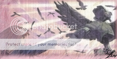
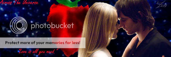
As for the banners, I think they lack thought. What I think you should do is start to look at your space that you need to fill. Think about how you want someone's eye to move across it. Take the first one for example. You've got a lot of contrast there. It stands out and the shape of where the edges meet will tell the eye where to look.
You want to pick a place for people to look. This is your focal point. Then, you can make it stand out with things like contrast, size, line, and color. The key is contrast. If you have contrast going everywhere, then there's no where to focus. Be in control of the image.
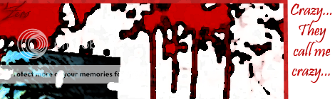
The first one is a good example. (By the way, be careful using images you didn't create. Supply a source if you can. If you can't supply a source, at least make it clear what you did actually do yourself.) The ball of yellow in the red makes a focal point that the eye is drawn to. The dark shape leads up to the right and pretty much points to the name. That's the only one that looks like it's got some kind of design. Everything else looks like you either didn't do anything at all (Furi Kuri) or that you just didn't think about what you were doing.
Also, avoid script unless there's a reason. It's hard to read and hard to see period. Defeats the purpose of having the text if you can't read it. Unless it's not supposed to be read, in say a pattern or something.
|
|
|
|
|
|
|
|
|
|
|
|
|
|
|
|
|
|
|
|
|
Posted: Sat Mar 22, 2008 1:34 pm
|
|
|
|
|
|
|
|
|
|
|
|
|
Posted: Sun Mar 23, 2008 1:42 am
|
|
|
|
Gwah! I don’t mean to come off as rude, but what you said above really annoys me. Now, don’t get me wrong, it’s not you, it’s everyone that assumes that in order to be an artist you have to have some sort of expensive art program. Yes, expensive art programs, such as Photoshop, will give you a bit of a leg up in the digital world, but unless you have talent a program will do nothing for you.
If you want to lean how to create your own work, the best thing I can suggest is getting a piece of paper and a pencil and practice, practice, practice! A art program does not give you artistic ability, creativity, diligence, practice and time does.
At first things may be hard and frustrating and you may think, “Damn it, I can’t draw to save my life!” but you can’t expect to be good at everything right off the bat. Getting good at something, especially art, takes time, lots… and lots… and lots of time. The biggest things to remember though are:
1) Don’t get down on your self.
2)Don’t give up.
3)Practice makes perfect!
|
|
|
|
|
|
|
|
|
|
|
|
|
|
|
|
|
|
|
|
|
Posted: Sun Mar 23, 2008 5:14 am
|
Errol McGillivray Captain
|
|
|
|
|
|
|
|
|
|
|
|
Posted: Sun Mar 23, 2008 10:10 am
|
|
|
|
|
|
|
|
|
|
|
Posted: Sun Mar 23, 2008 4:28 pm
|
|
|
|
|
|
|
|
|
|
|
Errol McGillivray Captain
|
Posted: Sun Mar 23, 2008 8:32 pm
|
|
|
|
|
|
|
|
|
|
|
|
|