|
|
|
|
|
|
|
|
|
 Posted: Mon Feb 04, 2008 1:17 pm Posted: Mon Feb 04, 2008 1:17 pm
|
|
|
|
|
|
|
|
|
|
|
|
|
|
|
|
|
|
|
|
|
|
Posted: Mon Feb 04, 2008 1:19 pm
|
|
|
|
|
|
|
|
|
|
|
Posted: Mon Feb 04, 2008 1:20 pm
|
|
|
|
|
|
|
|
|
|
|
|
|
Posted: Mon Feb 04, 2008 5:30 pm
 |
|
|
 |
First off, I think you need to add highlights to her scarf, it's almost too dark to see. I'm also not sure what her eyes are suppose to be doing, are they glowing? If so, you can use that as another light source to highlight the scarf in the front. Give the highlights a tinge of blue because the eyes are glowing blue. I don't think you need to worry about the moon that much because all of your lighting is from the back anyways. I think her hair looks good, though I usually add more detail, so if that is what you're looking for, add more lines and vary the colours more. So, use an even darker blonde with you hair, you know, add more tones. The wrinkles are her pants are nice, but try punching it up a little more so they stand out and are not overlooked, don't forget all the straps would pull on the material too. I think her hand is placed too high on her waist... it needs to be down resting on the top portion of her pelvis. Stand up and strike the pose, see if its the same.
Hope that helps and keep up the good work.
|
|
|
|
|
|
 |
|
|
|
|
|
|
|
|
|
|
|
|
|
|
Posted: Thu Feb 07, 2008 5:57 pm
|
|
|
|
|
|
|
|
|
|
|
|
|
Posted: Sat Feb 09, 2008 9:51 am
|
|
|
|
|
|
|
|
|
|
|
Posted: Tue Feb 19, 2008 2:11 pm
|
|
|
|
Try adding some other tones to your work, like blues/purples for shadows. It sounds weird, but I've seen it work. O: I personally still don't understand it much... but I hope this kinda helps. @ 3@
I am here, though, to talk about hair. C: Your is actually very cute. It's the generic anime styled hair, which really usually isn't realistic at all anyways. xD So I don't quite understand why you dislike it that much. What bothers me is the halo shine. ;____; You made little gradients that look nice, but then there's this huge white patch obscuring my view of the pretty hair. Whyyyy?
Note: If you want more realistic hair, you just have to add more lines in and soften the ends. You draw, like most manga style artists do, in chunks. the bottom of this girl's hair ends in triangle shapes that point out. When that happens, it does tend to look very fake (or overly gelled.) Think about how real people look! How would you get a regular person to get their hair like that? If the answer is loads of gel, that's probably no good.
http://zhoushijie.deviantart.com/art/Inking-Pracitce-Chibi-52213960
I'm kind of a hypocrite because my hair is not really much better than yours but can you see that while the hair does end in a triangle shape, it goes with a certain flow?
I hope this made sense! O: <3
|
 |
|
|
|
|
|
|
|
|
|
|
|
|
|
|
|
|
|
|
|
|
|
Posted: Sun Apr 20, 2008 2:13 am
|
|
|
|
|
|
|
|
|
|
|
Posted: Sun Apr 20, 2008 8:17 am
|
|
|
|
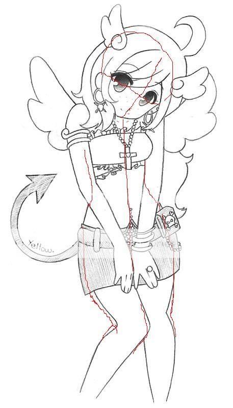
Very cute pic, and your inking is nice and consistent. Just a few things. When you do ink, think about line weight. All of your lines are the same color, except the eye lids. It flattens the picture. Stuff that overlaps other things should have thicker lines and things that are further away have thicker lines. You can change up line thickness in the hair and wings to make it pop more and outlines are also thicker.
A few anatomical things, her head and face is crooked. Make sure that when you draw your heads they aren't lopsided. As it stands, her head is shaped very strangly. Also, her eyes and ears don't quite seem to be aligned with eachother either, the left eye is rotated tad to the right and the ears aren't level. And her chin isn't on center, as seen in the red lining. Her top half is okay, I'd prefer the arm's to be more arm-shaped but pay no heed to my whining as that's just my asthetic.
On her bottom half the hips and leg sizes don't really match. If your going to draw her hips that curvy, make her legs bigger too. I've noticed in your older picture as well that you tend to draw your legs too small. For her right leg you have going on what I call the "pipe cleaner affect." Legs do not bend in that matter. When a leg is drawn from that angle the thigh overlaps the calf in the way that I redlined. |
|
|
|
|
|
|
|
|
|
|
|
|
|
|
|
|
|
|
|
|
|
|
Posted: Mon Apr 21, 2008 6:59 pm
|
|
|
|
|
|
|
|
|
|
|
Posted: Mon Apr 21, 2008 8:05 pm
|
|
|
|
|
|
|
|
|
|
|
|
|
Posted: Thu Apr 24, 2008 10:31 pm
|
|
|
|
|
|
|
|
|
|
|
Posted: Fri May 02, 2008 8:57 pm
|
|
|
|
|
|
|
|
|
|
|
|
|
|