|
|
|
|
|
|
|
|
|
 Posted: Thu Oct 11, 2007 12:23 am Posted: Thu Oct 11, 2007 12:23 am
 |
|
|
 |
This is an open redline and critique thread. Anyone can post ... Read below! vv
How to get a Critiqueing/Redlining
Post an image in this thread! Please don't give me a bunch of images or a whole gallery at once, let's work on one image at a time. My best work always comes from reviewing and reassessing my work while it is in progress - I can only encourage multiple drafts =) But still - just one at a time!
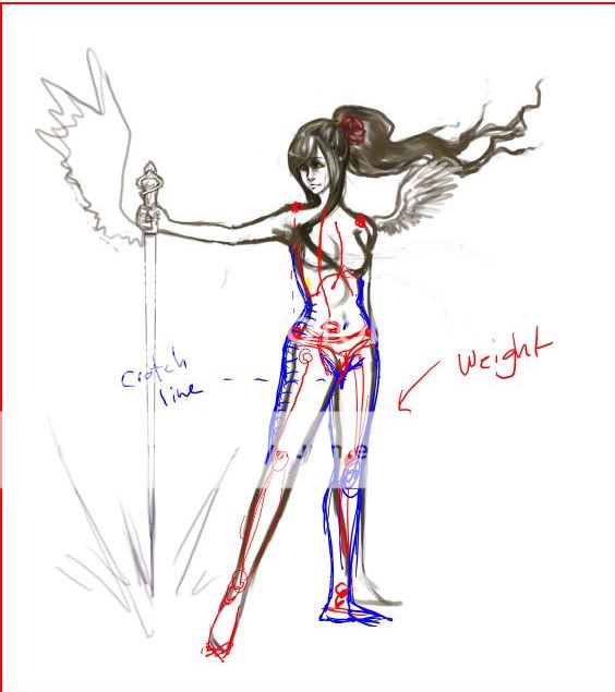
example of a redline:
About Vena
General:
I'm currently an animation student at the Emily Carr University in Vancouver, BC, Canada. It's a lot of fun and a lot of work but definitely what I love to do. =) My love of art spans across a lot of media and I have some experience painting in oil, acrylic and watercolors and drawing with conte/charcoal and ink.
Education:
Previous: I took continuing studies courses at HKU Space in Hong Kong, and at Emily Carr before becoming a full time student there. I have taken mostly drawing and life drawing courses, as well as painting.
Current: 2nd Year Animation student at Emily Carr University.
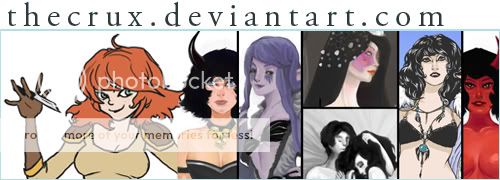
Art Site TheCrux
Time Zone: Standard time zone: UTC/GMT -8 hours
Times I'm Online: Usually a little bit in the morning, but mostly after 5 my time for the majority of the evening.
Contact:
msn: jasper_tear@hotmail.com
skype: kristen.campbell86
What I Have to Offer!
I love, love, LOVE to draw people. I've taken a few life drawing classes, and the subjects of my drawings are almost always focused on a person or people. I also have some groovy anatomy books at my disposal for reference.
I can help with painting/drawing media related problems.
I can help with some animation problems.
Stuff I can help critique:
- anatomy/structure
- composition
- shading/contrast
- animal structure
Other stuff:
Favorite artists: Egon Scheile, Gustav Klimpt, H.R. Giger, Ashley Wood, Ron Mueck, many more =D
 |
|
|
|
|
|
 |
|
|
|
|
|
|
|
|
|
|
|
|
|
|
Posted: Thu Oct 11, 2007 1:01 am
|
|
|
|
Challenges:
Challenges to get you going if you need something to start on.
Warm vs Cool Color Challenge
This is a two part assignment.
PART 1
Sketch a landscape, scene , or figure from observation. Do not worry about detail of the objects/scene. Make sure you have a strong lightsource and cast shadows. On your image, make note/sketch where the shadows are. Take a picture of your scene if you are afraid you will forget it!
PART 2
Choose ONE color that you will paint your scene with. You may use black, white to mix your color with, as well as two colors that will weight the warmth/coolness of your color, but not on their own. Ex. If you choose green, you may mix with yellow or blue to change the green- but you cannot have blue or yellow on their own!
Complimentary Color Scheme Challenge
Finished Products:
nighsongbyrd
Tiger-of-snow
Syrella
Use a mirror (not a picture!!) to draw your face. Only use either GRAYSCALE or COMPLIMENTARY COLOR (adding B&W to make tone and shade).
A complimentary color set are colors that are at the opposite of the color wheel from each other. They are:
Violet and Yellow
Orange and Blue
Green and Red
You can use black and white to make other tones and values, and of course you can mix the colors together. Try to make as many values as you can!
If you do it on the computer, try mixing the colors yourself by lowering the opacity.
Here are some of my own examples : Blue and Orange
This one is similar but it uses a discord color scheme. Discord
|
 |
|
|
|
|
|
|
|
|
|
|
|
|
|
|
|
|
|
|
|
|
|
|
|
|
|
|
|
|
|
|
Posted: Fri Oct 12, 2007 10:22 pm
|
|
|
|
|
|
|
|
|
|
|
|
|
|
|
|
|
|
|
|
|
|
Posted: Mon Oct 15, 2007 2:08 pm
|
|
|
|
Hey Kris =D Hehe kinda cool, my name is kristen =P
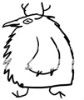
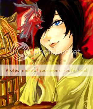
Soo with your picture I think the first thing that jumps out at me is that you have a really good focus on his face, but the rest of the picture gets a little lost to me. I didnt realize that he was crushing a bird until I read what you wrote... the bird is very undefined right now. If he is crushing the whole bird I would suggest showing mangled parts of the body, a leg, a whole wing or something so that it becomes more apparent that it is a bird. You could try looking up a picture of a small bird and distorting the positions of its body to match your hand in the picture. So gory =P
The face looks very nice to me, good work on that =D the only thing I would say about improving that is maybe make the eye a bit smaller (though I can tell its a stylistic thing, so its all how you feel about it) and the nose appears slight off center, because you havent drawn the bottom of it... if you shade the bottom a little darker it will help shape it, right now if feels a bit 2D.
for color, I really like the face and how focused the picture is on it, a tip is for background and foreground, desaturate the colors a bit. The red background detracts from the bloody hand, and since that is a big part of the narrative in the picture you will want to have more focus on it. The birdcage is also a bit busy in the picture, but since its not a real focus in the picture you could darken it or blur it so that its there, but not taking away from the face and the hand.
Anyways I hope that is helpful, and that I am not too long winded >< I do like how your picture looks, keep me updated =D
|
|
|
|
|
|
|
|
|
|
|
|
|
|
|
|
|
|
|
|
|
|
|
Posted: Mon Oct 15, 2007 2:40 pm
|
|
|
|
|
|
|
|
|
|
|
Posted: Mon Oct 15, 2007 2:41 pm
|
|
|
|
|
|
|
|
|
|
|
|
|
Posted: Mon Oct 15, 2007 2:46 pm
|
|
|
|
|
|
|
|
|
|
|
Posted: Tue Oct 16, 2007 1:57 am
|
|
|
|
|
|
|
|
|
|
|
|
|
|
|
|
|
|
|
|
|
|
Posted: Tue Oct 16, 2007 10:01 pm
|
|
|
|
|
|
|
|
|
|
|
|
|
Posted: Wed Oct 17, 2007 12:30 am
|
|
|
|
|
|
|
|
|
|
|
|
|
|
|
|
|
|
|
|
|
|
Posted: Wed Oct 17, 2007 1:57 pm
|
|
|
|
|
|
|
|
|
|
|
|
|


![.[ Cheesecube ].'s avatar](https://a1cdn.gaiaonline.com/dress-up/avatar/ava/c1/18/770f8a91018c1_flip.png?t=1533513860_6.00_11)