|
|
|
|
|
|
|
|
|
|
|
|
|
|
|
|
|
|
 Posted: Fri Apr 06, 2007 10:19 am Posted: Fri Apr 06, 2007 10:19 am
 |
|
|
|
I can't consider myself an expert on graphics programs, but I used to use the GIMP for all of my graphic needs. Assuming that you have Windows, you can download it here. Be sure to download and install the runtime environment first. Play around with the tools, experimenting will help you get used to the program and improve your skills.
Typical users of graphic programs either do the entire product, sketch to final result, on the computer, do their sketch on paper and finish the rest digitally, do their sketch and lineart on paper and then color and finish digitally, or ink and color on paper and do the rest digitally. It's your decision as to what you choose to do. I barely do art anymore, but I find that a traditional sketch and a digital finish works best for me.
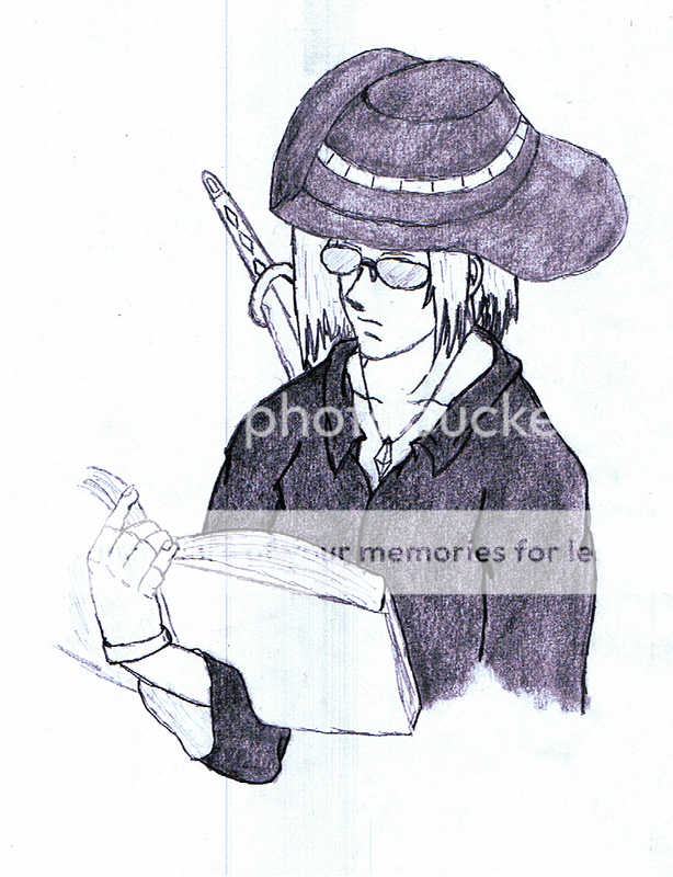
As for your drawing, it's really not all that bad. You definitely put effort into it and it shows. There are some things that can be adjusted, though. The hat on the character's head was drawn so that I didn't really know what shape the hat was supposed to be until I saw your dream avi in your sig. It's hard to pull off, but try to think of the hat in 3D and how it would look from that angle. Based on your shading, the hat seems to have a really weird-shaped brim and not stick up like it's supposed to. I can't exactly tell you how to fix it, but keep working with it until the result looks better. Practice is valuable.
Moving on down, you've done the face really well. The proportions make sense and the expression is realistic. The hair is drawn well but seems to lack shadows on it. White/gray hair can be a real pain to shade but it needs to be done anyways. The clothes look pretty spiffy, you've got the gist of where the folds go, which is something I'm still trying to figure out in my own drawings. The sword seems to be a sort of afterthought on the drawing and could use some shading on it.
The book is held in a pretty awkward position that probably couldn't be done unless the character had a third arm growing out of his stomach. Neither of the arms seem up to the task of holding the book like that because they're both at his sides. The hand is well-drawn, but I think you forgot to shade his fingerless glove. The inside of his sleeve lacks shading too, unless it's supposed to be white.
As for the shading overall, it seems to be sort of flat. I remember in art class a couple of years ago, I was assigned to do a value scale or whatever it's called. I had to take up part of a page of my sketchbook doing a scale of 10 shades of pencil from darkest to lightest. It would be good to try this and use a variety of shades of gray in your drawing rather than sticking to one shade for a whole area. Think about the shadows, highlights, textures, and everything else in your drawing and try to get that all in there. It's a big task, but you can do it. Practice, practice, practice. 3nodding
|
 |
|
|
|
|
 |
|
|
|
|
|
|
|
|
|
|
|
|
|
|
|
|
Posted: Sun Apr 08, 2007 6:03 am
|
|
|
|
|
|
|
|
|
|
|
Posted: Sat Aug 18, 2007 2:33 pm
|
|
|
|
|
|
|
|
|
|
|
|
|
Posted: Fri Sep 21, 2007 8:18 pm
|
|
|
|
|
|
|
|
|
|
|
Posted: Sat Sep 29, 2007 8:29 pm
|
|
|
|
|
|
|
|
|
|
|
|
|
Posted: Thu Oct 04, 2007 5:37 pm
|
|
|
|
|
|
|
|
|
|
|
|
|