Welcome to Gaia! ::

Gaian Art Mentors

Back to Guilds

Where artists are paired in a mentor/mentee fashion to share their knowledge. 

Tags: artists, mentor, mentee, learning, drawing 

Reply Sketchbooks [Get crits here! Open to everyone]
basilisk's sketchbook; updated again :D

Quick Reply

Enter both words below, separated by a space:

Can't read the text? Click here

Submit

basilisk

PostPosted: Mon Mar 12, 2007 3:38 am
Sketches, WIPs, and other things I think I could do with helpful comments and advice on. biggrin
My mentor is Yrindale. heart

Unless I mention otherwise, whichever picture is in my most recent post is the one I most want comments on. 3nodding If you have anything to say or to suggest, please do.

I feel like I ought to explain a bit about the sort of position I'm in right now... mid to late last year I was trying to get my portfolio together for purposes of showing to people to get work, but the thought of doing that was scary enough that I just about stopped working on my art altogether (with the thought being that if I didn't have a portfolio I wouldn't have to do the scary bit) and in the time it took me to notice and figure out what my problem was, I got a bit out of shape artistically.
I'm still trying to get back up to speed, really; I've been doing familiar/easy things and thinking "I'm back!" and then trying to challenge myself and coming to a complete stop again. I feel like I should be capable of a lot more than I'm achieving right now, but at the same time I'd much rather produce a lot of rubbish than not produce anything at all, even if I have to force myself a bit to keep going.

I think confidence is one of my biggest problems ._______.;;;; I'm sure I used to have more guts than this, I don't know what's wrong with me.
 
PostPosted: Mon Mar 12, 2007 3:38 am
Basic idea: semi-redesign of the legs and feet of a character I haven't drawn in a little while.

User Image

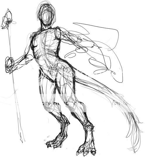
Scribbly as anything, obviously; I put the most effort into the shape and structure of the legs and feet (with far more reference to the dinosaur book I was using than was strictly necessary xd ) and just got the rest in to have a body to attach to them. As basic as the pose is, it appeals to me, with that sort of curved diagonal sweep going from the tip of the tail to the head (which was originally facing the same way as the rest of the body, but it just felt better this way). So, like... suggestions for making the pose more interesting, dynamic, natural, whatever; drawovers ( heart ); suggestions for the arms, all that.  

basilisk


basilisk

PostPosted: Tue Mar 13, 2007 2:47 am
OK, I had another go at the pose, going for some more movement.

User Image

I feel kind of silly posting this but whatever. I think I still need to work on this sort of thing D:  
PostPosted: Tue Mar 13, 2007 9:12 am
Leaning that far forward I think the tail would be lifted a bit to help balance. Otherwise though, I think things are coming along fairly well.  

Wispered


basilisk

PostPosted: Thu Mar 15, 2007 5:03 pm
I changed around the tail there but I'm not trying to work on that one at the moment. (I'll come back to it, and when I do I'll post another progress)
User Image
This is actually kind of old; I gave up on it a while ago, actually because there was another half to the design that I couldn't get to work, but this bit I'm quite happy with. I want to rewhatever it so I can use these lines for an experimental piece on a bit of clayboard I bought a while ago so I can see if I like working on it so that I can buy as many of the bits one of the art shops I go to has on sale because they're trying to get rid of them and I probably won't be able to get more easily after those are gone so I'd kind of like to work on it pretty soon. whew.

Armour design is a bit, well, made up, and I'm not sure about some of the pose/proportion/anatomy stuff, so any suggestions for changes to that super helpful, otherwise I'll probably move on with it pretty quickly.  
PostPosted: Thu Mar 15, 2007 7:44 pm
Hey basilisk! biggrin I really love the feeling and composition of that sketch *__*

Just a few things about the anatomy:
http://img.photobucket.com/albums/v198/nini206/redline/basilisk1.jpg

  • The top of the forearm dents in a bit too much and makes it look like the top of the arm is going down then turning to bend more.
  • The torso looks like it's in profile so the legs are in kinda akward positions... i.e. the butt should show a bit on his right leg.. and the other leg is attached too far up (it looks like it starts at the belly right now)
  • If you meant for the torso to be turning towards us more at the bottom there I guess try to make that more clear? :3 like maybe make a ridge down the front of his armor or on the sides so we can see what's going on. Though I guess that would be fixed when you color it.
  • Lastly his hand should be bent more at the wrist for him to be holding the sword perfectly upright like that.


Hope that helps @o@ And I can't wait to see it done since your painting skills are spectacular biggrin
 

tirbutt
Crew

Sparkling Sentai


basilisk

PostPosted: Sun Mar 18, 2007 4:22 am
User Image


User ImageI'm such a slow worker. >_<;;; I've been pissing around doing some rubbish practice watercolour sketches to get my hand back in. and trying to get over a nasty cold. My brain is still kind of full of snot, bear with me here ._.;;

I had a bit of a scribble over a slightly more worked on (but still old) version of the picture (shown here for comparison), tried to change the angle of her ( .__________.;; ) torso rather than angle of legs, and then got totally bogged down in trying to figure out the composition, 'cause the thing I'm going to be working on is twice as wide for the same height as my original composition. (Can you tell?)
I just kind of shifted a few elements over slightly so that there's something taking up the other half... I tried doodling in some possible background elements but I didn't think they worked with it so I decided to keep simple. The other thing is the framing/border, I guess. It didn't seem right without some, but I got stuck for a while on what. I couldn't really get the same asymmetrical effect as with the original composition, so ... yeah. I dunno D: I'm not totally dissatisfied with it though.  
PostPosted: Thu Mar 22, 2007 5:44 am
User Image

durrrrgh. Had a go at putting some colours on the messy little sketch I have there, to see how what I was thinking of would go with the composition and so on. the ground is blahhhh but I like the other colours.
and now it's past midnight and I have an early lecture tomorrow morning. that wasn't so smarts.  

basilisk


Wispered

PostPosted: Thu Mar 22, 2007 8:47 am
I like this composition better than the other one you showed us.
For the ground, maybe make the brown a bit darker, closer to the dark brown you have? The colour you've played with so far seems to highlight it a bit much.
The choice in sky makes me curious. I'm not a fan of that colour out of personal taste, but I think it could look really neat.  
PostPosted: Sun Mar 25, 2007 5:44 pm
Which other one? sweatdrop
The sky colour is kind of an approximation... it'll be a mix of cerulean or ultramarine and viridian. nice green-blue thing there. I think I can fiddle with the ground brown, get it to go... yeah.

But the important bit! I have finished(?) lines I can transfer now. biggrin
User Image  

basilisk


Wispered

PostPosted: Mon Mar 26, 2007 10:06 am
The other one being the half one...? *possible blonde moment on my part?*  
PostPosted: Tue Mar 27, 2007 3:31 am
I have all the lines transferred over ready to paint now. whee I also discovered that masking fluid makes an ugly mark on this clayboard, so that changes my plans a bit. I'm just glad I tried it first on an unobtrusive corner that's not going to be painted. wink

Can't do much watercolour painting under artificial light, I find, or at least I'm not quite familiar enough with all the pigments I have to want to risk it, so I've been pissing around working on a couple of other things.

User Image
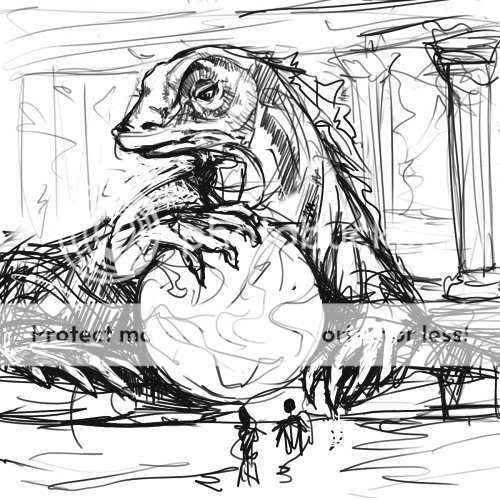
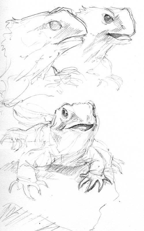
In one of the buildings at my university there's an enclosure with a number of tuatara; I go there and study them when I have some time to waste before a lecture or whatever biggrin . I thought I'd have a go at a dragon sort of influenced by them. This took about, I don't know, a quarter of an hour or so. I like the concept, it'd be nice to do something bigger with this or something like this I think.

User Image
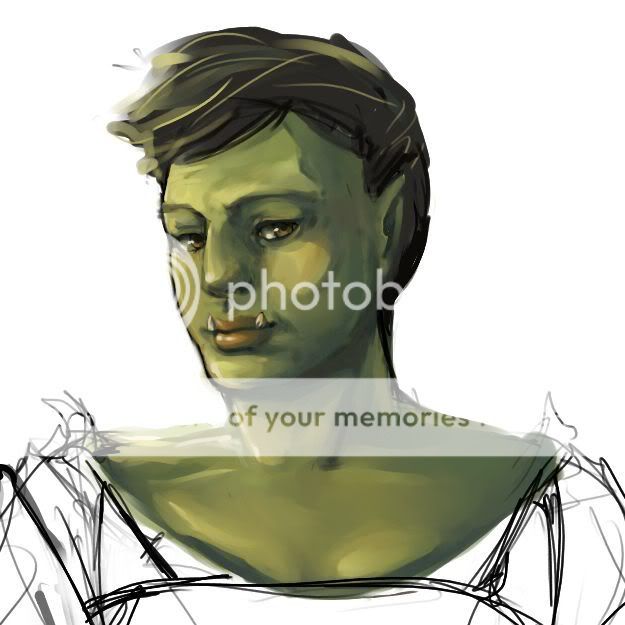
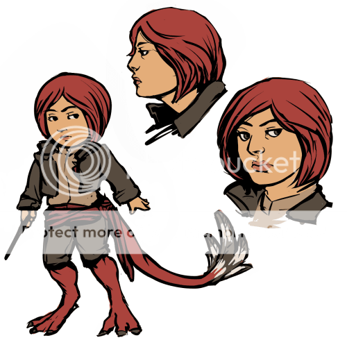
and another little thing, this was meant to be a sort of costume design sketch but I made the mistake of blocking in colours for her skin... after that I couldn't get myself to pay attention to anything else, I love painting green skin too much rofl . Never really intended to be much more than a sketch but I did something a little bit new with how I handled the brushes I used and with going from with lines to painting over the lines.

so yeah I dunno. I think I'm getting back a bit more spontaneity in sketching and painting stuff, I've been feeling quite stiff and awkward with it for a while. surprised  

basilisk


basilisk

PostPosted: Wed Apr 04, 2007 1:21 am
I have too much work to do to have time for anything big and finished. ._.;

User Image
OK, this is a little old but I just scanned it. wink

User Image
and this is a slightly more polished version of the stuff I've been doodling. I already know that the cartoonier full-body one is off-balance and stuff ._.  
PostPosted: Wed Apr 04, 2007 8:02 am
Hi basilisk, sorry I missed your last update.
I really like the orcish chick, though I'm not convinced by her teeth, they look painted on though. They don't seem to affect the way her lip moves and that makes them look like they don't go below the lip.
My only other crit is the second lass' tail seems to be positioned too high on her.
Your lizard/dragons are amazing!  

Wispered

Reply
Sketchbooks [Get crits here! Open to everyone]

 
Manage Your Items
Other Stuff
Get GCash
Offers
Get Items
More Items
Where Everyone Hangs Out
Other Community Areas
Virtual Spaces
Fun Stuff
Gaia's Games
Mini-Games
Play with GCash
Play with Platinum