|
|
|
|
|
|
|
|
|
 Posted: Tue Mar 06, 2007 4:01 pm Posted: Tue Mar 06, 2007 4:01 pm
|
|
|
|
|
|
|
|
|
|
|
Posted: Tue Mar 06, 2007 5:42 pm
|
|
|
|
|
|
|
|
|
|
|
|
|
Posted: Wed Mar 07, 2007 4:02 am
|
|
|
|
|
|
|
|
|
|
|
Posted: Wed Mar 07, 2007 7:58 pm
 |
|
|
|
Commenting on bee picture...
I love this concept! It's so cute!
I'll try to avoid stylistic issues...
Her right side (our left) of her neck should be more vertical...
Although I realize it's part of the style of this picture, as well as the character design of the bees, I would like the see some individual strands of the hair, like in your other pictures.
Also, their ankles should be thinner...the lower thigh should be thicker in the top half, and then taper down toward the feet.
I really like the cleanliness of this, as well as the gorgeous cross-hatching and the hands. *stares at the cross-hatching*
Other brief suggestions...
I love how you colored in Queen of Hearts. where it looks almost a painting. However, I think you should break up the rather unnatural vertical lines on her thighs...perhaps smudge it just a tad? Or layer on more colors to smooth it a little?
The third picture is so cute. ^w^ The only I can suggest is to make the bed...(ground?) less...scribbly. :3
The last thing I will suggest is to color the skin with more colors, such as more pink for the cheeks, as well as blues or greens for the shadows, depending on where the person is.
Great artwork!
|
 |
|
|
|
|
 |
|
|
|
|
|
|
|
|
|
|
|
|
|
|
|
|
Posted: Thu Mar 08, 2007 4:08 am
|
|
|
|
|
|
|
|
|
|
|
Posted: Fri Mar 09, 2007 7:18 pm
|
|
|
|
|
|
|
|
|
|
|
|
|
Posted: Sat Mar 10, 2007 11:13 am
|
|
|
|
|
|
|
|
|
|
|
Posted: Sat Mar 10, 2007 7:25 pm
|
|
|
|
|
|
|
|
|
|
|
|
|
Posted: Sat Mar 10, 2007 8:18 pm
|
|
|
 |
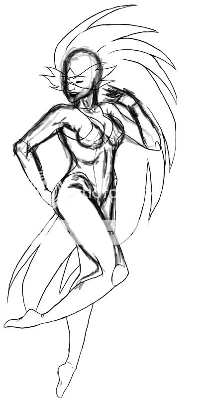
The torso is somewhat too short I think. I would suggest that when you draw a figure, measure the proportions for it. For example, usualy from the tip of the head and down to the where the belt would be it is about 3 heads, and then there are 4 more head in the rest of the body. Also, her neck was a little short. You could also measure the head and see how many times it fits in the shoulders, the average is 2, so it should be something like that.
It might have been an intentional stylistic approach, but if not I corrected some it [as far as I can tell]. I hope you find it useful. Pretty much the body was very bulky and squished.
Overall though, the anatomy was not too bad, the basic shapes and structures were all there, so it is good smile
i hope this helps
Edit: I also pulled the breasts a bit down....they were too high i think, the structure of the muscle and the breast tissue did not really fit in to the position where it was in your drawing. |
|
|
|
|
|
|
|
|
|
|
|
|
|
|
|
|
|
|
|
|
Posted: Sun Mar 11, 2007 12:11 am
|
|
|
|
|
|
|
|
|
|
|
|
|
Posted: Wed Mar 14, 2007 3:51 am
|
|
|
|
|
|
|
|
|
|
|
|
|