|
|
|
|
|
|
|
|
|
 Posted: Fri Mar 02, 2007 1:21 pm Posted: Fri Mar 02, 2007 1:21 pm
 |
|
|
 |
Hello everyone.
Not everyone needs to be a good artist to be a good critiquer. Honestly, I think I need a lot of help with colors. If you beg to differ, keep that to yourself. I'm here for critiques because I just can't seem to make myself color much (well time permitting is another factor as well).
Things I know I need work on:
panelling
dyamic figure drawing
hands and feet
animals
backgrounds
fingers and toes, hands and feet
facial expressions
inking
range of body types
colors, colors, colors
more to come, reallly.
Here are a few wip's that I've worked on and off, more off than on because I get tired of looking at them. Looking forward to feedback. It benefits us both since most times, I don't see what others are seeing. Also, I've been experimenting with different types of styles.
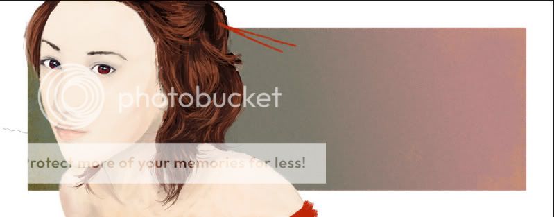
wip1: attempt at chinese novel type portrait
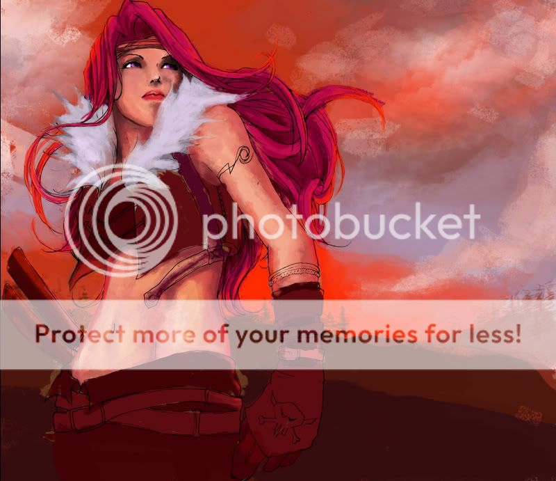
wip2: homan..i hate this more as i work on it.
|
|
|
|
|
|
 |
|
|
|
|
|
|
|
|
|
|
|
|
|
|
Posted: Fri Mar 02, 2007 2:59 pm
|
|
|
|
|
|
|
|
|
|
|
|
|
Posted: Fri Mar 02, 2007 4:34 pm
|
|
|
|
|
|
|
|
|
|
|
Posted: Fri Mar 02, 2007 6:11 pm
|
|
|
|
[*quote="j A d e d"]
Note from Iyou: Please do not quote long posts, especially if they're the first post in a thread. Thanks! :3
[*/quote]
Picture one:
It's not a great idea to cut the forehead like that, would be better to cut it either much closer to the eyes or show the entire hairline. Her east eye [i use east west north south...easier..they dun change..lol] should be a bit lower. The line of the edge of the face in the west is a bit off around the eye, i think the eyebrow bone should be a bit more visible and slightly lower. [the bone not the braw].
The chin[sp?] area is not right, it is too narrow, the cheek bone should be a bit higher [all on the west side]. The entire chin in general should be moved to the west a little, so it lines up with the middle of the face, and also get it a bit higher.
You did not finish the shading, right?
Picture two:
Again, chin. The foreshortening in here is uber tough, the chin should be much closer to the lips. compare the lenght of the nose, it is as big as from her lips to her chin. We should be able to see the buttom of her chin from this angle. The breasts are a bit too high also. I would generaly advice not to draw these kinds of angles without an exact refference. It is incredibly hard and MAYBE the most experienced [10+ years] atrictly female figure artists would be able to pull it off well.
hope it helps ^_^
|
 |
|
|
|
|
|
|
|
|
|
|
|
|
|
|
|
|
|
|
|
|
|
Posted: Fri Mar 02, 2007 10:36 pm
|
|
|
|
|
|
|
|
|
|
|
Posted: Mon Jun 18, 2007 9:27 am
|
|
|
|
omg jaded! I didn't know you were a member too! I really should have been posting on here more xD
This is probably a belated reply, I hope I can help in some way.
You know I think you have a natural knack for dramatic colouring. I love your second piece. So don't hate it! I'm especially in love with the brush you used, making the sky look so textured. Although I don't think that textured look worked so well with the skin. But then again that could have been the look you were after. Otherwise a smoother brush/blender would make the skin more natural and smooth. I'm really impressed with the silhuette landscape. It really compliments the the angle of the figure, and I think the simple forms work well to keep the emphasis on the fore. In terms of the hair, I think that it might work to employ the style you did with the chinese novel type portrait (which is lovely and really works), as in stroke by stroke. I get the feeling that the shading of the hair in is going outside the lines a bit too much, so the lines and shading are kind of contradicting eachother.
As for your chinese novel portrait, as I said, I love the hair. In terms of the face, I know that chinese novel type style lacks a lot of contrast and only really emphasize the major features like the nose and the lips, but this would be perfect if you just added a little more contrast in those key areas. As it is now, the face appears a little too flat. The colour you used for the skin could have a bit more yellow in it too.
Hope to see you around soon!
|
|
|
|
|
|
|
|
|
|
|
|
|
|
|
|
|
|
|
|
|
|
|
|