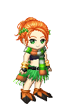
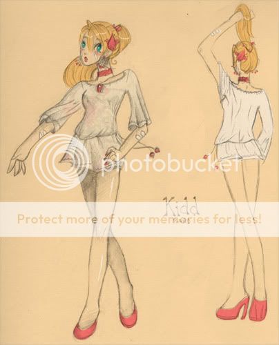
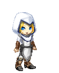
I'll add more detail-y stuff to this post in a bit, but for now, here's the most recent thing I was working on. It was done for a costume design community on LiveJournal. I'm not planning on editing it at this point, but general suggestions are very welcome on anatomy and such.
Posted: Wed Feb 28, 2007 10:47 pm
Very cute! ^w^ Most of the anatomical mistakes I see are probably due to your style, but I'll still mention some... Oh, I'm only going to critique the one on our left hand side, facing us.
The head is a little too far out for the neck. I wouldn't move the neck though, just the head. The neck is slanted enough. Erm..although I suppose you don't have to change it in this picture, as that might be rather hard. ^w^ Just keep that in mind next time. Also...I think that her shoulders are just a tad too wide...and the shoulder bone should be so visible... Her legs are too long for the rest of her body, but again I think that's just your style. Lastly, her wrists should be thinner with respect to her forearms.
However, the anatomy in the picture is pretty good, and the character and costume design is definitely very cute.
PinkGhost
Offline
Gackt-dono
Offline
Posted: Thu Mar 01, 2007 9:20 pm
Mm, I agree. ^_^ Very very cute! The shirt/dress is an adorable design and I envy your eye for style. You have a very unique and artsy style that I enjoy! 3nodding Now for the pointers ^_~ I notice on the one where she's facing the other way, that her butt seems to disappear as a part of her legs. I'm not sure if that's an effect to make her legs seem longer and leaner, but we'd probably be seein' just a tad flash of her tushy with a tunic so short 3nodding And remember, even the skinny girls have a tad bit of "roundness" and shape. I wasn't sure if that was your style, but I guess that I'm just more used to drawing girls with shape all over sweatdrop . I agree with the fact that your anatomy is very good. biggrin I did notice that her hands could use a bit more work. I'm not a hands guru, but I might try a draw over later on tomorrow when i get home from school to demonstrate. 3nodding But other than that, I didn't see much! It's lovely picture, very cute whee Keep up the great work 3nodding And I'm no mentor either sweatdrop lol!~* Hope it helps! wink
Posted: Fri Mar 02, 2007 12:50 pm
I love this place, you guys are so helpful. heart
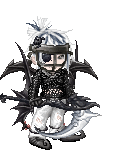
I'm going to see if I can get SOMETHING done tonight, seeing as it's Friday and all.
soupey
Offline
soupey
Offline
Posted: Sun Mar 04, 2007 5:28 pm
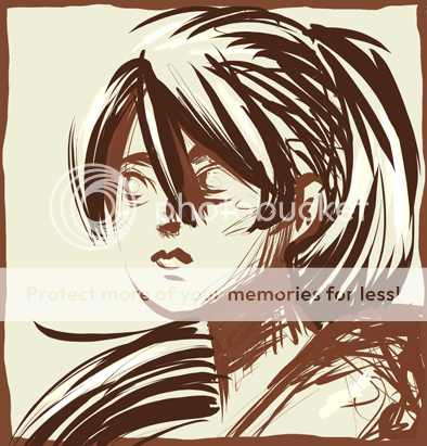
I'm easing my way into lineless art. I'm starting small with the bare essentials until I can start to get the hang of it. The only thing is that I'm not sure where to go from here. Advice?
Posted: Sun Mar 04, 2007 6:09 pm
I really like the posterized feel of this, its really neat. I think a lot of your deep shadows are pretty much taken care with. If you're going to continue, come in for some mid-point shadows. Places like the far cheek and under the nose. Get a lighter shade of the colours you used and keep building it up. I also think adding a hint of really dark, under the jaw. The back of the neck. Eyelids. It'll add some more definition, especially in the jawline.
Wispered
Offline
soupey
Offline
Posted: Mon Mar 05, 2007 12:50 pm
:3 Sounds good! I'll be sure to try that as soon as I get to finishing this.
Posted: Fri Mar 16, 2007 9:40 am
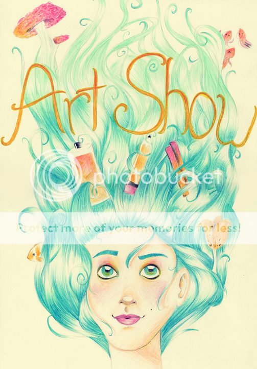
Newest thing. We had to design a poster for class advertising the school art show. I had soo much fun coloring, but any criteques, especially coloring related much appreciated. Also, very influenced by monaux's work.
soupey
Offline
Wispered
Offline
Posted: Sat Mar 17, 2007 9:48 am
Hey there ^_^
A very nice poster, I'm in no place to give colour crits, but I have a thing or two I noticed. Her neck isn't properly centered with her head, it's most noticeable since you have such a symmetrical composition. My other concern is that it is a symmetrical composition. It works, but I would suggest having the items in her hair more staggered, right now they all pretty much line up, making horizontal paths across the page. This sort of leads the eyes out.
It is cute though, and I love the things in her hair, its just the placement that concerns me.