|
|
|
|
|
|
|
|
|
|
|
|
|
|
|
|
|
|
 Posted: Wed Aug 17, 2011 1:55 pm Posted: Wed Aug 17, 2011 1:55 pm
|
|
|
|
|
|
|
|
|
|
|
|
|
Posted: Wed Aug 17, 2011 4:21 pm
|
|
|
|
|
|
|
|
|
|
|
Posted: Thu Aug 18, 2011 9:08 am
|

Errol McGillivray Captain
|
|
|
|
|
|
|
|
|
|
|
|
Posted: Thu Aug 18, 2011 3:21 pm
 |
|
|
 |
Errol McGillivray Please use this one thread for all your artwork. Thank you. And on to critique. What tools are you using? Lines: Colour: Digital (Scan cleanup/save): It does look like branches, but the dragon is ******** confusing. If you let me know what you're using, I may be able to give you tips to help make things more clear and easy to read.
I'm using inktense watersoliable pencils and the outline with prismacolor pen/marker. I'm not finished, I still have to do shading on the body and the wings. |
|
|
|
|
|
|
|
|
|
|
|
|
|
|
|
|
|
|
|
|
Posted: Sun Oct 09, 2011 12:15 pm
|
|
|
|
|
|
|
|
|
|
|
|
|
Posted: Sun Oct 09, 2011 4:11 pm
|
|
|
|
|
|
|
|
|
|
|
Posted: Sat Oct 15, 2011 3:03 am
|
|
|
|
|
|
|
|
|
|
|
Errol McGillivray Captain
|
Posted: Sun Nov 06, 2011 5:41 pm
|
|
|
|
Sorry for the long delay in reply.
Before you begin to put in your colour, make a photocopy or scan it and print out just the lineart. Make a value proof in greyscale.
This will help you create your focal point and also separate your levels before you spend time colouring.
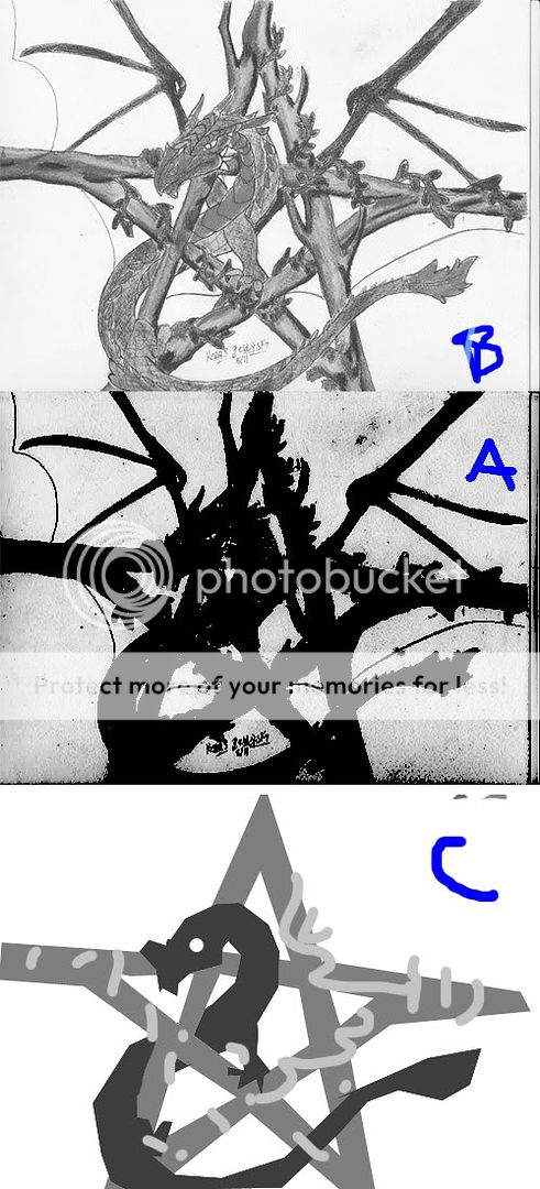
If you greyscale your image, you can see that it's all around the same grey. That's very confusing and makes it all very flat. When I black it all in, you can see what the silhouette looks like. You can't tell one thing from another. The silhouette is the REAL information people read, so keep them clear and separate them with different values. The more contrast between them, the more they pop.
Here, I gave the darkest value the the dragon and made the eye white, because that's the biggest contrast and it will draw attention to his face. (Which is good. You don't want a centered focal point.) Then I chose another, lighter value for the bark, so that there was less contrast with the eye, but still a lot of contrast with the dragon. He really stands out and you can see everything clearly. I used a lighter value, but not close to white for the leaves, so they stand out and are clear too. Still the only white in the image is the eye. If I wanted to add accents to the dragon, I would do so in a value close to that of his skin and the same goes for the branches. High contrasts will separate things.
|
|
|
|
|
|
|
|
|
|
|
|
|
|
|
|
|
|
|
|
|
Posted: Sat Mar 03, 2012 11:13 am
|
|
|
|
|
|
|
|
|
|
|
|
|
|