|
|
|
|
|
|
|
|
|
|
|
|
|
|
|
|
|
|
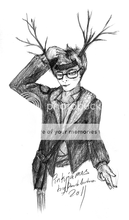
 Posted: Thu Feb 10, 2011 7:04 pm Posted: Thu Feb 10, 2011 7:04 pm
|
|
|
|
|
|
|
|
|
|
|
|
|
Posted: Tue Feb 15, 2011 8:17 pm
|
|
|
|
|
|
|
|
|
|
|
Posted: Mon May 16, 2011 9:24 pm
|
|
|
|
|
|
|
|
|
|
|
|
|
Posted: Sat May 21, 2011 7:17 pm
|
|
|
|
|
|
|
|
|
|
|
|
|
|
|
|
|
|
|
|
|
|
|
|
|
|
|
|
|
|
|
Posted: Mon Jul 18, 2011 6:03 pm
 |
|
|
|
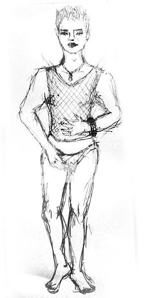
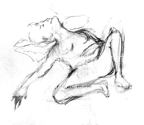
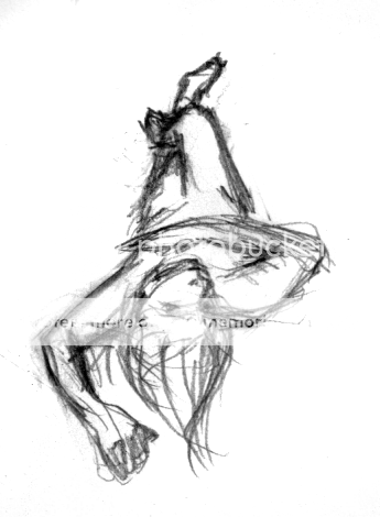
Hm, I think you should start by establishing your ground and placing the character on it for weight. In the spirit of being lazy, here's some crits I gave other people. The principles never change, so you can learn just as much from looking at crits of other work.
Ground your figures and show the space they take up.
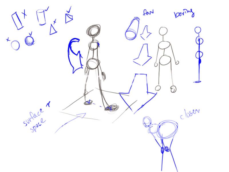
Draw solid, 3d shapes and connect them with soft bodies.
Linked for nudity
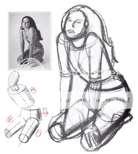
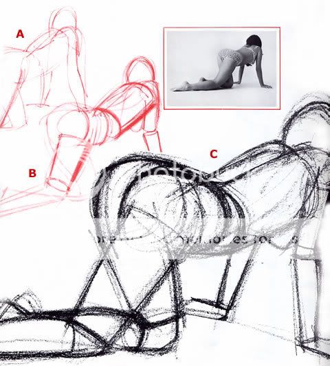
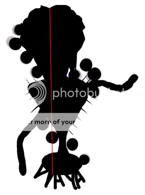
Actions should be clear in silhouette.
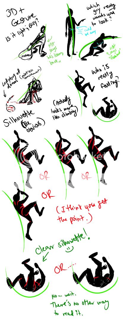
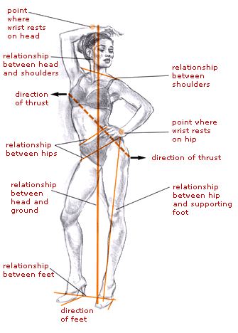
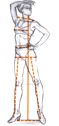
The body always balances itself. With even weight, the head is evenly over the feet. When the weight is offset, the head is over the weight bearing foot.

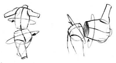
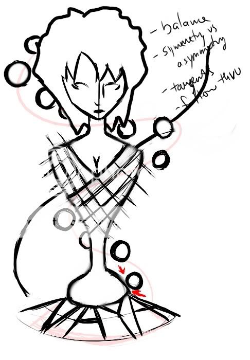
You're here:
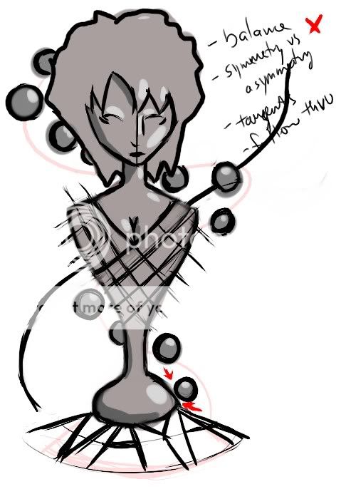
Put them together and work to be here:
Add some Light and Shadow Theory:
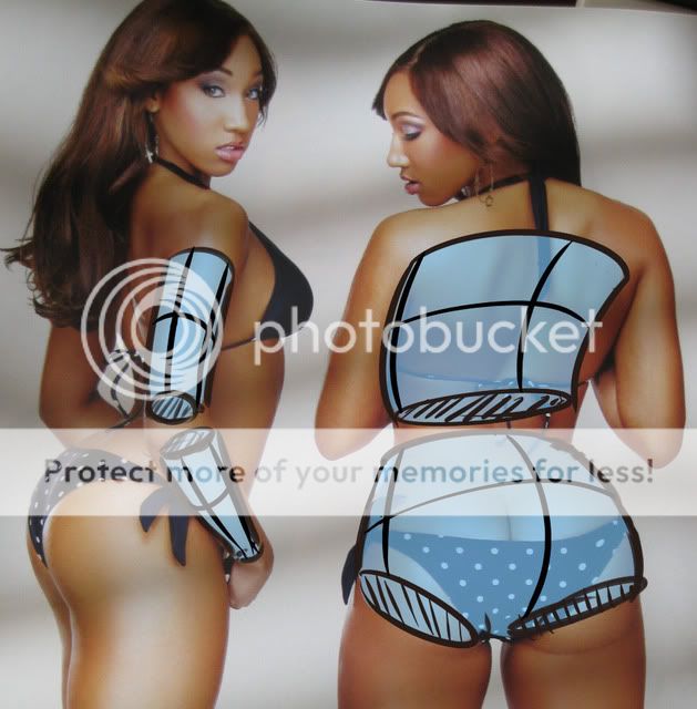
Quote: Without getting complex or technical (that can be left for color theory), light is pretty active. It doesn't stop when it hits something. It bounces off and back to our eyes. That's how we see. Empty space is pitch black because the light just keeps going and doesn't come back. Value means how light or dark something is. Low values are dark and high values are light. White is your highest value. Black is the lowest. When learning shading, I like to choose a number of steps and work from there to make sure I can see the difference.  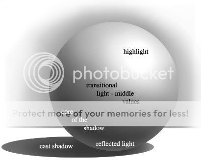 Parts of shadowHighlight Parts of shadowHighlight - This is your highest light on the object. How bright and the shape depends on the surface material and texture. You can see examples of that in this awesomely kickass art guide. Midtones - These are the transitional values between the light and the dark on the object. They will be darker than your light, but not as dark as the dark side. Core shadow - This is the darkest part of your shadow. It's where your dark side starts. The reflected light doesn't reach here. Also called your form shadow. The shape of your object is mostly defined by this shadow. The edges are softer. Reflected light - Light will bounce off the surface that your object is near back onto the object. The reflected side will always be darker than your light/mid side, but never as dark as the core shadow. Cast shadow - This shadow is your darkest shadow. It's made by something directly blocking the light. The edges are sharp.
And be here:
Only you know. Good. Haha. The light thing was new to me when I did that crit and I still have a lot to learn.
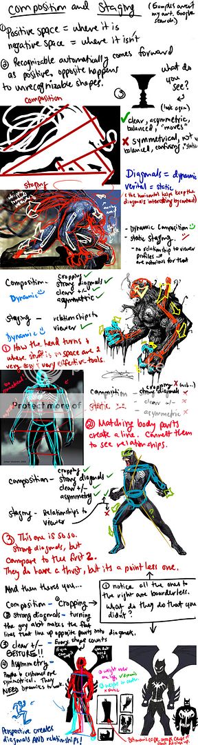
Composition and Staging
|
 |
|
|
|
|
 |
|
|
|
|
Errol McGillivray Captain
|
|
|
|
|
|
|
|
|
|
|
|
Posted: Sat Aug 27, 2011 9:11 pm
|
|
|
|
|
|
|
|
|
|
|
|
|
|
|
|
|
|
|
|
|
|
Posted: Fri Nov 18, 2011 4:53 am
|
|
|
|
|
|
|
|
|
|
|
Posted: Fri Nov 18, 2011 7:07 pm
|
|
|
|
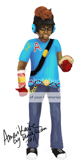
Yulo-chan Ohhh your colors really pop ! This is really good * u * Most people begin with really bland colors lol.... Try experimenting with darker, cooler shadows to really bring out the form. In order words, jump hues on the color wheel and move towards the black/desaturated part of the square hahah * u * Would like to see where your style takes off from here !
I know that people usually have bland-colour problems so maybe I overdid it somewhat. Indeed more experimentation would yield better results! Thanks. |
|
|
|
|
|
|
|
|
|
|
|
|
|
|
|
|
|
|
|
|
|
|
|
|
|
|
|
|
|
|
|
|
|