
This has been buggin' me for days man...
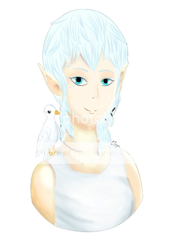
You see, I entered in this competition a few weeks ago called Bird's Nest. It's an OC contest based on the best interpretation of the OC "Sharahs".
Here's my entry. [X]
I worked all weekend on it, and this was the result. I feel happy about how hard I tried on it. Especially since this is my 2nd art contest ( The 1st one being here. 3nodding )
Now here's the problem: My picture ended up bright. A little too bright. And I've been fickle about changing the skin tone because I believe this one fits the best. However, it doesn't fit very well in a white background. I could've worked more on the shadow tones, but...
Is there anything that I could have done to improve my entry?
![]()
Cherub and Friends Art Guild
In this guild you may post your art for all to see, get tips on improving your work, and enter our monthly contests!
 |
|
|||||
|
||||||
|