Welcome to Gaia! ::

Cherub and Friends Art Guild

Back to Guilds

In this guild you may post your art for all to see, get tips on improving your work, and enter our monthly contests! 

Tags: anime, drawings, avatar, manga, shop 

Reply Tips, Tutorials, and General Questions
Critique me?

Quick Reply

Enter both words below, separated by a space:

Can't read the text? Click here

Submit

Quvi

PostPosted: Thu Oct 14, 2010 1:44 am
Hello! Anything I can improve on? I'm mainly trying to get better with coloring on Photoshop. Hopefully I'll get a working tablet soon.

Close up

User Image

Full

User Image

User Image  
PostPosted: Thu Oct 14, 2010 12:01 pm
Very skilled!

I think I'm going to enforce a membership fee on you and have you pay me in arts. LOL.

Just kidding, of course! <333  

Pandiecakes
Captain

Timid Healer

14,400 Points
  • Loiterer 100
  • Crack Shot 50
  • Millionaire 200

Quvi

PostPosted: Fri Oct 15, 2010 9:19 pm
Pandiecakes
Very skilled!

I think I'm going to enforce a membership fee on you and have you pay me in arts. LOL.

Just kidding, of course! <333
Or are you? I think I'll make a freebie thread when everything's out of the way. smile  
PostPosted: Fri Oct 15, 2010 9:42 pm
mmm the first one... its either the perspective of it thats throwing me off... or her head is just tiny compaired to the rest of her body... I think even with perspectiveness taken into consideration... her head might be a bit to small... sweatdrop not to entirely sure... but it just... looks off... sweatdrop

other then that... they are really good. .3  

roseankitty


Quvi

PostPosted: Sat Oct 16, 2010 1:15 am
roseankitty
mmm the first one... its either the perspective of it thats throwing me off... or her head is just tiny compaired to the rest of her body... I think even with perspectiveness taken into consideration... her head might be a bit to small... sweatdrop not to entirely sure... but it just... looks off... sweatdrop

other then that... they are really good. .3
hahaha EVERYONE is telling me the head is too small, and I agree. It's because of how the mouth/nose/eyes are placed on the face. I was just too lazy to fix it smile But thank you for pointing it out.  
PostPosted: Sat Oct 16, 2010 4:32 am
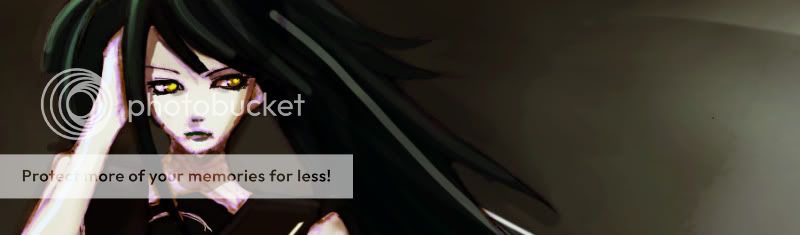
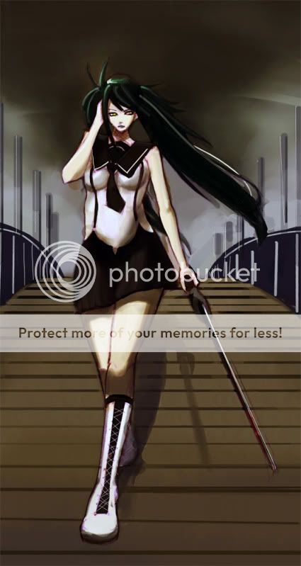
Quvi
roseankitty
mmm the first one... its either the perspective of it thats throwing me off... or her head is just tiny compaired to the rest of her body... I think even with perspectiveness taken into consideration... her head might be a bit to small... sweatdrop not to entirely sure... but it just... looks off... sweatdrop

other then that... they are really good. .3
hahaha EVERYONE is telling me the head is too small, and I agree. It's because of how the mouth/nose/eyes are placed on the face. I was just too lazy to fix it smile But thank you for pointing it out.


XD lol, alright... Any time. .3  

roseankitty


IndigoNight

PostPosted: Sat Oct 16, 2010 10:31 am
I really like the perspective of the bridge and the overall atmosphere of the piece--you did really good there--but there are quite a few anatomy/proportion issues and the shading on the knee doesn't make sense to me. Knees pop out further than shins do so it wouldn't be so dark. I've redlined the anatomy for you. =O Don't look at em if you don't want to because I'm also going to do my best to describe what I think needs fixin. [x] [x]

First of all, like people have mentioned the head looks too small. In my redlines I made it so that her head wasn't angled downward, but I did realize that the head was proportionate to the shoulders, however the hair is what makes it look so small. The hair is positioned on her head for someone who is looking right at you. Bring the bangs down a little and that should do it.

The arm reaching up to her head is too long. Remember foreshortening =] but also her shoulders are slightly angled at a slant so her breasts would be too. Her right side (our left) was too straight and needed to be curved in towards her suspenders (which by the way are pressed too close to her beneath her breasts. The shading doesn't look like her boobs are squished down by it so it wouldn't hug her figure quite so much.) I do see what you were going for (an arched spine) but it didn't seem to fit with her chest and shoulders.

The legs are the most disproportionate of the drawing, they're too long and too thick to fit the rest of her body. Like wise if you choose to shorten them, you'll have to shorten the arm holding the sword too.

I think that about covers it. I hope I wasn't too harsh, I didn't mean to be, and I hope I helped =]  
PostPosted: Sat Oct 16, 2010 12:38 pm
It is really good overall and the coloring is very nice. But I think you should clean it a bit. Also, the 2nd picture shows a unnatural line which would impact on the character's figure. I think you need to work more on the human anatomy as well as the point of view.  

Magezian

Tipsy Raider

8,000 Points
  • Pie Scarface 150
  • Pie Hoarder by Proxy 150
  • Pie Enabler 100
Reply
Tips, Tutorials, and General Questions

 
Manage Your Items
Other Stuff
Get GCash
Offers
Get Items
More Items
Where Everyone Hangs Out
Other Community Areas
Virtual Spaces
Fun Stuff
Gaia's Games
Mini-Games
Play with GCash
Play with Platinum