|
|
|
|
|
|
|
|
|
 Posted: Wed Sep 08, 2010 7:52 pm Posted: Wed Sep 08, 2010 7:52 pm
 |
|
|
 |
Hello Everyone my name is Mistalina. I'm just getting back into drawing after a long break from it. Lately I've been doing all digital graphics work and wanted to pick up drawing again for a change. My art education thus far is what art classes I've had in school as well as online tutorials.
Any comments, critique or redlines are most appreciated.
Working Towards
- Drawing male figures (and figures in general). I'm a bit more comfortable drawing females though.
- Put some life into my work, previously it has been quite stale.
- Stronger lighting and shadows. Definately need to get back to doing object studies and the like.
-- Dec 06/11: Working on a sketch for a painting, will share when its more finalized!
-- Update Mar 24/11: Added a page from my sketchbook.
-- Update Jan 22/11: Digital flower for color and lighting practice.
......
To start things off, a quick head sketch of a semi-developed character who has been running around in my brain for quite a while:
Clickie to save space.
He hasn't been nice enough to give me a name just yet but I do know that he's something of an aquatic creature, rather merman-esque. His kind like to live in the very deep parts of the oceans: they suffer from sort of deep sea gigantism causing him to be rather tall and large skeletoned over all. He has large grey eyes, blue skin (not sure on the exact shade yet) and light hair.
My Thoughts On This:
- I do like how the eyes turned out, quite eerie looking. They may end up a bit more prominent in a later version, though not overly so.
- I like the gill-ish nose, though maybe it would look less off if his nose was a bit more flat?
- The spikes on the ear fins could be a bit longer and taper to very thin tips.
- His hair needs more spikes or a different style all together.
- He might have more markings/tattoos later, just not sure if they would overwhelm the design too much.
- Little chin or lip tentacles might fit as a sort of mustache or beard.
- He does love jewelry, I just couldn't decide what to sort to give him.
|
|
|
|
|
|
 |
|
|
|
|
|
|
|
|
|
|
|
|
|
|
Posted: Thu Sep 09, 2010 2:21 pm
|
|
|
|
Gonna write up a post for you, but I gotta go to class first. Stay tuned :'D
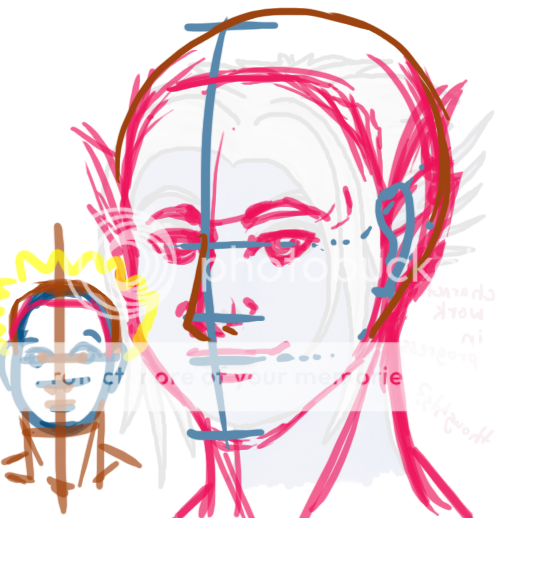
OK, here's what I came up with. I know it looks like a mess, but bear with me.
You need to work on proportions. More than giving you the "learn anatomy" spiel. What I mean by proportions is studying the relationships between certain features on the face and their relative sizes. It's something that I struggle with sometimes too, but it's really important. If you don't get it right, no amount of coloring/detail work is gonna fix it.
Usually what I've seen recommended is that you split the head into an oval, ranging from the top of the skull to the base of the chin. In this model, the eyes are pretty much dead center. You can then split the bottom half into two, the middle line showing where the nose goes. Then repeat once more to place the mouth. Ears are typically from the top of the eyebrows (slightly above the eyes) to the bottom of the nose or so. This gets the face about right. You'll want to add a little bulk to the sides to complete the skull. Play around with these proportions a bit to get the gist, then feel free to experiment!
A few extra things I thought I'd mention: when drawing men, you'll want to use more bold lines and strokes, compared with more subtle or understated strokes when it comes to women (this is generalized, of course). Some other differences include that men typically have a stronger jaw line, a thicker neck, a heavier brow ridge, a longer nose, and a thinner mouth. Men typically also have a lot more muscle definition, even if you're going for the shrimpy guy look. Also, if you wanna go for the anime cliche, you can also include smaller or narrower eyes.
But perhaps more importantly than even all of this is to start understanding the basic form of what you're drawing. You're trying to show a 3D shape in 2D. A few points that'll help you achieve this are learning about perspective and form. When you say you want to include more contrast in your work, then this is exactly what you'll want to pay attention to. Start off drawing things like spheres, pyramids, boxes, etc in perspective. Work your way up to more complicated shapes. Vary the lighting. Drawing from life will also help.
http://www.sheamusburns.com/?p=274
<< example of how to draw a box & light it
(There was another really good tutorial that I found awhile back, but I can't seem to locate right now. It had one part that showed you how to draw a ladder and include a light source, too. Very informative.)
http://www.anticz.com/heads.htm
http://www.anticz.com/drawing1.htm
<< Here's two tutorials I found that look promising.
And lastly, what I'd suggest is to sketch out the basic skull shape before going in to add all of the details. This can help you avoid issues where the head is cut off due to the hair (aka flat-head syndrome).
Ah, and on an unrelated note (last thing, I promise!), you'll want to look at some references when drawing anything. By reference, I don't mean copying exactly what you see necessarily. More, you'll want to get the "gist" or "concept" of something. If you were drawing a dragon, for example, you might look up lizards, bat wings, dinosaurs, birds, etc. Since you want a mer-man type of character, why not look up fish? Or other types of creatures? The zora from Zelda keep popping into my head.
Any questions, feel free to ask me. I'm a bit tired as I'm writing all this and I fear I might be rambling. xDD Anyhow, good luck.
|
 |
|
|
|
|
|
|
|
|
|
|
|
|
|
|
|
|
|
|
|
|
|
Posted: Thu Sep 09, 2010 9:07 pm
|
|
|
|
|
|
|
|
|
|
|
Posted: Fri Sep 10, 2010 6:25 am
|
|
|
|
mistalina13 Thanks lots Syrella. heart I'm about a year+ out of practice of drawing at all so I figured I would need to start over. I'll admit what I posted looked a lot better last night, but I was half asleep when I posted it. xP I'll look at those tutorials tomorrow night and probably just go back to doing studies on lighting and stuff before I do anything else. Can't decide if I should do stuff mostly in pencil or digitally; I haven't had my tablet that long so I'm not as comfortable with it as I'd like. My linework with it is a lot steadier than it was with a mouse so its definately an improvement.
Working digitally and working traditionally both use the same methods... neither is a walk in the park. I used to run into people who thought tablets were made of magic and that buying one suddenly made you an expert. :'D I think that myth is still around just a little.
Anyhow, for you... I'd actually suggest working more traditionally for now, since it's a bit more portable. You can go wherever you like and no need to stare for hours at the computer. Avoids eye strain, yay! Also, it helps prevent digital work from becoming a crutch. Ex) You can only erase so much on paper before you gotta start over, there's no undo button, etc. It teaches you that every little bit counts and also how to work around and deal with mistakes. It can also teach confidence too, which is important. smile A shaky line is an unsure one!
Be that as that may, why not do freebies for people to practice your tablet work? When I got mine in December, that's what I did. It helped a lot. ^^ |
|
|
|
|
|
|
|
|
|
|
|
|
|
|
|
|
|
|
|
|
|
|
Posted: Sun Sep 12, 2010 4:26 pm
|
|
|
|
|
|
|
|
|
|
|
|
|
|
|
|
|
|
|
|
|
|
|
|
|
|
|
|
|
|
|
Posted: Sat Apr 02, 2011 9:37 pm
|
|
|
|
XD The page is stretched, but that's okay.
Not much to comment on the lily - do color it up, and we'd see smile
I think I know how to fix the face - your guide line was in the wrong place.
(If you imagine reeeeeallyhard) The head is alittle like an inverted egg-shape, and the central guide line should follow the shape of the head, curving to pass the top center of the head, and ending at the centre tip of the chin. And yup, the nose and the lips are in the center following your 'guide line'.
The nose could be alittle lower, and subsequently the lips alittle lower, even given the semi-tilted position of the head. Since it's a 3/4 view, her right nostril should be smaller than the other. Rendering of lips...ehh. In the end, it's still a line, realism or not. Just with some subtle curves to it. Whether you shade the lips or not depends on how you're rendering the rest of your image.
Hope that helps.
|
|
|
|
|
|
|
|
|
|
|
|
|
|
|
|
|
|
|
|
|
|
|
Posted: Sun Apr 03, 2011 12:06 pm
|
|
|
|
|
|
|
|
|
|
|
|
|