|
|
|
|
|
|
|
|
|
 Posted: Sat Jul 31, 2010 9:05 pm Posted: Sat Jul 31, 2010 9:05 pm
 |
|
|
 |
This thread's for me, Sat-Am_Reject to post stuff in the attempt to get critique from users here~
Skill Set: Not sure what it is, really. Anime and Realism, I guess. Inking's a stronger point of mine, I feel, as well as using Prismacolor Markers. I can use Photoshop and SAI rather well.
Education: Student of the arts, have taken several of the basic courses, still have about three years before getting my bachelor's in art.
Experience: Have been drawing for about ten years, working digitally for about 4.
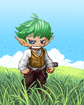
I'd like to start this thread off asking for critique on a piece I just finished a little bit ago, DATTEBAYO!, which is a Naruto fan piece, if that would be alright :3
|
|
|
|
|
|
 |
|
|
|
|
|
|
|
|
|
|
|
|
|
|
Posted: Sun Aug 01, 2010 3:00 am
|
|
|
|
|
|
|
|
|
|
|
|
|
Posted: Sun Aug 01, 2010 6:38 pm
|
|
|
|
|
|
|
|
|
|
|
|
|
|
|
|
|
|
|
|
|
|
Posted: Mon Aug 02, 2010 6:10 am
|
|
|
|
I gotta second that the face is the part of the image that really stands out as being a bit out of place.
I think, yes, it's a little too tiny, and the headband doesn't really support the perspective, making it look flat. The expression is more what bothers me, though, specifically the eyebrows. If you're going for a serious look, the eyebrows shouldn't be raised like that, particularly if his brow is furrowed and the angle that he's at. Try making that expression in the mirror. If you find it's possible and doesn't look or feel awkward, then by all means, keep it in there... it just looks off to me is all.
Also, it feels like you've drawn his supporting hand like a foot. I know it's partially obscured by the grass, but it could use some work.
Last notes... I like the way you did the composition in general, but I feel like it lacks impact. If you wanted to push it to the next level, I'd suggest studying how to exaggerate more and also reading up again on composition and perspective.
|
|
|
|
|
|
|
|
|
|
|
|
|
|
|
|
|
|
|
|
|
Posted: Mon Aug 02, 2010 10:27 am
|
|
|
|
syrella I gotta second that the face is the part of the image that really stands out as being a bit out of place. I think, yes, it's a little too tiny, and the headband doesn't really support the perspective, making it look flat. The expression is more what bothers me, though, specifically the eyebrows. If you're going for a serious look, the eyebrows shouldn't be raised like that, particularly if his brow is furrowed and the angle that he's at. Try making that expression in the mirror. If you find it's possible and doesn't look or feel awkward, then by all means, keep it in there... it just looks off to me is all. Also, it feels like you've drawn his supporting hand like a foot. I know it's partially obscured by the grass, but it could use some work. Last notes... I like the way you did the composition in general, but I feel like it lacks impact. If you wanted to push it to the next level, I'd suggest studying how to exaggerate more and also reading up again on composition and perspective.
By the end of it, I'd debated cropping out the top half of the image and decided not to, for some reason.
And the hand looked a lot better when you could see the fingernails D:
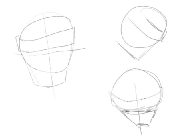
Folken_Schezar well if the forest was humid thing then it should be consistently humid. when you try to take these kinda short cuts it makes the picture look weird. [picgoeshere] here is what i mean about the headband, the one on the left is the head looking forward. and the ones on the left are of the head looking down. its not a great render but if the head is looking down we see more of the top of the head. the same should be true of the head band and or anything else that would be on the head hahah as for the hand there shouldn't be much of any perspective. the easiest way to remember or think about is is remember perspective is something that happens over distance. and in this case his hands are not that far apart from the viewers aspect. but yea i hope that helps you with when to use perspective i hope that clears things up a bit for you. but it is a solid pic ^__^
Well, I understood the headband, but not about the chin thing. Also, when I had originally started, the pose was a bit different and his hand was one of the few things that didn't change, and I think that I'd left it exaggerated on accident XD; |
 |
|
|
|
|
|
|
|
|
|
|
|
|
|
|
|
|
|
|
|
|
|
|