|
|
|
|
|
|
|
|
|
|
|
|
|
|
|
|
|
|
 Posted: Mon May 24, 2010 3:00 pm Posted: Mon May 24, 2010 3:00 pm
|
|
|
|
|
|
|
|
|
|
|
|
|
Posted: Mon May 24, 2010 3:08 pm
|
|
|
|
|
|
|
|
|
|
|
Posted: Tue May 25, 2010 2:08 pm
|
|
|
|
|
|
|
|
|
|
|

Errol McGillivray Captain
|
Posted: Thu May 27, 2010 9:45 am
 |
|
|
 |
Your drawing lacks volume. I like to lightly draw a box in for the pelvis and chest, so I make sure there is room between her legs for her hips. As you have it, one leg looks like it's straight back, directly behind the bent one, rather than to the left of it. Unfortunately, I can't supply any visual examples, but if you look at pretty much everything, you should see it.
Have someone stand still with their feet about shoulder width apart. Walk around them and look at their feet, knees, and hips, noting that you can see the width space between them.
|
|
|
|
|
|
|
|
|
|
|
|
|
|
|
|
|
|
|
|
|
Posted: Sat May 29, 2010 1:35 am
|
|
|
|
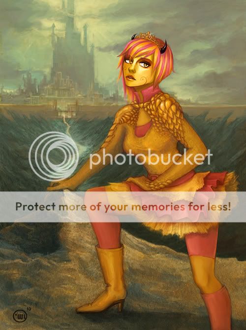
You have an amazing skill for drawing backgrounds. However there are several points which seem "off" to me or can be improved upon.
-Composition
-Lighting
-Balance (anatomy)
-Telling a story (an optional critique really)
I grayscaled your art to point out the composition and lighting issues. The center image is your art grayscaled, without all the redlines. Here's a tip, it makes it easier to point out any problems with compositions to take away the color.
Essentially, the composition does not flow smoothly towards the castle and the high contrast of the face further disrupts the flow of the composition. Composition is based on the direction of lines and contrast of values. Your objective is to provide a continuous flow of contrast with the direction of lines (from the body in this case) towards the beautifully rendered castle.
Unfortunately the highest amount of contrast in the face smacks my eye's attention to the face. I think there can be some shading to the whites of the eyes too because if you look at your own eyes, it's not pure white. Also, it's easier to add highlights from the leg up to the face to ease the eye up to the castle. Plus, it addresses the lighting issues. Objects in front have the highest contrast so we can perceive the object is in the front. You did a great job with the background though with the atmospheric perspective and all.
The anatomy lacks balance and the pose doesn't really make sense to me. See if you can do that pose with ease first by doing the same pose you have drawn. If you fall over or feel very uncomfortable...errr...you get the point. I'm not sure why her left hand is towards the other side of her torso, but it doesn't seem like it contributes to helping with balance. (Especially with those high heels.) I redlined a pose which seems more balanced as an example, but you can ignore it if you wish.
And yeah, it helps to give your character a sense of purpose to their pose to make your art come to life. I wanna know why she's on that ledge. But I can't tell what the character's purpose for being on that rocky edge. |
 |
|
|
|
|
|
|
|
|
|
|
|
|
|
|
|
|
|
|
|
|
|
|