|
|
|
|
|
|
|
|
|
|
|
|
|
|
|
|
|
|
 Posted: Mon Dec 28, 2009 3:39 pm Posted: Mon Dec 28, 2009 3:39 pm
 |
|
|
|
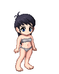
1st one: her left eye is looking straight forward, whereas the right one is looking up and forward. Hair is like a block, it looks nothing like hair. Nose slants upwards, eyes are straight, and lips slant down. Weird curve above boob.
2: Eyes slightly off, again. Gun and bullet need more detail. Hair is once again just a shape, not actual hair. Boobs join off-center on body; shift them both a little left. Shading on leggings is too random: attracts all attention, and becomes focal point.
3: I actually don't have much specific complaint on, other than "what the hell is coming out of her hands?" Also, head and neck are off-center.
Batman, I'm presuming is a joke, so I won't critique properly.
Overall/stylistic: Shading is a bit rough, especially on hair. The shading lines don't follow the lines of the shaded shapes, and they're just erratic and scribbly. Shading on skin is pretty good, though. Also: the fact that you don't shade fabric much bugs me to no end. Oh, and the boobs on all of them tend to join too high.
Also: Copy paper doesn't necessarily go smudgy if you add detail; I have no issues with it. You just need to be careful not to put your hands on it too much, and to clean the drawing up with an eraser once you're done.
|
 |
|
|
|
|
 |
|
|
|
|
|
|
|
|
|
|
|
|
|
|
|
|
Posted: Tue Dec 29, 2009 7:34 pm
|
|
|
 |
Hello and welcome :>
I'm not really good with harsh critiques but I'll give it my best.
You do tend to make your legs too small. The heads also seem bigger, but that could be stylistic, I'm not sure what you're going for.
The third picture is a good start, I'm not sure however you're using perspective or if the legs are accidentally to small. If you were using perspective, the gap between her thighs wouldn't be necessary. If you weren't using perspective, then her legs are a bit short. Superhero's legs are generally 2/3 of their body. Also her crotch is a bit to far to the left.
In general, as with any pencil drawing, try to make your pencil marks to add form. That is, when you're shading, don't just randomly sketch everywhere, make the lines follow the 'grain' of the form. I find it very hard to explain this so I'll just show you :>
This image is just one example of what I mean, but you can google up hundreds. Notice how the pencil strokes are not at all random, they are placed in a way that is logical and follows the form of the skin. I'm not sure if that was coherent enough, but if you have any questions ask.
Apart from that I think you're on your way. Keep practicing and get out an anatomy book every once in a while to brush up.
Good luck!
|
|
|
|
|
|
|
|
|
|
|
|
|
|
|
|
|
|
|
|
|
Posted: Wed Dec 30, 2009 9:51 am
|
Errol McGillivray Captain
|
|
|
|
|
|
|
|
|
|
|
|
|