|
|
|
|
|
|
|
|
|
 Posted: Tue Jun 09, 2009 9:06 pm Posted: Tue Jun 09, 2009 9:06 pm
Hey everyone. (:
I go by Wing on the forums, and I'm going to be a senior in high school next year. Currently, I am seventeen and am into drawing anime as well as realism and still life. Because I will be entering into AP Studio Art in the fall, I have a lot of improvement to make in the summer... and I hope that you will help by giving me critiques and constructive criticisms. In return, I will also give critiques to your works if you would provide a link. (:
Well, without further ado...
|
 |
|
|
|
|
|
|
|
|
|
|
|
|
|
Posted: Tue Jun 09, 2009 9:10 pm
Thank you guys so much for helping on the first image! It is complete, and you can view it here. I will be doing a few more touch ups later.
Currently, I am working on two pictures. The first:
If you see anything off, please tell me about it. One thing, the legs and feet look extremely awkward, but I'm not sure how to fix it. Any tips?
The second:
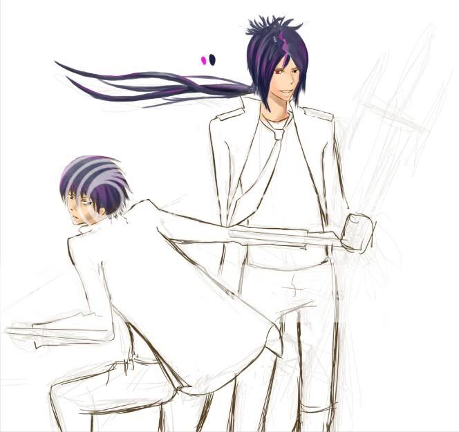
There is something extremely awkward about Hibari's pose (the one on the left), and I think it has to do with his hip/leg positions. Suggestions and redlines would be especially helpful.
|
|
|
|
|
|
|
|
|
|
|
|
|
|
|
|
|
|
Posted: Tue Jun 09, 2009 10:48 pm
to be perfectly honest i am really confused by this pic.
the shadows seems to be all over the place. is the light source coming from his hand or is it behind him? and in either case his hand should be shaded
proportion and anatomy wise you did good. 2 main things is the wrist looks off. it should make such a bump like that. i'd scale it back a tiny bit. and secondly it looks like he has no jaw. i mean the flat part that goes from the chin to the neck
i think you're very close on the skin. i think what you're missing is giving the skin highlights. unless the light source is far away skin usually will have very bright highlights
i think you did a great job with the colors. mixing opposing colors always produces a very vivid and powerful look
let me know if you have any questions
|
|
|
|
|
|
|
|
|
|
|
|
|
|
|
Posted: Wed Jun 10, 2009 8:20 am
Thanks for the advice! ^^
The light is supposed to be coming from a butterfly (not drawn in) that he's holding in his hand. So accordingly, I guess I should change the color on his tux and... maybe add a few trees directly behind the light source.
Also, do the lips seem too light?
|
|
|
|
|
|
|
|
|
|
|
|
|
|
|
|
Errol McGillivray Captain
|
Posted: Wed Jun 10, 2009 9:59 am
The only purpose for the subforums in the guild are critique. There isn't much point in asking for them in the thread title. (This isn't PP afterall.)
Anyway, it doesn't look 3d at all. Overlapping things isn't going to make it look 3d either. I think part of the problem is that you give no frame of reference for depth.
I'll have to come back and say more. My lunch break is over. If you have long distance, call my office phone and I can explain, or this will have to wait a few hours til I'm home.
|
|
|
|
|
|
|
|
|
|
|
|
|
|
|
Posted: Wed Jun 10, 2009 2:28 pm
I guess my title is a bit redundant. ^^ /fixes.
I don't really understand what you mean by frame of reference...?
|
|
|
|
|
|
|
|
|
|
|
|
|
|
|
|
|
|
Posted: Tue Jun 16, 2009 10:44 pm
I added more detail to the picture, and hopefully the skin color is now somewhat right... comments, please.
|
|
|
|
|
|
|
|
|
|
|
|
|
|
|
Posted: Wed Jun 17, 2009 12:14 am
the skin is definately looking better
but i still think you got your shadows mixed up. there should be much less on the face especially around the eyes. shoes typically only appear there when the light source is above to behind the face. and since the light is basically being held by the hand there should be shadows on the outside of the hand
and with all the nice shadows around the face you should make the ear look better it looks out of place or that he has someone's ear.
hoped that was helpful if you have questions aobut what i said or anything in general let me know ^_^
|
|
|
|
|
|
|
|
|
|
|
|
|
|
|
|
|
|
Posted: Sun Jun 21, 2009 12:19 pm
I got a little tired of working on the first pic, so I fixed it up a bit and put it up on my dA.
I updated with two more pictures I've been working on. Any comments?
|
|
|
|
|
|
|
|
|
|
|
|
|
|
|
Posted: Sun Jun 21, 2009 1:50 pm
okay as for the 1st pic
the legs look weird cause you over lapped the calf into the thigh to much. also the back don't really have the arch for that pose and even when the back is straight it should have a curve to it.
the reason the back isn't arching is cause your arms are too long. her elbow ends are about where the pelvis begins. eblos should end about where the ribcage ends
as for the second pic
haha this one is really simple. its really awkward in the arms. the left arm its too straight its a because of the shape of our ribcage and sometimes the size of the lats the arm doesn't come down straight like that. and the forearm should point slight toward the background
|
|
|
|
|
|
|
|
|
|
|
|
|
|
|
|
|
|
|