
So i'll post some examples of my work and try to keep coming back here with things I need help on.
Strengths:
Defining shapes in perspective (... sort of, it's a work in progress xD)
Male and female anatomy
Canines and birds
Hair/fur/feathers
Weaknesses:
Realistic anatomy D:
inorganic creatures
high detail
symmetry
composition
RECENT
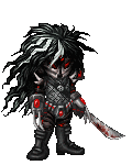
Drawing of avatar:
Drawing of OC with digital color:
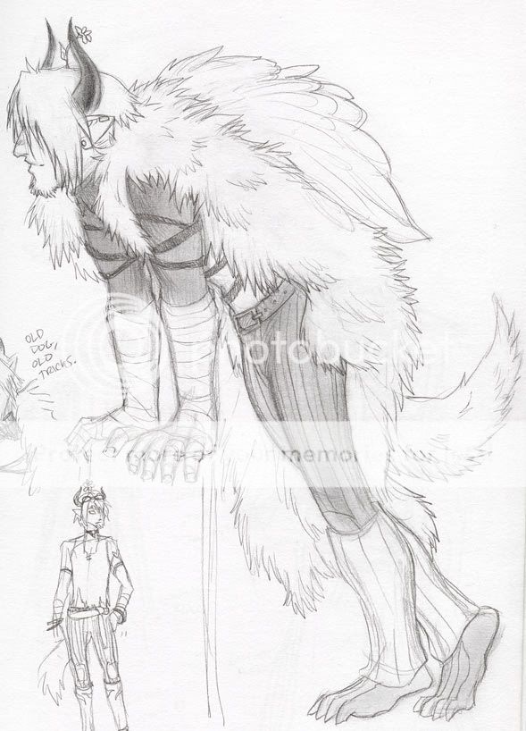
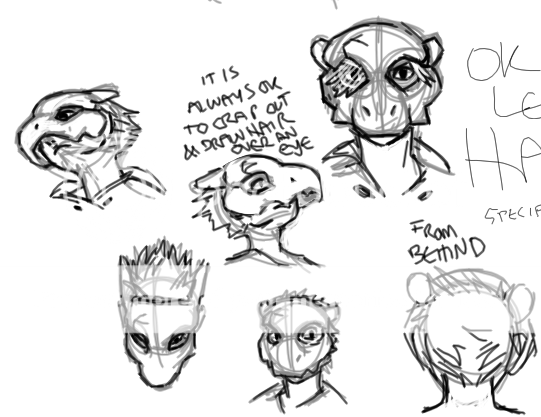
Tegaki roleplaying character- head at different angles:
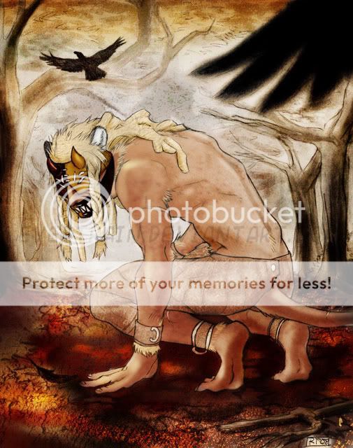
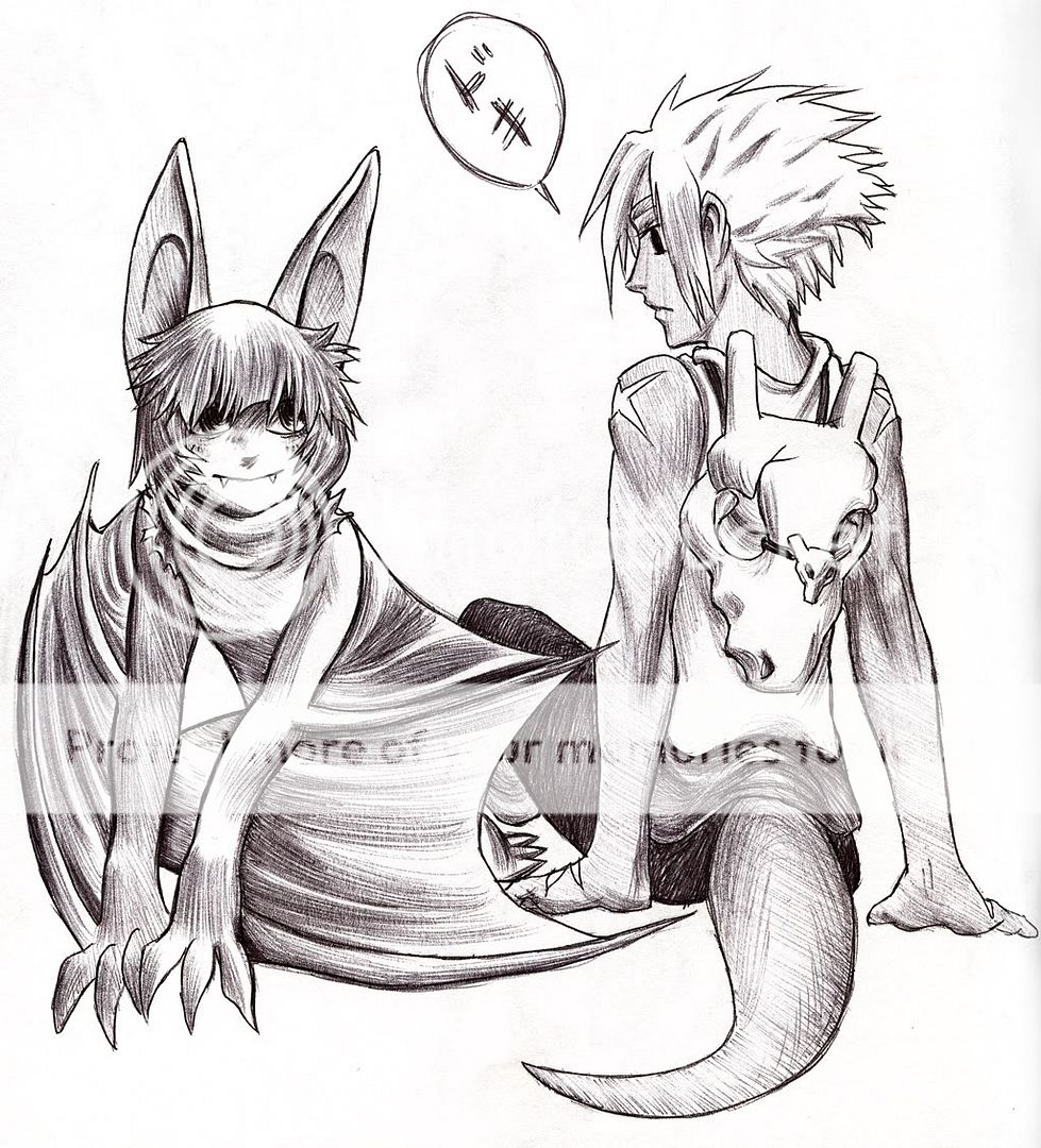
Same character, but in serious drawing:
Please critique anything you can. I will organize things more/turn these into links instead of page stretching when I have new stuff to post. Please let me know if I can help you help me in any way xd
Thanks in advance!