|
|
|
|
|
|
|
|
|
|
|
|
|
|
|
|
|
|
 Posted: Sat Jun 21, 2008 11:10 am Posted: Sat Jun 21, 2008 11:10 am
 |
|
|
|
Hi there!
Okay.
First off, I really like the examples you posted. 3nodding They show a variety, which is lovely to see.
Your first drawing:
I think, of all that you posted, your first image is the most eye catching. It has loads of movement to it and the character's facial expression is fabulous. heart Did you use a picture reference or draw from life? One thing that could be done to make that first drawing even better would be to shade more. You've started crosshatching, which is great, and there is even some directionality and the feeling of a light source! Nifty! But, you could go further, especially regrading his face. 3nodding It is my favorite, though.
The second:
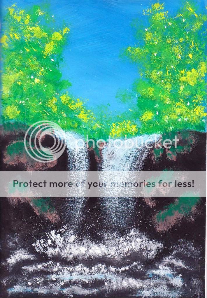
Yay for paint! heart I love paint. A waterfall off a wooded cliff, right? 3nodding Something that would be super helpful would be to google different images of forests, skies, water, and waterfalls to get an idea of how things really look. There is nothing, nothing wrong with using references. It's a terribly bad thing that artists get in their heads, "if I draw this without references, that makes it ten times better". Wrong. xd References are your friend. 3nodding
The Third:
What a cute idea! I love his wings and his hair - it looks so fluffy! 4laugh
Just as with the waterfall picture, almost all the problems with this image can be fixed with a little look at a photograph. What does a hand holding a bow look like? Google it. What about his shoulder that's drawing the string? Google it. Google is an amazing resource - seriously! heart
Watch out for proportions and angles and don't be afraid of using foreshortening.
The Forth:
Yay for light sources! heart
This is the sort of picture that could greatly benefit from a background. A sand dune or two, a mountain... anything. Your character seems to be in a harsh environment... but we don't know what it is! xd
If you're feeling brave, go ahead and make your shadows more extreme. 3nodding You've got an extreme light source, so there's no reason not to go crazy with it! heart
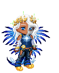
The Fifth:
She's very pretty! There are a lot of things about this that I absolutely love. Her lips, her nose, her hands (I can really tell you put a lot of time into them!)
There are some things that you need to watch out for, though. A big one is her ears. In the drawing you have them starting at the level of her eyes and going up from there. If you look in the mirror, though, or at a picture reference, you'll notice that the ears actually start at the level of the nose and then extend to the level of the eyes. The ears themselves look great though!
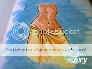
Also beware of breasts. It's easy to want to make them look voluptuous and forget about gravity. 3nodding One thing about breasts is that they actually stem from the area around the armpits (weird!). So, there's a little area of skin before the breasts meet the arms, as you can see here:
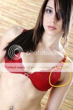
(Hope you don't mind the image post)
You're doing a great job with your drawings. heart Keep drawing at every chance you've got and have fun with it. blaugh
(And don't forget to post when you scan something in - we'd love to see it!)
heart
|
 |
|
|
|
|
 |
|
|
|
|
|
|
|
|
|
|
|
|
|
|
|
|
Posted: Sat Jun 21, 2008 11:15 am
|
|
|
|
|
|
|
|
|
|
|
Posted: Fri Jul 04, 2008 6:30 am
|
Errol McGillivray Captain
|
|
|
|
|
|
|
|
|
|
|
|
Posted: Sun Jul 13, 2008 3:53 pm
|
|
|
 |
All the images are very well done in general ^_^ Nice shading and a good variety to your drawings.
The first pic of the karate guy is excellent biggrin very bold pose and nice cross hatching (I think that's what it's called heh). Only thing I can suggest is the jawline on the ear (that's showing) doesn't quite look right. This will be tough to explain (and I am not 100% sure of this, just my opinion as an artist still learning). The jaw looks to much on the front of his face, not enough on the side. Try defining the seperation between the chin and the jaw line better and move the jaw line more towards the side. Again not 100% sure and not able to explain well, sorry ^_^"" But I love the pic, the feet and hands are awesome (a tough thing for most people to draw, including myself).
The main thing I notice with the Cupid is the way the forehead/nose go overtop of the other eye, I think you need to make the eye/cheek not visible at all, or the forehead/nose less defined. Also the shading on the body seems a bit too dark, but it's well placed and the wings and hair look amazing! The clothing folds too.
The last picture of the girl is very pretty, and you did the hairline very well. The main things I notice is one eye seems raised (the eyes are not inline horizontally) and the ears are way too high. The top of the ear should align with the top of the eye. This will change depending on if she is looking up or down (but I don't think this is the case in this picture). Also the end of the nose seems crooked because it does not line up with the bridge of the nose (which you did an awesome job shading btw 4laugh ). The hair and lips are very well drawn and I love the hands ^_^ (I can't draw hands xD)
The other two pics look great biggrin keep up the nice work ^_^ ur already an awesome artist and by getting help here, ur on ur way to becoming even better than you already are! heart
|
|
|
|
|
|
|
|
|
|
|
|
|
|
|
|
|
|
|
|
|
Posted: Sat Nov 08, 2008 10:57 am
|
|
|
|
|
|
|
|
|
|
|
|
|
Posted: Sun Nov 16, 2008 5:11 pm
|
|
|
|
|
|
|
|
|
|
|
Posted: Sun Nov 16, 2008 8:40 pm
|
|
|
|
|
|
|
|
|
|
|
|
|
|