|
|
|
|
|
|
|
|
|
|
|
|
|
|
|
|
|
|
 Posted: Sun Feb 24, 2008 11:13 pm Posted: Sun Feb 24, 2008 11:13 pm
 |
|
|
|
First off I would just like to say: Wow! I absolutely love you style, it is amazing!
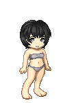
Anyways, before I get suck on that, on to the crit. Truthfully, I really don't see that much wrong with her. One thing that does really stick out though is the left arm. Compared to the right arm, the left arm is extremely short and very straight. I would suggest maybe reposition her arm/hand and adding more definition. Also, though it might just be a style thing, I think her head and neck are just a tad to large for her body, it almost makes her look top heavy, than again, I can't really say anything about that, I draw my heads large as well. Another thing that cough my attention as being a bit off where her feet, they seam way to small for her body or at least the left one does. Now I know I said I didn’t see much, and what I'm pointing out probably seams like allot, but I'm only trying to help. I really do love your style, the sketch is so clean and pretty! -Swoons- I wish I could do that. Oh! Another thing. lol, you probably want to shoot me right about now. The left hip, for some reason it seams like you struggled with the left side of this picture, seams strange. I'm not really sure how to explain it... But it looks like maybe the join of the hip is located to far up, maybe? I'm not really sure, all I know is something is wrong there. I would suggest asking someone with better a better anatomical eye, you might get a better answer. Anyway, I can't wait to see more from you and welcome to the guild!
PS: The hips could do with being a bit larger, but I say that to everyone, lol
|
 |
|
|
|
|
 |
|
|
|
|
|
|
|
|
|
|
|
|
|
|
|
|
Posted: Mon Feb 25, 2008 7:18 am
|
|
|
|
|
|
|
|
|
|
|
|
|
|
|
|
|
|
|
|
|
|
Posted: Thu Feb 28, 2008 7:48 am
|
|
|
|
|
|
|
|
|
|
|
Posted: Thu Feb 28, 2008 10:57 pm
|
|
|
|
|
|
|
|
|
|
|
|
|
|
|
|
|
|
|
|
|
|
Posted: Thu Mar 06, 2008 5:34 am
|
|
|
|
I think your line weights could be a bit more varied in a way that suggests shape and distance rather than just thick outline, thin inside lines.
Yes, outlines are thicker, but I would also make sure that overlapping forms are included in the outline for things that are in the front, but the outlines are thinner on things that are further back. For example, the standing leg and the skirt. The outline is the same for the foot that's well in front of the cloth that's dragging behind. This really flattens everything and takes away from the image. Use two levels of outline (thick) line weight. Thinner outline for things in the back. Do the same with the thinner inside lines. Thicker in front, thinner in the back.
The lines in the cane are pretty consistent and it looks clunky. Also, it's a geometric object, but the shapes are soft and that makes things look sloppy. Make a stencil to get a confident and proper line for the globes and use a straightedge for the lines. Then detail accordingly to keep it solid. Little things like this will give your images substance.
I think you did a great job spreading out details so it's not cluttered, but not empty and boring. The only things I would have to say you need to work on improving besides your line quality is the lack of mass in the body and the lack of expression on her face.
Work in 3d as much as possible. (Your guide shapes are boxes and not rectangles, cylinders and not bars, spheres and not circles. Feel me?
Looks good.
|
|
|
|
|
|
|
|
|
|
|
Errol McGillivray Captain
|
|
|
|
|
|
|
|
|
|
|
|
Posted: Mon Mar 24, 2008 9:56 am
|
|
|
|
|
|
|
|
|
|
|
|
|