|
|
|
|
|
|
|
|
|
 Posted: Fri Aug 31, 2007 10:39 pm Posted: Fri Aug 31, 2007 10:39 pm
 |
|
|
 |
||-{The waitress is practicing politics, while the businessmen slowly get stoned...}-||
I'm not sure if I have to follow the same procedures as with the finished-piece posting bit, but...I'll do some talking about them, any way.
The concept doodles, as promised:
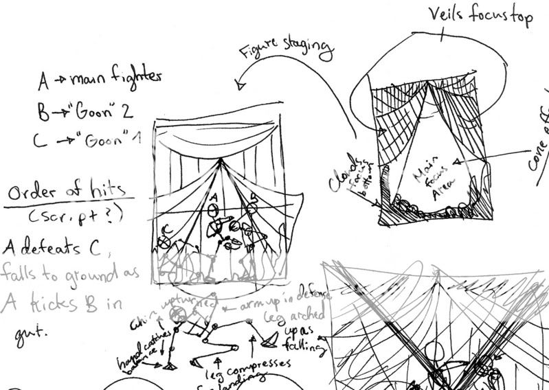
Okay, this one.
What I want to do to improve focus on the two main figures is to create a cone of...I don't know, less dense, lighter, more noticeable space where they are standing, with them in the center.
I hope to do so using the veils and smoke/flames as demonstrated.
The thumbnail on the left is more for posing/character positioning on the page, whereas the thumbnail on the right is more for figuring out how to position the background and objects to create the cone/triangle.
I also tried to do a bit of a script, which I found kind of difficult, to order out the hits.
At the bottom you can see the beginnings of me messing around with the third guy's posing, which has been giving me a great deal of trouble.
I later brought that to a completely different page, which is next.
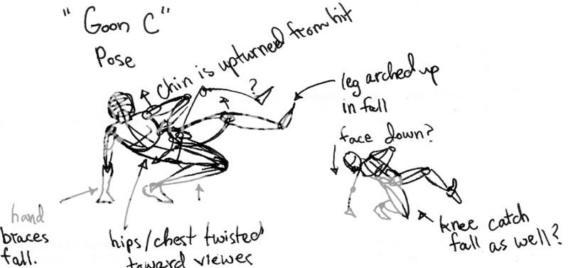
This is kind of self-explanatory.
Though you suggested just tossing him off to one side slightly, I wanted to take it further--for one, I want to take him out of the frame and out of main focus, because he's no longer current, and for another, I want him to completely lose control--falling backwards and to the side instead of just stumbling, which he could recover from.
I want his defeat to be obvious.
Help? xD;;
||-{...They're all drinking from a cup they call 'Loneliness', but it's better than drinking alone.}-|| |
|
|
|
|
|
 |
|
|
|
|
|
|
|
|
|
|
|
|
|
|
Posted: Fri Sep 07, 2007 7:40 am
|
Errol McGillivray Captain
|
|
|
|
|
|
|
|
|
|
Errol McGillivray Captain
|
Posted: Mon Sep 10, 2007 5:59 pm
|
|
|
|
|
|
|
|
|
|
|
Posted: Tue Sep 11, 2007 6:45 pm
|
|
|
|
-What if his fingers were splayed upwards, showing that his hand was sliding along the floor? Shows less controll, though it might be more complicated, I suppose...
It's automatic instinct to brace--just because you brace doesn't mean you're going to recover. I imagine that if it happened quickly enough, his arm would buckle under the sudden pressure and he would crash to the floor in one semi-smooth motion.
-Also, one of his feet is off the floor. Both post thumbnails showed that, I believe? But what if I took the one foot still on the floor and had it so that only his heel was touching, rather than the whole of it? Again, slide-worthy, and less control. Easier to imagine him slipping and showing.
-Not to be sarcastic or impertinant, but would the thumbnail have been self-explanitory if I hadn't written the words? I merely added them as an afterthought, because I was messing around with it so much.
Still, some elaboration on how to "block it in" would be appreciated--I thought I did that with the second one, but I suppose not. The only way I could really do it would be in pen, since [while I can CG somewhat decently] I am practically incapable of drawing properly on my tablet...And I'm not sure how to do it either way, besides make it a full out drawing and then just...silhoette it in.
-The easiest way to explain would, I suppose, be to offer up my schedule for you.
Monday, I get out of school at 3.00PM, and have guitar lessons at 8PM until 10PM. The time before guitar lessons is reserved primarily for homework, which usually takes me four to five hours on a regular basis.
Tuesdays through thursdays I have band practice from 3PM to 5.30PM, and the time after that is reserved for homework. Still, I've been finishing around 10-11PM, and reserving free time from 11PM-2AM, which I should stop. Also, for the past few days I haven't been properly doing my homework and have instead been getting online or slacking off...which I need to stop as well.
Fridays are free for the most part, but every other one [the next one being next friday] I have a band performance, in which I have from 3-5PM to get my homework done and get ready, and from 5PM-11PM I'll be at the performance.
I usually end up passing out when I get home.
See what I meant when I said I haven't got much time for artwork anymore, as much as I wish I did? Still, I generally manage to get online at least once a day. It's motivating myself to work on anything more serious than a doodle during time at which it would be constructive and not in the way [ IE, not when I'm trying to do homework] that's difficult, along with finding the time to do so.
It's on the weekends that I'm most available for interactive work, and will be able to actually draw in response to an assignment or critique that day, but I also have to balance that time out between practicing guitar, doing any homework I might not have managed to do on friday, cleaning, and friends. Thus...time is limited, I'm sorry to say.
Still, I'm willing to try if you are.
|
 |
|
|
|
|
|
|
|
|
|
|
|
|
|
|
|
|
|
|
|
Errol McGillivray Captain
|
Posted: Tue Sep 11, 2007 9:52 pm
|
|
|
|
Yukiko Gemini What if his fingers were splayed upwards, showing that his hand was sliding along the floor? Shows less controll, though it might be more complicated, I suppose... It's automatic instinct to brace--just because you brace doesn't mean you're going to recover. I imagine that if it happened quickly enough, his arm would buckle under the sudden pressure and he would crash to the floor in one semi-smooth motion.
Quote: -Also, one of his feet is off the floor. Both post thumbnails showed that, I believe? But what if I took the one foot still on the floor and had it so that only his heel was touching, rather than the whole of it? Again, slide-worthy, and less control. Easier to imagine him slipping and showing.
Quote: -Not to be sarcastic or impertinant, but would the thumbnail have been self-explanitory if I hadn't written the words? I merely added them as an afterthought, because I was messing around with it so much.
Your thumbnails are hard to read visually because they are only lines. There isn't much clear definition of depth or any fact telling details.
Look at the thumbnail examples on the last page. The first set (professionally done) give a lot of information. What can you tell about the characters? What are they doing? What is their objective in each one? What can you tell about where they are? As for depth, value is the basic measure used for depth and importance. Things closer and/or more important are darker. Things further and less important are lighter. Also, the silhouettes and shapes they make are clear as to what each thing is. Those are successful thumbnails because you can turn those into whoever you're working with and they understand exactly what you're doing.
If you look at the last one I showed (also professional) you see that value isn't really a measure here. It's just used for general shape (strong silhouettes) and the details are erased in (lighter). Once again though, the concepts and ideas are clear.
Quote: Still, some elaboration on how to "block it in" would be appreciated--I thought I did that with the second one, but I suppose not. The only way I could really do it would be in pen, since [while I can CG somewhat decently] I am practically incapable of drawing properly on my tablet...And I'm not sure how to do it either way, besides make it a full out drawing and then just...silhoette it in.
Quote: -The easiest way to explain would, I suppose, be to offer up my schedule for you. Monday, I get out of school at 3.00PM, and have guitar lessons at 8PM until 10PM. The time before guitar lessons is reserved primarily for homework, which usually takes me four to five hours on a regular basis. Tuesdays through thursdays I have band practice from 3PM to 5.30PM, and the time after that is reserved for homework. Still, I've been finishing around 10-11PM, and reserving free time from 11PM-2AM, which I should stop. Also, for the past few days I haven't been properly doing my homework and have instead been getting online or slacking off...which I need to stop as well. Fridays are free for the most part, but every other one [the next one being next friday] I have a band performance, in which I have from 3-5PM to get my homework done and get ready, and from 5PM-11PM I'll be at the performance. I usually end up passing out when I get home. See what I meant when I said I haven't got much time for artwork anymore, as much as I wish I did? Still, I generally manage to get online at least once a day. It's motivating myself to work on anything more serious than a doodle during time at which it would be constructive and not in the way [ IE, not when I'm trying to do homework] that's difficult, along with finding the time to do so. It's on the weekends that I'm most available for interactive work, and will be able to actually draw in response to an assignment or critique that day, but I also have to balance that time out between practicing guitar, doing any homework I might not have managed to do on friday, cleaning, and friends. Thus...time is limited, I'm sorry to say. Still, I'm willing to try if you are. |
|
|
|
|
|
|
|
|
|
|
|
|
|
|
|
|
|
|
|
|
|
|
|
|
|
|
|
|
|
Errol McGillivray Captain
|
Posted: Sat Sep 15, 2007 8:09 pm
|
|
|
|

The anatomy is pretty alright. I think the things that stand out as looking off are because of a lack of foreshortening and perspective. The angle could be a little more dynamic, but this is a pinup and a view like this is appropriate. One thing I did notice is the overly round breasts. Cartoon breast can be melon like and still work. The one thing I'd do is account for the mooshing of them more. By making the cups on the top stiffer and more straight rather than giving to the breasts, it makes them look pushed up and gives them some mass. Also, I would consider changing her hips. The way you drew them were very noodlish and lack structure. Of course, my redline is kind of loose, but you get the idea. Having her sit on one hip looks more natural as that's how the body will rest comfortably. Also, the tilt of the hips is interesting to look at and will accentuate the crotch which adds to sex appeal. Showing the change of muscle shape as her body twists will also add a dynamic that will make up for the rather straight on camera angle you used.
Whenever I draw a pose, I try and get into it myself to make sure it will work.
The only other thing that bothers me a bit is her arm that's down. First, she's supporting herself on something that would roll. That just looks rather off and takes away some of the base in reality this would have to make her more "real" and appealing. Consider having her interact with it in a different way. Even having it on the floor with her hand closer to us than it will help. As long as she's braced on the floor so she doesn't look like she could fall over.
Oh yeah. Her glasses are lopsided and are throwing off her face. I checked and it's not her facial features, it's definitely the glasses. Try and line them up better.
The linework is very clean and clear. I can't stress how wonderful that is and how much it helps the picture. You have areas of finer detail and areas that have broader shapes. They're mixed decently throughout the image. I recall others you've shown me were very busy or were too even with the visual distribution. Her expression is direct and engaging. This is part of why I think turning the hips toward the viewer will help. To turn the crotch away from someone is an unconscious response a woman has when she's no interested or turned off. She turns her crotch towards one she's open and receptive too. Using nonverbal cues that people don't even think about help give your ideas to the viewer without throwing it in their faces. (Just turning her hips or having a direct eye contact is more inviting than open legs or bared breasts with hips turned away. It's classier too.
I think you did a good job. Definitely an improvement when it comes to visual balance. |
|
|
|
|
|
|
|
|
|
|
|
|
|
|
|
|
|
|
|
|
Posted: Mon Sep 17, 2007 2:56 pm
|
|
|
|
|
|
|
|
|
|
|
Errol McGillivray Captain
|
Posted: Mon Sep 17, 2007 8:59 pm
|
|
|
|
|
|
|
|
|
|
|
Posted: Fri Sep 21, 2007 1:36 pm
|
|
|
|
|
|
|
|
|
|
|
Errol McGillivray Captain
|
Posted: Fri Sep 21, 2007 2:57 pm
|
|
|
|
|
|
|
|
|
|
|
Posted: Fri Sep 21, 2007 6:13 pm
|
|
|
|
|
|
|
|
|
|
|
Errol McGillivray Captain
|
Posted: Sun Sep 23, 2007 6:25 am
|
|
|
|
|
|
|
|
|
|
|
|
|
|
|
|
|
|
|
|
Errol McGillivray Captain
|
Posted: Tue Sep 25, 2007 9:39 am
|
|
|
|
|
|
|
|
|
|
|
|
|