Hello kids! Well here's my lil schpeal about color theory. I'm sure you guys already have some idea of all this but I'm just to refresh your memory 8D.
I'm sure you've all seen the color wheel.
The primary colors are Yellow, Red, and Blue and you can mix those to get your
Secondary Colors (orange, violet, green), and finally the
tertiary colors from mixing primaries and sexondaries (yellow-orange, orange-red etc... usually the primary name comes before the secondary but people forget a lot XD)
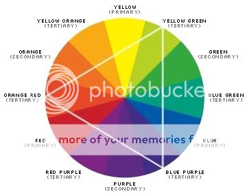
The colors opposite each other are
compliments and cause the greatest visual jump when viewed next to each other.
If you mix comlimentary colors perfectly you get a perfect gray.
With paints, the more you mix the less saturated it becomes - it's most saturated straight out of the tube.
If you have way too much time on your hands you can read through more color theory stuff: http://www.wetcanvas.com/ArtSchool/Color/ColorTheory/
Here's a fun little 'exercise' site that shows you how putting colors next to each other gives them different effects. http://www.marilynfenn.com/fun_stuff.html
Some vocab:Saturation: the amount of pigment that is in a color - what we usually say is the "brightest" color... when things are less saturated they are more 'gray'
Value: the lightness/darkness of a color.
- Things in shadow are not only DARKER they're also LESS SATURATED.
- If there's a bright light, the most saturated section is where the shadows and the light mix, (this is actually the line people should draw when cel-shading and the part where there is most contrast)
- Things that are far away are also less saturated and detailed; keeping your more saturated hues in the foreground will make things pop and not distract the eye.
So here are three dots I colored using a primary color and then shaded using its compliment instead of black:
 Assignment
This is really easy. I want you to first make 3 lil dots like I did and color them by using the complimentary color ;3 - you don't have to use the same colors I did and you can also do this traditionally. After that, try applying the information to the next picture you color. There's no due date for this, it's more just an exercise/useful info to keep in mind.
Lastly, here's a website to help you with color schemes
biggrin : http://www.steeldolphin.com/color_scheme.html