|
|
|
|
|
|
|
|
|
 Posted: Sun Aug 19, 2007 9:50 pm Posted: Sun Aug 19, 2007 9:50 pm
|
|
|
|
|
|
|
|
|
|
|
Posted: Sun Aug 19, 2007 10:38 pm
|

Errol McGillivray Captain
|
|
|
|
|
|
|
|
|
|
|
|
Posted: Sun Aug 19, 2007 11:37 pm
|
|
|
|
|
|
|
|
|
|
|
Posted: Mon Aug 20, 2007 5:47 am
|
Errol McGillivray Captain
|
|
|
|
|
|
|
|
|
|
|
|
Posted: Mon Aug 20, 2007 12:51 pm
 |
|
|
 |
||-{The waitress is practicing politics, while the businessmen slowly get stoned...}-||
I don't think so. xD
But I'll bold a few things any way.
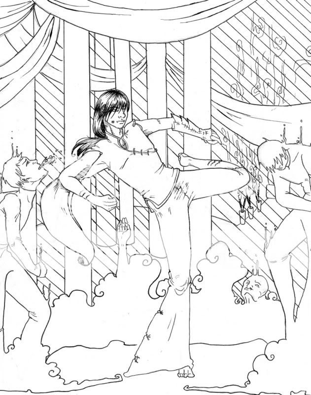
Link to larger image: http://sky-diving-kiwi.deviantart.com/art/Shaman-Feud-Ink-62771143
Tools used: Triconderoga 2B pencils, Pigma Micron inking pens [05, 005, 03, 02...I don't quite remember if I used all of them, but I remember I used three different ones, maybe four].
Time taken: Er...quite a while. I didn't plan for it to turn into a complete, background + interaction picture, but...It just blossomed. It started out with just a dynamic pose study doodle, then the other two people joined in, and then the background came to be.
This was an off-and-on worked on drawing so...I'm not sure on how long it took. The drawing itself, I'm reckoning two to five hours, and the inking...one to three, possibly more.
Self-Critique: While I'm fairly pleased with how this turned out, it being only my second interacting, background-included picture, I know that there's a lot of room for improvement.
-First of all, I'm not happy with how the dynamic pose turned out. While anatomically it might be right [I'm sure it probably has issues, though], it looks very stiff and the clothing and hair don't seem to...flow.
I really need to work on folds especially, but I'm not sure what could be done to make the figure itself seem more realistic. I have a feeling that the torso is a big problem spot, but I can't put my finger on what exactly is wrong with it.
-Also, I'm very unhappy with how the folds in the hanging fabric turned out, I plan to erase or thin some of them when I CG this. I was experimenting with using different widths of pen nibs, and it didn't turn out as well as I'd hoped.
+I like how the blood/whatever that is coming from the one demon/ghost's mouth turned out, and I like its pose/expression in general.
The head coming out of the clouds is horrid, but eh. >.<; I didn't spend much time on it.
Um...I can't think of anything else.
But constructive critism/line-overs are greatly appreciated.
||-{...They're all drinking from a cup they call 'Loneliness', but it's better than drinking alone.}-|| |
|
|
|
|
|
|
|
|
|
|
|
|
|
|
|
|
|
|
|
|
Posted: Mon Aug 20, 2007 8:01 pm
|
Errol McGillivray Captain
|
|
|
|
|
|
|
|
|
|
|
|
Posted: Mon Aug 20, 2007 8:37 pm
|
|
|
|
|
|
|
|
|
|
|
Posted: Tue Aug 21, 2007 8:05 pm
|
|
|
|
One thing I like to do before getting into a critique is telling the artist my first impression. The first thing I thought when I was this was "********". That's partially because I find the word hilarious, but also because the image is very cluttered and confused. It's also extremely linear and that is what is giving everything the stiff feel. You've got an excellent concept here, however your execution is fairly weak. Don't worry though, you've just got to learn the things that make a composition strong.
On to the main event...
Design:
My eyes don't know where to look. You have a possible focal point at the guy's head because his hair's dark value contrasts with everything in the image. It's the only thing that's dark and shaded. Those diagonal lines in the background are hurting that though. Whatever they are, the seem to serve no purpose and I would suggest losing them. They do nothing but flatten and clutter the image. His head and his torso fight for attention because the open and nonlinear shape contrasts with the very linear image on a whole. Then my eye tends to go up to the open, horizontal, smooth shape or down to the open, smooth, horizontal shape at the bottom. At the same time, there's that very hard, vertical, open shapes that are against the diagonal, clustered lines.
Watch your contrasts. The eye goes to areas of contrast first. As the illustrator, you tell a story in an image. Your narration depends on how you lead the viewer around the image.
Some examples of ways to create Contrast:
Value: Light/dark (hair on the pillar)
Shape: Smooth/rigid (pillars, smoke)
Density: a lot of things going on/open space (background, chest)
Direction: Horizonal/Vertical/Diagonal (pillars, diagonals in the back)
Here's a quick link I think you'll find helpful. (Also shows why art history is so important.)
http://n-sane.net/fundamentals/focal-point/index.php
Gesture:
The gesture of your smoke guys is better than your main guy. The guy to the (our) right's motion is down. He's curling forward and we can continue him motion in our minds. We know he's defeated. The one on the left is weaker. His head it thrown back from what I can only assume is an uppercut, but there's no other indications that he was hit. The motion should carry throughout the body. Is he going to fall over as well? Then knock the head to the side and up, that way, he's falling to the side and going down and the same time. Try to choose a general direction of motion so the figure is moving and not just splayed on the page. This is the main issue with the pose of the central figure. The pose doesn't look strong or balanced because he's moving in too many directions at once. Even when you do complex motions, it's really a series of much simpler motions. I'd say get into that pose yourself. Feel what you have to do in order to keep your balance like that. I'll have to break down that pose later when I'm at my own computer.
Edit:
Goon A: He's great. I would bring him forward though so he looks like he's part of the action. Right now, fighter guy has no one to kick.
Good B: He's far to stable for someone that got hit that hard. The force of the blow is going to push him. Also, open his arms. Take control of his body away. I still say his head should be to the side, turned to the audience showing his pain as he falls over.
Fighter guy: He looks like he's falling over. Here's atip to always help you balance the weight of the figures. Your head is over your standing leg or directly between the legs when balanced. If not, you're in the process of falling over. When you move the foot under his head, you get a sense of him moving his core forward to deliver the blow. Also, try standing like that. Always try and position yourself like the figure to see how natural it feels. Does the pose make sense?
Give him control over his body by bringing the arms in. Look up some defensive arm positions. Keep in mind that while someone attacks, they have to defend or they're wide open. Keep his eyes on where he's going to strike. Or at least on the guy he's hitting.
All the figures that share a plane (of a relative height) will share the same eyeline. Draw a line across at the fighter's eyes. That's what makes it seem like the hunched over guy is farther back.
I probably just confused the hell outta you. I'm sorry. It's very late and I'm very tired. Here's a redline that should help illustrate what I mean.

I would consider a short script of the fight. Know the order of the blows so you can position the figures in a way that makes more sense. Even with the changes, fighter guy is more stable, hurt guy is less stable, but where did the blow come from? What is fighter guy hitting? Is hunched buy mourning the loss of his puppy, or is he beat the hell up? We can't really place events with this illustration.

/end edit
Perspective:
This is where the image takes the biggest hit. the image doesn't imply 3 dimensional space. Even without using technical perspective (one, two, three point ect) you can use silhouette and value to do it. The darkest things are closest to the viewer. Stark white is the back wall. You can place things with the grey you choose. Of course, this is line art, but doing this with some simple thumbnails will help you remember to take up space.

I'm going to opt to leave complex perpective out of this because I'm working on a study guide for perspective that should give you all the basics you need. I'll keep you posted and it will be available in pdf format.
I think this is a great concept and with a little reworking, can be a much stronger illustration. I know this may have been hard to follow. Normally I have no problem keeping it simple, but I'm so tired and I was pretty distracted today. I'll probably revise this, but if you have any questions at all, please ask me.
|
 |
|
|
|
|
|
|
|
|
|
Errol McGillivray Captain
|
|
|
|
|
|
|
|
|
|
|
|
Posted: Tue Aug 21, 2007 8:50 pm
|
|
|
|
||-{The waitress is practicing politics, while the businessmen slowly get stoned...}-||
First of all, I'd like to thank you for putting so much time into that.~ xD
I'm still trying to digest and make sense of a great deal of it, but a lot of it also made sense--mostly how the poses were off, and how to better figure out the balance and shifting of the weight/core in context with the action of the piece [if that makes any sense].
I'd actually like to try and make a new revised version of this picture in the near future, but first I'm going to read that a couple more times [preferably tomorrow evening, when I'm more awake] and formulate a response more based on it [along with questions, possibly].
A few things I can say off the bat, though, are that I'm not used to working with pictures with backgrounds--and so, they're one of my main weaknesses.
Not an excuse, just stating the obvious. x3;;
Some of the things I've figured out [along with your critique and past experience] are that I'm really lost when it comes to composition--I've heard a thousand explanations for why what should be where, and I can tell when the composition of another piece is good, but I can't seem to put it into my own work.
This is something I really want to improve on.
Do you think the perspective study guide would help with this? o.o;
EDIT:: On a side note, that focal point page was extremely helpful. I'm going to book mark that. Thanks for pointing me to it.~
||-{...They're all drinking from a cup they call 'Loneliness', but it's better than drinking alone.}-|| |
|
|
|
|
|
|
|
|
|
|
|
|
|
|
|
|
|
|
|
|
Posted: Wed Aug 22, 2007 8:47 am
|
|
|
|
Yukiko Gemini First of all, I'd like to thank you for putting so much time into that.~ xD I'm still trying to digest and make sense of a great deal of it, but a lot of it also made sense--mostly how the poses were off, and how to better figure out the balance and shifting of the weight/core in context with the action of the piece [if that makes any sense]. I'd actually like to try and make a new revised version of this picture in the near future, but first I'm going to read that a couple more t[preferably tomorrow evening, when I'm more awake] and formulate a response more based on it [along with questions, possibly].
Normally my words are a bit more focused. I know that I was maybe a bit too advanced, but what I'm gonna do is bring you up to speed on the things you didn't understand. Slow and steady.
Quote: A few things I can say off the bat, though, are that I'm not used to working with pictures with backgrounds--and so, they're one of my main weaknesses. Not an excuse, just stating the obvious. x3;; Some of the things I've figured out [along with your critique and past experience] are that I'm really lost when it comes to composition--I've heard a thousand explanations for why what should be where, and I can tell when the composition of another piece is good, but I can't seem to put it into my own work. This is something I really want to improve on. Do you think the perspective study guide would help with this? o.o; EDIT:: On a side note, that focal point page was extremely helpful. I'm going to book mark that. Thanks for pointing me to it.~
Composition: All that stuff about focal point and leading the eye. Contrast and all the s**t we sweat over to learn, but stop having to think about.
Figure drawing: Balance and motion. I'll cover the body's mechanics and physics to help your understanding of what the body does and why. That will help loosen up your figures and make your poses more believable. We'll also talk a little bit about gesture.
Perspective: This is gonna take a while to do. We'll break it up into steps.
I'll work on the comp one this weekend. If you have any questions please ask them so I can cover them in the guide. |
|
|
|
|
|
|
|
|
|
|
Errol McGillivray Captain
|
|
|
|
|
|
|
|
|
|
|
|
Posted: Wed Aug 22, 2007 12:12 pm
|
|
|
|
||-{The waitress is practicing politics, while the businessmen slowly get stoned...}-||
Yeah, those are some of the things I'd really appreciate help in. ^^
But, aside from that, the response I've been working on for the critique:
Actually, I've decided to do a few thumbnails to work out composition and set-up before I do sketches or line-art, since this has gone from just a doodle/excersize to an actual piece.
I'm thinking of using the drapery and smoke as a way to bring the focus on the three main characters [which I might make just two, and have the other there but not part of the current event, if you will].
I'll run the thumbnails by you for critique before I start work on the final sketch, though.
Questions regarding the critique, though.
I've read it a few times now, and I'm fairly sure I understand most of it.
-Eye-line and distance:
You said that everyone who is on the same plane [such as, pressumably, the three fighters] will be at the same eye level.
But what about the guy that's stooped over? Wouldn't his eye-level be lower, because he's bowing his head/curling his torso over?
-Perspective
This picture was never meant to be in black and white [since I planned to CG it from the beginning], but even so, the idea of the background being white and the main characters being black confuses me.
I could understand if it was the other way around, or in the case of colour, if the main characters/foreground were brightly or richly coloured, and the background was dark and/or faded.
Even the focal-point page you sent me to mentions that white or brighter colours catch the eye and draw the attention to them first, whereas darker things are secondary when it comes to attention-grabbing.
Maybe I just misunderstood this part?
Also, you can't really tell from the line-art I suppose, but the place they're in is meant to be rather shadowy and poorly lit [that's actually the purpose of the diagonal lines], so having the far walls be bright would...adverse to the lighting.
||-{...They're all drinking from a cup they call 'Loneliness', but it's better than drinking alone.}-|| |
|
|
|
|
|
|
|
|
|
|
|
|
|
|
|
|
|
|
|
|
Posted: Wed Aug 22, 2007 7:16 pm
|
|
|
|
Yukiko Gemini Yeah, those are some of the things I'd really appreciate help in. ^^ But, aside from that, the response I've been working on for the critique: Actually, I've decided to do a few thumbnails to work out composition and set-up before I do sketches or line-art, since this has gone from just a doodle/excersize to an actual piece. I'm thinking of using the drapery and smoke as a way to bring the focus on the three main characters [which I might make just two, and have the other there but not part of the current event, if you will]. I'll run the thumbnails by you for critique before I start work on the final sketch, though.
Quote: Questions regarding the critique, though. I've read it a few times now, and I'm fairly sure I understand most of it. -Eye-line and distance: You said that everyone who is on the same plane [such as, pressumably, the three fighters] will be at the same eye level. But what about the guy that's stooped over? Wouldn't his eye-level be lower, because he's bowing his head/curling his torso over?
Quote: -Perspective This picture was never meant to be in black and white [since I planned to CG it from the beginning], but even so, the idea of the background being white and the main characters being black confuses me. I could understand if it was the other way around, or in the case of colour, if the main characters/foreground were brightly or richly coloured, and the background was dark and/or faded. Even the focal-point page you sent me to mentions that white or brighter colours catch the eye and draw the attention to them first, whereas darker things are secondary when it comes to attention-grabbing. Maybe I just misunderstood this part? Also, you can't really tell from the line-art I suppose, but the place they're in is meant to be rather shadowy and poorly lit [that's actually the purpose of the diagonal lines], so having the far walls be bright would...adverse to the lighting.
How about this, I'll put together two in depth examples of both these concepts, when I have a little time this weekend. (Maybe friday morning since I'm planning to call out from work.) |
|
|
|
|
|
|
|
|
|
|
Errol McGillivray Captain
|
|
|
|
|
|
|
|
|
|
|
|
Posted: Wed Aug 22, 2007 9:51 pm
|
|
|
|
Errol McGillivray Well, you have to visually put him in line so that if he were upright, it would fall in place. It takes practice to see all that, but you will in time. I'll explain it in depth in the study guide. Also, I'll find some images to help explain.
Actually, that was the conclusion I'd come to on my own when thinking about it--but I wanted to make sure I was right, first.
It just makes more sense, logically...and it's not terribly hard to do, if you can visualize the head being upright and then slumping down.
Though, slumping down the entire body might cause some problems for me.
I don't know, I'll have to practice it a few times and see how that goes.
Quote: First, separate color and value in your mind. There are many uses for value that have nothing to do with coloring things. It has to do with distance from the viewer. The darkest values are closest to the viewer. The lightest, the most far away. How about this, I'll put together two in depth examples of both these concepts, when I have a little time this weekend. (Maybe friday morning since I'm planning to call out from work.)
Hmm.
Colour is the hue.
Value is...the brightness of the hue, yes?
So, something can be red, while the value can vary all along?
Thus...A rich, blood red would be a darker value as opposed to a faded, more grey mauve...?
I'm trying to translate that into something I understand, but I'm not sure.
Am I at least heading in the right direction?
When working with values, I'm used to it being only in black and white, generally with pencil drawings--so applying it to colour is...somewhat baffling to me.
That that's fine, I look forward to seeing them. Hopefully they'll help this make a bit more sense. |
|
|
|
|
|
|
|
|
|
|
|
|
|
|
|
|
|
|
|
|
|
|
|
|
|
|
|
|
|
Errol McGillivray Captain
|
Posted: Fri Aug 31, 2007 5:57 am
|
|
|
|
|
|
|
|
|
|
|
|
|