|
|
|
|
|
|
|
|
|
 Posted: Wed Nov 07, 2007 8:22 pm Posted: Wed Nov 07, 2007 8:22 pm
Thanks! I'll have to wait till late Thursday to work on it because I work tomorrow.
|
 |
|
|
|
|
|
|
|
|
|
|
|
|
|
Posted: Wed Nov 07, 2007 9:23 pm
You're very welcome! Hmm, another thing... I'm seeing a trend in your finished pictures. You tend to be a little shy with your shading, and keep your dark colors closely near the lines. Don't be afraid to cover large areas in shadow, especially in pieces with line art! I think that you do this because when you observe yourself and other objects, it is usually in a very diffused light. Try turning off all the lights in your room except for a small lamp, and putting objects of different textures near the lamp. Experiment with tons of different intensities of light and positions of the source of light. An exercise that would definitely help break this habit would be lineless pencil / charcoal drawing. Maybe you could try your hand at it once your finished with your commissions? Some examples of art with dramatic lighting: here, here, here, and here.Hope I was able to explain that coherently. I'll go into more detail if you'd like. OH. I also have a really good .pdf file that covers almost everything related to rendering humans, if you're interested.
|
|
|
|
|
|
|
|
|
|
|
|
|
|
|
|
|
|
Posted: Thu Nov 08, 2007 8:10 am
I'd love to take a look. If you need to send it through email or something it's Sal102587@aol.com
I don't know why I'm so scared of shading a lot... I guess because I really don't understand lighting and shading much yet.
|
|
|
|
|
|
|
|
|
|
|
|
|
|
|
Posted: Thu Nov 08, 2007 8:49 pm
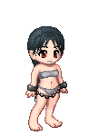
 Um, I did a little drawover for the boobs...they didn't look quite right to me. Um, I did a little drawover for the boobs...they didn't look quite right to me.
Because her arms are lifted, this affects the shape of the breast, and lifts it up and out as well. The muscle in the armpit is connected directly to the breast which is why it affects it like that. Also the n****e on the left breast should be facing outwards more.
God that was a crappy explanation. The image explains it more I think.
When you draw breasts though, think of them like bags filled with water 8D they basically act the same way.
Her lower half is awesome though!! Seriously, I love the form of her hips/thighs, especially the right leg. Awesome stuff, especially looking at how you started.
Um, with the folds, I'd suggest making sure you keep in mind the form of the body beneath the folds. What I can see so far is the folds over the right thigh are really flat, like there's no form beneath it, just a stick or something holding them up. Make sure the folds curve over the thigh instead of just..through it, kind of.
I'm sorry I can't help you more there, my own folds are pretty terrible sweatdrop
|
|
|
|
|
|
|
|
|
|
|
|
|
|
|
|
|
|
Posted: Thu Nov 08, 2007 10:06 pm
Sorry, the email nazis are saying that the file is too big to send.
|
|
|
|
|
|
|
|
|
|
|
|
|
|
|
Posted: Fri Nov 09, 2007 8:22 am
`Famire: Thanks so much. I'll work on that today. ^_^
Ishrie: Is there another way to send it?
Maybe a ZIP file or whatever?
|
|
|
|
|
|
|
|
|
|
|
|
|
|
|
|
|
|
Posted: Fri Nov 09, 2007 10:53 am
|
|
|
|
|
|
|
|
|
|
Posted: Fri Nov 09, 2007 4:20 pm
I tried putting it into a .RAR. It doesn't really help.
Do you have MSN? I've sent it through that before.
|
|
|
|
|
|
|
|
|
|
|
|
|
|
|
|
|
|
Posted: Fri Nov 09, 2007 7:26 pm
stephfannyannie@hotmail.com
or something... it's on my MSN link thingy
|
|
|
|
|
|
|
|
|
|
|
|
|
|
|
Posted: Sat Nov 10, 2007 7:45 pm
|
|
|
|
|
|
|
|
|
|
|
|
|
Posted: Mon Nov 12, 2007 4:32 pm
Calm down, you haven't ruined anything. smile
I love the textures you used. How long did it take to do that?
As for the coloring... It looks like you used a huge, round, fuzzy brush for your shading. That's a general no-no, unless you're planning on going over it again to the point where you wouldn't be able to tell. For instance, because of the heavy textures on most of the corset top, it's hard to tell that you used that kind of brush, so it looks good.
The red shadows on her breasts / stomach need to be blended more. Right now, there's just one shade of red on a bunch of gray tones, which is why it looks strange. A strong color like red would add a WHOLE bunch of reflected light to a neutral color like gray. It looks like you started to do this on her right side, but then stopped with every other red line.
Her eyes look fine to me, but the face looks a little strange because she doesn't have a nose.
I also think that you should get rid of the folds on the cloth on the areas where her legs are, because those spots would be pulled much tighter because of the added volume. Right now (especially on the leg on our right), since there are as many folds on the legs as there are under them, it looks like the fabric is all on the same plane, instead of draped around two large, round objects.
Finally, I think that this would look a whole lost crisper if you tightened up and smoothed out the edges. Right now, they seem just a little too wobbly.
This is coming out great. I hope your customer loves it.
|
|
|
|
|
|
|
|
|
|
|
|
|
|
|
Posted: Tue Nov 13, 2007 8:15 am
Thank you for the critique. I really like doing my stuff without lines... but your right, it's wobbly. I think I'll have to go back over it when I'm done next time. About the shading... I think I need to tweak the color/lighting settings on my monitor because it wasn't as bad looking on it... but here at school I see just how "O.O!" it is. I didn't realize that until now. The customer realllllly liked it. So I'm happy about that. I kinda gave up on it 'cause I was getting bored and agitated so I just finished up. There's ton more I could fix but I don't feel like it. She didn't pay me enough to care, haha. Thanks again for your help! ^_^ Edit: Here's the finished piece. For some reason the school's computers mess with the placement of the avatars and I can't click "edit". 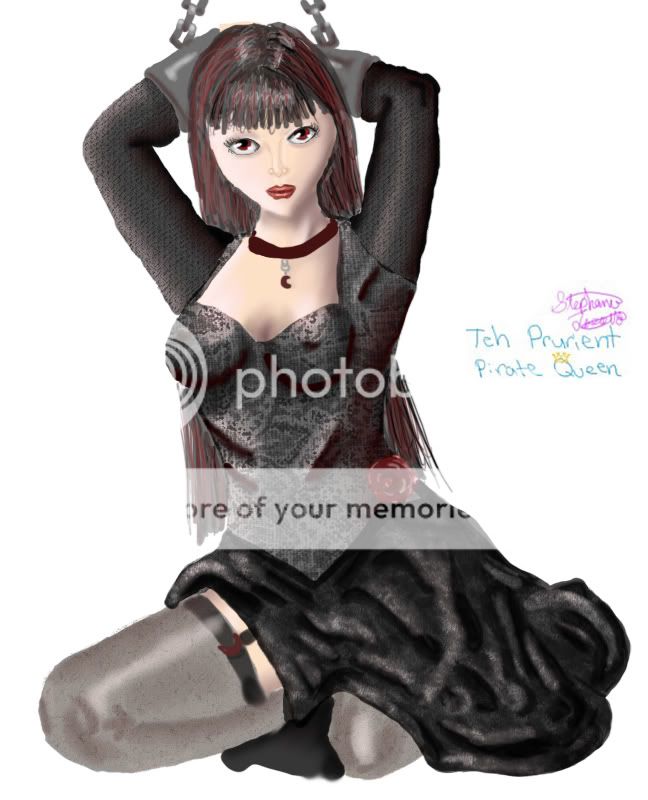
|
|
|
|
|
|
|
|
|
|
|
|
|
|
|
|
|
|
Posted: Tue Nov 13, 2007 8:32 pm
Ohhh, I hate that! My monitor settings were nuts a while back, and I didn't even know until I turned in a finished commission. I sent the guy the link to the picture, and he told me that his OC's shirt was blue, not purple. gonk I looked at it from the computer in the other room and was shocked. A really cheap, easy way that I reduce wobbly lines is by erasing all the really obvious little spots that poke out and starting out really huge. I usually work at four to six times larger than I want my image to be, at the highest resolution I can afford to without making my computer cry. It looks really nice, I'm glad your customer liked it.
|
|
|
|
|
|
|
|
|
|
|
|
|
|
|
Posted: Wed Nov 14, 2007 9:04 am
Yeah, now that I'm at home the colors don't look like "*Slaps you in the face*".
I'll have to adjust it.
Thanks for the advice. I'll try it next time. ^_^
|
|
|
|
|
|
|
|
|
|
|
|
|
|
|
|
|
|
Posted: Wed Nov 14, 2007 4:07 pm
|
|
|
|
|
|
|
|
|
|
|
|
|