|
|
|
|
|
|
|
 Posted: Wed Oct 24, 2012 4:51 pm Posted: Wed Oct 24, 2012 4:51 pm
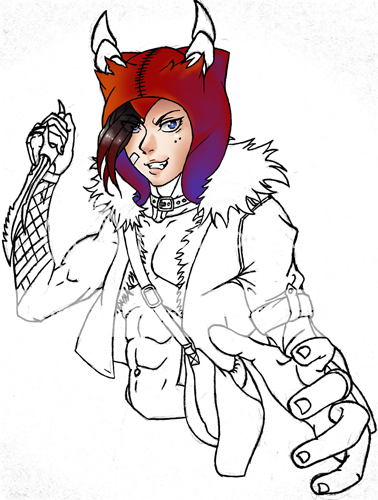
Trying a new approach to coloring. It'll probably be awhile before I understand color theory that I recently learned, but it's a start.
|
 |
 |
|
|
|
|
|
|
|
|
|
|
|
|
 Posted: Wed Oct 24, 2012 7:00 pm Posted: Wed Oct 24, 2012 7:00 pm
Oh! I really like the start, Kai! biggrin
|
 |
 |
|
|
|
|
|
|
|
|
|
|
|
|
|
|
|
 Posted: Wed Oct 24, 2012 10:25 pm Posted: Wed Oct 24, 2012 10:25 pm
Thanks. xp End of the day and Imma grab something to eat so a little update.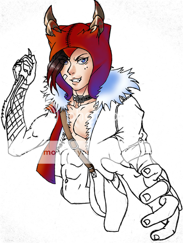
|
 |
 |
|
|
|
|
|
|
|
|
|
|
|
|
 Posted: Thu Oct 25, 2012 3:05 am Posted: Thu Oct 25, 2012 3:05 am
Can't sleep. Too tired. This is the final product. emotion_zombie 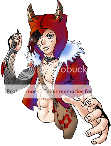
|
 |
 |
|
|
|
|
|
|
|
|
|
|
|
|
|
|
|
 Posted: Thu Oct 25, 2012 11:14 am Posted: Thu Oct 25, 2012 11:14 am
Looking good there looking food. Liking the new coloring methods 3nodding
|
 |
 |
|
|
|
|
|
|
|
|
|
|
|
|
 Posted: Thu Oct 25, 2012 8:13 pm Posted: Thu Oct 25, 2012 8:13 pm
His coat looks kind of iridescent with the blue and red. It's an interesting effect.
|
 |
 |
|
|
|
|
|
|
|
|
|
|
|
|
|
|
|
 Posted: Thu Oct 25, 2012 8:38 pm Posted: Thu Oct 25, 2012 8:38 pm
*Still staring at those muscles, which look even better colored in ... * emotion_dowant
|
 |
 |
|
|
|
|
|
|
|
|
|
|
|
|
 Posted: Fri Oct 26, 2012 6:13 am Posted: Fri Oct 26, 2012 6:13 am
I've already started on my next idea, but it's too forced when the inspiration isn't quite there yet and it's looking rather fail. xd
I usually take forever on art anyway so I'm going to switch to another project. One with more boobs. I'm like going through boob withdrawal here.
|
 |
 |
|
|
|
|
|
|
|
|
|
|
|
|
|
|
|
 Posted: Sat Oct 27, 2012 7:24 pm Posted: Sat Oct 27, 2012 7:24 pm
With the combination of the blue shading and your normal shading, plus the shade of blue you chose, it looks like he's got two lights on him: one being a while light roughly coming from the top left, and the other being a blue light roughly coming from the bottom right. The fact the vivid blue shading is only on his jacket also makes it stand apart from the rest of the picture.
That shade of blue certainly has an interesting effect, but with it only being applied to one part of the drawing makes it look off since the jacket is in a different lighting environment than the rest of him.
|
 |
 |
|
|
|
|
|
|
|
|
|
|
|
|
 Posted: Sat Oct 27, 2012 11:03 pm Posted: Sat Oct 27, 2012 11:03 pm
Yeah, admittedly with the inconsistent shading pattern the jacket looks fruity. It was a good test run to try something different, but I think I'll run the final back through photoshop again and get the blue lighting on everything and see how it looks from there.
Ultimately I think I'm more attracted to color splash art with bizarre and vivid light and shadows. Maybe I'll end up going in an Andy Warhol direction minus the soup cans.
Choosing a background color and make that the color of the light source and reflected shadows may help me nail down a consistent color scheme for the whole piece. Once I clear some things up, I'd like to do some more freebies just to play around with colors.
|
 |
 |
|
|
|
|
|
|
|
|
|
|
|
|
|
|
|
 Posted: Sun Oct 28, 2012 12:07 am Posted: Sun Oct 28, 2012 12:07 am
And this is what I came up with giving all shadows a touch of blue.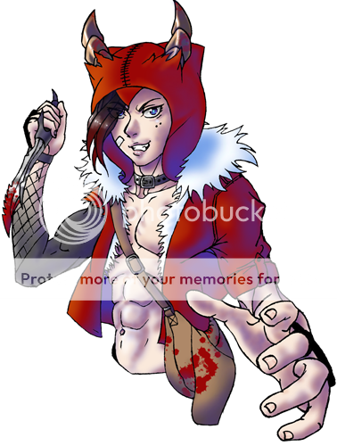
|
 |
 |
|
|
|
|
|
|
|
|
|
|
|
|
 Posted: Sun Oct 28, 2012 7:12 am Posted: Sun Oct 28, 2012 7:12 am
I swear... are you freakin' retarded? It's times like this where if I could boot you out I would. stare
Though this does give me some ideas on how to deal with shading on white and black colors that I hadn't thought of before.
|
 |
 |
|
|
|
|
|
|
|
|
|
|
|
|
|
|
|
 Posted: Sun Oct 28, 2012 8:07 am Posted: Sun Oct 28, 2012 8:07 am
Much better. Now it looks like he and the jacket are in the same environment.
But yes, using colors for shadows I think tends to look best on white surfaces. Interestingly enough, the first time I ever used color for shadows on a white surface was for the TesXKai mistletoe picture emotion_awesome
|
 |
 |
|
|
|
|
|
|
|
|
|
|
|
|
 Posted: Sun Oct 28, 2012 11:18 am Posted: Sun Oct 28, 2012 11:18 am
I still wonder if I'm drawing male faces too femininely for general audiences, but you could say it's my style overall to draw things in a feminine way, not that I'm into characters like that or anything. I prefer my men with a slimmer build... well maybe not slimmer... less muscley. Not sure how to say it.
Oh deal with it Kaori. Your guys are pretty. Just go with it. Needz moar eyelash though. desu desu desu desu desu!
|
 |
 |
|
|
|
|
|
|
|
|
|
|
|
|
|
|
|
 Posted: Sun Oct 28, 2012 7:13 pm Posted: Sun Oct 28, 2012 7:13 pm
Kuroshitsuji characters have long eyelashes regardless of gender, so why not? emotion_awesome
|
 |
 |
|
|
|
|
|
|
|
|
 |
|
|
