Welcome to Gaia! ::

Gaian Art Mentors

Back to Guilds

Where artists are paired in a mentor/mentee fashion to share their knowledge. 

Tags: artists, mentor, mentee, learning, drawing 

Reply Sketchbooks [Get crits here! Open to everyone]
Mogtoats' stuff [Updated: Jul 19 2010] Goto Page: [] [<] 1 2 3 4 [>] [»|]

Quick Reply

Enter both words below, separated by a space:

Can't read the text? Click here

Submit

Mogtoats

PostPosted: Sun Jul 06, 2008 10:17 am
Fixed, I think?

http://img.photobucket.com/albums/v173/DarkBlue_Ice/vader.jpg

Anything else before sealing?  
PostPosted: Mon Jul 07, 2008 8:27 am
That made a big difference. The shapes are a lot more clear now.  

Errol McGillivray
Captain


Mogtoats

PostPosted: Tue Jul 29, 2008 7:04 pm
Fishfrogfishfrogfish!

Ahahaha.

My scanner's very bad. The paper's bubbled, and the concavities show on the scan because they're blurry.

Filling a large area is some pain.  
PostPosted: Mon Oct 13, 2008 6:18 pm
User Image

Newest. Verticality FTW. And yay for background.  

Mogtoats


Errol McGillivray
Captain

PostPosted: Tue Oct 14, 2008 3:10 pm
I like that you can see the underlying gesture of the leggy things here. It makes things more alive and interesting.  
PostPosted: Thu Nov 06, 2008 1:20 pm
Thanks Errol.


A quickie for an auction:

User Image

Symmetry is nonexistent here. D:  

Mogtoats


Mogtoats

PostPosted: Sun Nov 16, 2008 4:00 pm
User Image - Blocked by "Display Image" Settings. Click to show.


So?

(if the image breaks, click the link?)

Thigh/crotch area to be reworked, if I ever re-work it. D:  
PostPosted: Fri Nov 21, 2008 7:41 am
Dude, it looks cool to me. What type of medium do you use?  

Anpu the black Seraph


Mogtoats

PostPosted: Fri Nov 21, 2008 11:57 am
Smog: Pencil + minor Photoshop
The guy with the...cylinder: Photoshop.  
PostPosted: Sat Nov 22, 2008 7:17 am
I think the legs look good. It's the torso that is a bit confused. I would say to layer your strokes once you've make the overall shape to indicate what is overlapping something else. That can help with the crotch area too. (I think the crotch area is alright actually.)

The first one is symmetrical with just enough asymmetry to not be a boring mirror of itself. (Of course inorganic things like the mask have to be symmetrical, but I like that the organic hair is not. The buildings could have been a bit more naturally asymmetrical (skyline).  

Errol McGillivray
Captain


Mogtoats

PostPosted: Sun Nov 23, 2008 12:14 pm
Now you know that I never looked seriously at a skyline. smile

Thanks for the comments/tips!  
PostPosted: Thu Dec 04, 2008 8:17 am
User Image

No refs. Arm turned out slightly weird. I think it's because of the cape. Oh well.  

Mogtoats


Mrs.Orange

PostPosted: Fri Dec 05, 2008 8:24 am
I think her skull is too flat behind o_o and I don't know if the arm's weirdness is because of the cape, it's probably the muscles that might be too emphasized for the pose, and also mislocated.

Maybe you could give a look to some anatomy books to learn about what's behind skin, it's really important because, in the end, human shape depends on that.


Anyhow, I don't know much about digital painting, but the colouring looks great =)

And I really like the creatures you draw, very detailed.
 
PostPosted: Fri Dec 05, 2008 11:54 am
Thanks for the comments! You're right about the skull. D:

I should definitely start doing studies.  

Mogtoats


Badeye

Shirtless Friend

PostPosted: Mon Dec 29, 2008 4:04 pm
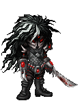
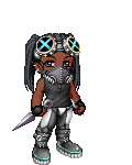
I hope you don't mind, I did a drawover 'cause i'm not very good at words D:


User Image

So this is following the arm. I started with the arm, then tried to set up everything else to suit that. Her head isn't wide enough, but more difficult to me was the angle at which her face is turned- nearly pure profile. With the body twisted away from us and the head twisting towards us, it creates an unnatural pose. Possible, but kind of awkward.

User Image

This one I started with her head. If the body is more in profile, there's less conflict between the movement of the body and the movement of the head. If that makes sense. It means the shoulder needs to be pushed back significantly, but it improves the pose, I think.


I'm not terrific at anatomy so there are likely some bumps, but maybe that'll help smooth out some of the things that seem off? Very cool coloring, by the way.

fake ps- I didn't set the hips very well for balance on either drawover since the cloak covers it up and the pic doesn't seem to need the legs. If you do need the legs though, you'd probably wanna set the hips more centered under the head to improve the look of sturdiness or balance.  
Reply
Sketchbooks [Get crits here! Open to everyone]

Goto Page: [] [<] 1 2 3 4 [>] [»|]
 
Manage Your Items
Other Stuff
Get GCash
Offers
Get Items
More Items
Where Everyone Hangs Out
Other Community Areas
Virtual Spaces
Fun Stuff
Gaia's Games
Mini-Games
Play with GCash
Play with Platinum