Welcome to Gaia! ::

Gaian Art Mentors

Back to Guilds

Where artists are paired in a mentor/mentee fashion to share their knowledge. 

Tags: artists, mentor, mentee, learning, drawing 

Reply Sketchbooks [Get crits here! Open to everyone]
Errol's sketchbook [images added 5/2/11] Goto Page: [] [<] 1 2 3 ... 4 5 6 ... 12 13 14 15 [>] [>>] [»|]

Quick Reply

Enter both words below, separated by a space:

Can't read the text? Click here

Submit

Errol McGillivray
Captain

PostPosted: Mon Mar 05, 2007 5:24 am
I'll be sure to fix those things. I think I'll draw out the hand on it's own layer and then just let whatever's hidden be hidden.

Thanks Eej. You are extremely helpful.  
PostPosted: Mon Mar 05, 2007 6:56 am
Errol McGillivray
I'll be sure to fix those things. I think I'll draw out the hand on it's own layer and then just let whatever's hidden be hidden.

Thanks Eej. You are extremely helpful.


I'm glad I am. biggrin Sometimes I worry that I just ramble... but seriously, can't wait to see it.  

Wispered


Errol McGillivray
Captain

PostPosted: Mon Mar 05, 2007 8:10 am
Yrindale gave me a great drawover. I can't work on it tonight, but I plan to finish this by the weekend. I have a RL commission I need to get working on too. And of course, homework. stare  
PostPosted: Sun Mar 11, 2007 12:12 pm
3/11/07

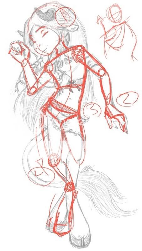
I was cleaning my apartment with Collie Buddz, new single, 'Mamacita' playing over and over. People, it is HOT.

Anyway, since I was done dancing around my kitchen and bathroom, I sat and drew Anon (my WoW main and rp character) dancing because, let's face it. He'll always be my pretty little mamacita. He's a crossdresser who loves a good time. He parties a lot. Especially when the faire is in town and holidays since that's the only time there's alcohol in his entire country. (No, I'm not a goddamn furry. I just like playing a tauren.)

I did this pretty fast (1 hour, trust me it's fast. I'm very slow), so I guess the figure drawing classes are paying off.

User Image - Blocked by "Display Image" Settings. Click to show.


Lyrics:
http://www.dancehallreggae.com/lyricsview.aspx?songid=6169

The song can be found here:
http://profile.myspace.com/index.cfm?fuseaction=user.viewprofile&friendID=68917080
Mamacita  

Errol McGillivray
Captain


Wispered

PostPosted: Sun Mar 11, 2007 5:33 pm
Aaaiiee...I want a plushie of your Tauren xd

So very cute.
The one thing that stood out to me is the lad's thighs. They should probably be thicker. Even a skinny tauren is still based around a bull so would have strong legs. Not that you need to make them giant haunches, just just thicker than the lower legs.

I -love- the face.  
PostPosted: Sun Mar 11, 2007 6:28 pm
His legs are a hair thinner than they should be. They're also a little bit longer than I like them to be. I was having trouble with them and I just wanted to have fun and not aggravate myself so I let them end up however, as long as they were positioned close enough.

This was definitely practice for me with plotting relationships between parts of the body so things see more... there. I feel like this figure 'exists' more than in the past. There's some solidity to it that wasn't there in my other drawings.

I had fun and I was able to apply something I learned. Also, I'm drawing a lot faster than I used to. whee

Now if only I could get asses to look right in pants. xd  

Errol McGillivray
Captain


pach_work

PostPosted: Sun Mar 11, 2007 6:56 pm
first of all , i wanna say i freaking LOVE the style , pose and expression biggrin <3

AKI well , i know of this kinda WOW species and such , but ive never drawn em so , i kinda know its part of your style and all that smile

you have a nice movement to it already biggrin now you just have to push it a bit further to really make it 'POP' !

1) with the eyes , remember the eyeball is a sphere and the eyelid goes overtop of it , so the crease in the eyelid wont be striaght across , it'd be curved to show the shape of the eye underneith smile this is just a lil tip to make your features look more inset and 3d - this is an eye tutorial i made , you dont have to follow it but it gives you an example of what im talking about. Also , if you draw a centre line down the face it kinda shows you the 3d structure and shape of the face and helps you place the features smile

2) define the arms and wrists a bit more , taper in at the elbow and at the wrist smile

3) POP THOSE HIPS ! ok i know hes a boy , so forgive me if this is too curvey but it gives you an idea - follow a line of action and all that jazz

4) now , the legs are up to you cuz , ive never drawn legs like that before , but with humans ...USUALLY the foot will poitn in the same direction as the knee (unless its being strained or somthin , ye'know? ) so i just kinda followed the same principle with the back hoof

User Image  
PostPosted: Mon Mar 12, 2007 4:07 am
Well, the face is pretty much set. I went from completely 2d to much more 3d and settled back into the "2d that mocks 3d kinda".

The arms and the legs: Oh God, THANK YOU SO MUCH. That's what gave me the trouble. So I need to widen the hip to give me more to work with so the legs won't be as difficult to place, I guess. I really appreciate it Pach. Also, I'm glad I did alright with the movement. Thank you. whee
edit: That eye tutorial is helpful though when I'm drawing my less cortoony style. So the eyes aren't mistaken for "ah-nee-meh". rolleyes  

Errol McGillivray
Captain


Errol McGillivray
Captain

PostPosted: Sun Mar 18, 2007 4:39 pm
3/18
User Image - Blocked by "Display Image" Settings. Click to show.  
PostPosted: Tue Mar 20, 2007 5:06 pm
Hello Errol ^_^ I always -love- seeing new stuff from you.
I -love- the depth given to the rings on his ankles and wrists, I wish though that you had hinted at it on the leather bands, right now they look a bit painted on.
The hands/arms/legs are very well done.
I'm not sure about the horns, they lack volume and the closest one doesn't seem to be anchored, I think the volume can be solved by differentiating the planes in them a bit more, and the anchoring by having the hair affected by the placement.
My last comment is the snout. Moving it to the right a bit and extending the front line will make it look longer, right now it seems very squished.

As always, can't wait to see more from you ^_^  

Wispered


Errol McGillivray
Captain

PostPosted: Tue Mar 20, 2007 7:22 pm
Eejbeej
Hello Errol ^_^ I always -love- seeing new stuff from you.
I -love- the depth given to the rings on his ankles and wrists, I wish though that you had hinted at it on the leather bands, right now they look a bit painted on.
The hands/arms/legs are very well done.
I'm not sure about the horns, they lack volume and the closest one doesn't seem to be anchored, I think the volume can be solved by differentiating the planes in them a bit more, and the anchoring by having the hair affected by the placement.
My last comment is the snout. Moving it to the right a bit and extending the front line will make it look longer, right now it seems very squished.

As always, can't wait to see more from you ^_^
His nose much be squished of his head wouldn't be a ball. xd But yeah. I kind of left the head as 2d as always and let the body get more volume. I know I shouldn't, but there's certain things I never want to change about how I draw him and if I have to flatten him out to make it work, I will. Consistently. I guess I'm always looking for a mix. It's kind of like the neck. It attaches at the right place, but I acutally don't pay as much mind to the placement of the face in relation to the neck when it doesn't suit me. Mostly the objective is to have the face visible, which is difficult in a position like that, so there are some things that are considered 'mistakes' which were active decisions to preserve a look I want.

The horns kind of have the same thing, but what I'll do is play with that and see what I like more. I have a feeling I'll like your suggestion more though.

I need help on making thin things have volume. I have no idea how. Not with line anyway. If this was in color (or tones with value) I can do it. Maybe I need to work on a larger canvas?  
PostPosted: Wed Mar 21, 2007 7:27 am
Just give it a hint of a lip, even the tiniest of bumps where the object begins will indicate volume.  

Wispered


Errol McGillivray
Captain

PostPosted: Wed Mar 21, 2007 8:48 pm
Eejbeej
Just give it a hint of a lip, even the tiniest of bumps where the object begins will indicate volume.
Ah. Like a long lump near the edge?  
PostPosted: Thu Mar 22, 2007 8:43 am
heh, I think so. Sometimes its hard to tell if folk are all talking about the same thing. Giving some sort of thickness to the top and bottom edges basically? I think you probably understand what I mean.  

Wispered


Errol McGillivray
Captain

PostPosted: Thu Mar 22, 2007 11:53 am
Eejbeej
heh, I think so. Sometimes its hard to tell if folk are all talking about the same thing. Giving some sort of thickness to the top and bottom edges basically? I think you probably understand what I mean.
Yup. I gotcha. That's what I meant to say. A ridge, only round. I'm used to doing that with color. I can also do it with a very light line if it's just lineart. I'll be sure to do that from now on. Thanks Eej. Oh and *points to balls* biggrin  
Reply
Sketchbooks [Get crits here! Open to everyone]

Goto Page: [] [<] 1 2 3 ... 4 5 6 ... 12 13 14 15 [>] [>>] [»|]
 
Manage Your Items
Other Stuff
Get GCash
Offers
Get Items
More Items
Where Everyone Hangs Out
Other Community Areas
Virtual Spaces
Fun Stuff
Gaia's Games
Mini-Games
Play with GCash
Play with Platinum