Welcome to Gaia! ::

Gaian Art Mentors

Back to Guilds

Where artists are paired in a mentor/mentee fashion to share their knowledge. 

Tags: artists, mentor, mentee, learning, drawing 

Reply Sketchbooks [Get crits here! Open to everyone]
Mogtoats' stuff [Updated: Jul 19 2010] Goto Page: [] [<] 1 2 3 4 [>] [»|]

Quick Reply

Enter both words below, separated by a space:

Can't read the text? Click here

Submit

Ishrie

PostPosted: Sun Dec 16, 2007 9:37 pm
Yes, I could see the cheese. X{D Looking at this again brightened my night.

As for the bread... looking at it again, I'm guessing you were going for a pain? I Googled it, and got some decent reference photos.

http://www.fromages-xavier.com/images/pain.jpg

Notice how it's spongey in the middle, with crusty parts on top? I think that your bread would be more recognizable if you added textures.  
PostPosted: Mon Dec 17, 2007 6:42 pm
I was thinking about a less spongey texture. Like very fine little things.

Because I just don't eat bread that often I forget that there's bubbles in it. D:  

Mogtoats


Mogtoats

PostPosted: Mon Jan 07, 2008 8:55 am
http://darknessblueice.deviantart.com/art/Oie-gnon-74035195

Unfortunately I don't have onions at home. So everything is from my mind. I tried to add a light source. More or less worked. D:  
PostPosted: Mon Jan 07, 2008 7:57 pm
Google is your friend.

I like that there's a definite light source in this, and the goose looks nice. The French pun was pretty funny, and the concept is good.

Maybe it's just because the way it was scanned (my scanner always kills my pencil work), but it doesn't look like there's enough dark hues in this. Everything seems to go from very light to midtone... and I think it would pop a lot more if you went over your darkest shadows in an 8B/6B.

Also, the scribbly lines on the goose look sort of strange next to the details on the onion... try studying feathers to get an idea of their textures for future reference.

Another thing that strikes me as odd is that the onion appears to be more realistic than the goose, because you got rid of the outlines on the areas with the brightest highlights. The goose is much closer than the onion to the light source, but it still has the outlines... work on defining your realistic pieces through values instead of outlines. Some gentle grays around the edges of the goose (to define volume) would have done very well to separate it from the background, especially when combined with detailed texturing for the feathers.

Anyway, that's my two cents. It looks really good. I was able to identify the onion and the goose, even though you didn't have a ref for the onion.  

Ishrie


Avali_Sunstrider

PostPosted: Sun Jan 20, 2008 8:04 am
lol! This little rat is so cute! xd
Ever since playing Castlevania, I've always hated Cthulhu, but this could make me change my mind...

You've got a great eye for shading, from what I can see. I would say that because the shading lines are a little messy, to give him some sharp contrast to the background, try going in with a fine pencil and make the edges between him and the rest of the image more sharp and pronounced. maybe add a few little dropped crumbs to the ground around him and the yummy cheese. whee

Agh, if I haven't mentioned it already....he's so cute.  
PostPosted: Thu May 22, 2008 11:13 am
I'm back!

(for two months)

So, these 5 months haven't been productive at all. But there are something:

http://darknessblueice.deviantart.com/art/Shellfish-75145136
(warning: no light source, scan was too light and original drawing was too dark. Messy as usual, and no background.)

http://dbi-znt.deviantart.com/art/Oh-82678261
(warning: enourmous messyness. More of a lightsource, but I feel parts are still not dark enough. Or is my screen settings weird.)

Thank you for the comments, I'll try to take them into account next times. And maybe to touch the drawings up for later.

I suppose this isn't getting locked? :3  

Mogtoats


Mogtoats

PostPosted: Tue Jun 03, 2008 7:56 am
This is more of a legal bump than anything. biggrin

http://img.photobucket.com/albums/v173/DarkBlue_Ice/mir.jpg
Random freebie sketch.

http://img.photobucket.com/albums/v173/DarkBlue_Ice/masked.jpg
The thing I wear in my sig... Full sized.

And here for the rest:
http://conceptart.org/forums/showthread.php?t=116569

(that was when I was trying to stay on ConceptArt. But eventually it died)  
PostPosted: Wed Jun 04, 2008 1:04 pm
I'm rather enamored with your pencil strokes. They've got a lot of energy, but your shapes and figures aren't quite kinetic yet.

Try to look at them as purposeful shapes. Like say, if you draw something with a mouth open, it wouldn't be sitting there with it's mouth open. It wouldn't be pulling back with the mouth open. It's mouth is open to catch something so the energy should be moving forward.

I started doing something I read about in a Disney animation book with head shapes that helped. Just draw a page of random shapes. Look at those shapes and add features to make them into heads. You'll get some really different characters. It takes some practice, but you can train yourself to keep your shapes moving. In any case, great potential.  

Errol McGillivray
Captain


Mogtoats

PostPosted: Wed Jun 04, 2008 6:09 pm
D:

Teh attack of teh moving shapes!

Thanks for the info. What's that book's name?  
PostPosted: Sun Jun 15, 2008 1:22 pm
I love your pencils. Your shading, proportion, and overall style is amazing. I kinda understand what Errol means about the lack of energy in some of the pieces though. The sketches are excellent, some of them just lack motion or life. Overall I'm impressed. Keep em comin.  

Anpu the black Seraph


Mogtoats

PostPosted: Thu Jun 19, 2008 11:49 am
Ohwait, proportions are right? OMG WUT. Lol
Thank you!

Mm.... More lifelike? Any tips?

New arts:

http://img.photobucket.com/albums/v173/DarkBlue_Ice/mugshot.jpg
http://img.photobucket.com/albums/v173/DarkBlue_Ice/West.png
http://img.photobucket.com/albums/v173/DarkBlue_Ice/shaoshaochan.png

Two auction theme pics, one commission. No refs. Maybe I should start using them. Lazy I am.  
PostPosted: Sun Jun 22, 2008 2:52 pm
heart
I absolutely love your first image, the mug shot. xd Seriously. You showed a nice range of values in your pencils and you seemed to have fun with it. mrgreen Of course, in a real mug shot all of the obstructing clothing would be removed. xd

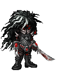
Your second image looks quite nice as well. I love how confident you seem to be with your lines. 3nodding The man's nose looks particularly good, but beware of his chin and lips. With a schnoz like his, he'd probably have a pretty square jaw too. Chins don't just jut downwards, but kind of make a swoop too, off the lower lip. Be mindful of ears too. wink
Here's an example:
User Image
All people are different, so if you were going for a specific individual, you're better off using THEM as an reference. 3nodding
All of these iffy areas can be fixed by checking out a reference next time around. It takes a bit more time, like you mentioned, but it is totally worth it in the end.
Although I love your confident lines, as I said, you might want to tone them down sometimes and practice gentler shading styles too. Crosshatching is a great skill to get down. heart

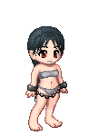
Of the three images you posted, I like this last one the least. Your other drawings were confident and fun, but this one seems very routine. sweatdrop Just because it's a head shot of an avatar doesn't mean that it has to be expressionless. 3nodding That's a problem I run into too. But, luckily, it's easy to fix. Just treat it like every other drawing!
Part of the reason it feels so dead is because she's ... eyeless. I'm assuming that's a Gaia accesory. 3nodding BUT, expression can just as easily be shown through eye BROWS and the mouth. Seriously!
Here's a super cool tutorial on facial expressions. Well. Not really a tutorial. xd It's more of a compilation of expressions that make great helpful references. 3nodding
That said, I really like the shape of her face - you did a very nice job there. I also like your shading, it's getting very mature.
Some things to keep an eye on in the future. Make sure ears are placed far enough back on the head. They really are kinda far away, but it's really easy to plop them right next to the eye when doing 3/4 views. 3nodding Noses are tough, but don't (DON'T!) be afraid of using references.
Ever.

heart

I hope that was somewhat helpful.
You're doing a great job with your drawings! (I do seriously LOVE that first image. xd ) Keep up the great work!

heart
 

Orockthro


Mogtoats

PostPosted: Sun Jun 22, 2008 5:23 pm
Thanks for the comments. I should get to practice face drawing more sometime soon. If I don't get bored halfway through.

About lines: I somehow do not like the exremely gentle and orderly kind of style. It's all personnal preference I suppose. But I'm just too messy sometimes.

Interesting thing is: in chronological order:
Face
Mugshot
Avatar headshot

Progress between every drawing?

Mugshot was really for fun. Fun is fun!  
PostPosted: Wed Jun 25, 2008 2:06 pm
I have the urge to post this thing everywhere.

http://img.photobucket.com/albums/v173/DarkBlue_Ice/Vadey.png

D:  

Mogtoats


Errol McGillivray
Captain

PostPosted: Fri Jul 04, 2008 6:25 am
That looks pretty good to me. It could use a bit more light marks to describe the shapes in the darker areas. Everything gets muddled in the shadows and you lose a lot of form.  
Reply
Sketchbooks [Get crits here! Open to everyone]

Goto Page: [] [<] 1 2 3 4 [>] [»|]
 
Manage Your Items
Other Stuff
Get GCash
Offers
Get Items
More Items
Where Everyone Hangs Out
Other Community Areas
Virtual Spaces
Fun Stuff
Gaia's Games
Mini-Games
Play with GCash
Play with Platinum