|
|
|
|
|
|
|

Errol McGillivray Captain
|
 Posted: Tue Jun 01, 2010 5:52 am Posted: Tue Jun 01, 2010 5:52 am
|
|
|
|
|
|
|
|
|
|
|
Posted: Tue Jun 01, 2010 6:37 am
 |
|
|
|
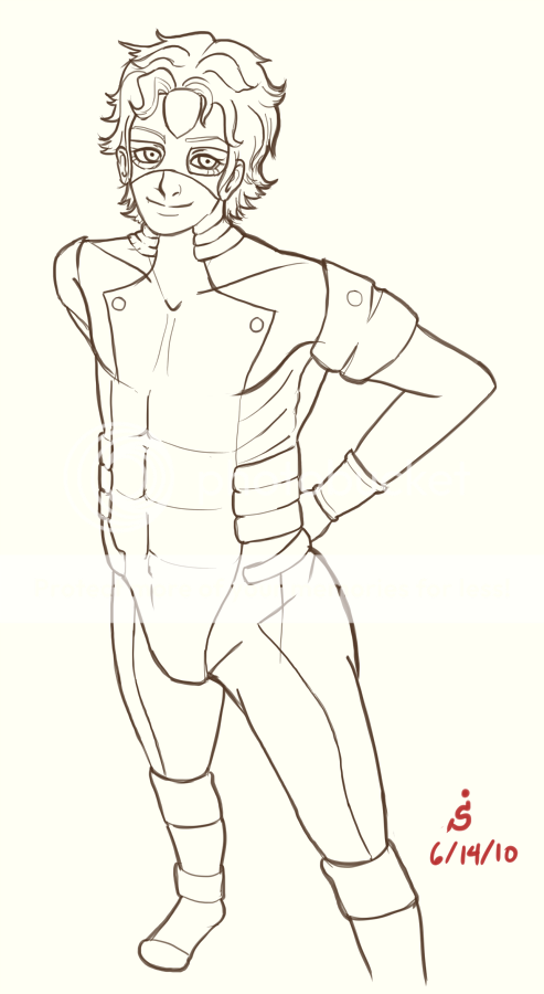
Errol McGillivray Hey Spoggly. Thanks for the suggestion with colour. I notice you like to put a lot of detail in your lineart. That's great, but it can also hurt the level of interest people take in the image. Here are some tips to keep it detailed, but not tedious: Use black/white spotting. Have some solid or mostly solid areas of black/white. It breaks up the tedium of detail lines, by giving the eye places to start, move to, and rest as they move over the image. Take my sig for example. The collar and the sides of the hat make you focus on the head. You can look at the details of the face, then rest your eyes. Vary line weight. If you double or thicken your lines, where the object is facing away from the light, it adds some depth. Surface details can be lighter, since they aren't separate forms. This will keep things looking like one piece and not chopped up where you have detail lines.
I've never actually tried varying my line width too much before, or tried black/white spotting, but those are great suggestions, I'll definitely try them out in some future pieces. 3nodding Thank you Errol! |
 |
|
|
|
|
|
|
|
|
|
|
|
|
|
|
|
|
|
|
|
|
|
Posted: Fri Jun 04, 2010 4:53 pm
|
|
|
 |
Hey again,
Thanks for posting on my page too... xD Welcome to the guild by the way!
I think your art has a nice feel to it overall.
(But of course, there are always things to improve on...)
One main part that stands out to me is that your figures all look a bit static. Maybe stiff is a better word. Ways that you could improve that might be to practice gesture drawing a bit more. Sometime that I find myself doing often is that I use my hand in very tiny, tight strokes. The results it that the image comes out looking a bit too stiff and doesn't flow very well. Try using your entire arm and shoulder when you draw. If you have to, tie something around your wrist when you're in the "sketch" phase to help remind you.
The other main detail that I'd suggest working on is just how to convey volume in an image. Speaking from my own personal experience, it's a very difficult thing to do. But when you start really understanding it, it can make your drawings really pop out and come to life. Suggestions might be to practice drawing simple geometrical shapes like spheres, cylinders, or squares. Ask yourself -- what makes them appear 3D? Typically it's the way they are shaded. And what gives it the illusion of three-dimensionality is the way the highlights appear and the way shadows are cast. Once you get good at that, try changing up the light source. Finally, when you decide you want to work on people again, see if you can't use some of the techniques you've learned to really make it all stand out. ^_^
If you have any questions, feel free to let me know. I may just be spout off nonsense, but I won't know unless you tell me so. <3
|
|
|
|
|
|
|
|
|
|
|
|
|
|
|
|
|
|
|
|
|
Posted: Fri Jun 04, 2010 6:47 pm
|
|
|
|
|
|
|
|
|
|
|
|
|
Posted: Sun Jun 06, 2010 8:08 pm
|
|
|
|
syrella Hey again, Thanks for posting on my page too... xD Welcome to the guild by the way! I think your art has a nice feel to it overall.
Thank you, I'm liking it here so far. ^^
syrella One main part that stands out to me is that your figures all look a bit static. Maybe stiff is a better word. Ways that you could improve that might be to practice gesture drawing a bit more. Sometime that I find myself doing often is that I use my hand in very tiny, tight strokes. The results it that the image comes out looking a bit too stiff and doesn't flow very well. Try using your entire arm and shoulder when you draw. If you have to, tie something around your wrist when you're in the "sketch" phase to help remind you.
I've been getting the 'static pose' crit rather frequently, so I'll definitely have to work on that. Thanks for suggesting how to loosen up my lines though. <3
syrella The other main detail that I'd suggest working on is just how to convey volume in an image. Speaking from my own personal experience, it's a very difficult thing to do. But when you start really understanding it, it can make your drawings really pop out and come to life. Suggestions might be to practice drawing simple geometrical shapes like spheres, cylinders, or squares. Ask yourself -- what makes them appear 3D? Typically it's the way they are shaded. And what gives it the illusion of three-dimensionality is the way the highlights appear and the way shadows are cast. Once you get good at that, try changing up the light source. Finally, when you decide you want to work on people again, see if you can't use some of the techniques you've learned to really make it all stand out. ^_^ If you have any questions, feel free to let me know. I may just be spout off nonsense, but I won't know unless you tell me so. <3
I'll probably try to practice coloring and shading landscape art and some still lifes more often.. I draw humans way too frequently compared to other things.
Thanks for the crits! =) |
|
|
|
|
|
|
|
|
|
|
|
|
|
|
|
|
|
|
|
|
Posted: Sun Jun 06, 2010 8:10 pm
|
|
|
|
|
|
|
|
|
|
|
|
|
|
|
|
|
|
|
|
|
|
Posted: Wed Jun 16, 2010 10:55 am
|
|
|
|
|
|
|
|
|
|
|
|
|
Posted: Fri Jun 18, 2010 8:57 am
|
|
|
|
|
|
|
|
|
|
|
Posted: Fri Jun 18, 2010 12:32 pm
|
|
|
|
|
|
|
|
|
|
|
|
|
|
|
|
|
|
|
|
|
|
Posted: Sat Jun 19, 2010 6:29 am
|
|
|
|
|
|
|
|
|
|
|
|
|
Posted: Sun Jun 20, 2010 3:23 am
|
|
|
|
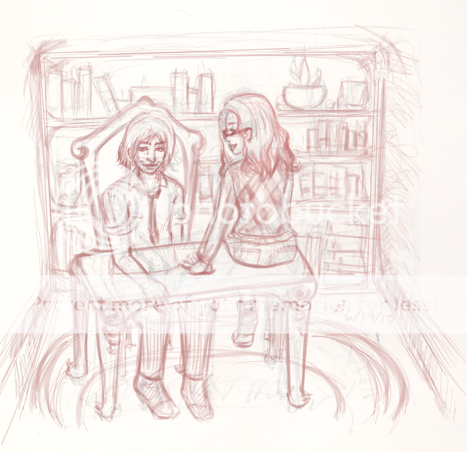
I applaud your efforts to work on backgrounds. They're tough! You are able to add nice details to your work, but I'm confused about the perspective.
I'll give a shot at redlining and write explanations later when I can collect my thoughts.
Some stuff to keep in mind
When drawing, try to focus more on the form of what you are drawing rather than details.
Your eyes can pick up errors if you take a step back at the structure of your drawing without details to distract your eyes.
Redline attempt
On the left in green, I roughly traced over the planes in your drawing. It's good to eyeball how your figures look roughly without the details, just to make sure the forms register correctly from afar. Sometimes your eyes can pick-up something strange when you step back.
Everything in perspective depends on your eye level (aka horizon) as if you were in the scene you're drawing.
I assumed that the horizon/eye level was above the bookshelf because I can see the top surface area of the shelf and the top surface area of the desk. However, the individual shelves and the objects in the shelves, do not reflect the receding effect towards the horizon. If your eye level is above the shelf, then you can see the top areas of each individual shelf too.
Before drawing the individual objects, it's best to plan out the platform the objects are sitting on first. I tried to illustrate this with the purple outlines. Once you have that down, you can make cross sections, as if you had x-ray/CT scan vision, for each individual object sitting on that platform.
Further critiques
-The area of the desk looks off to me. It appears to be too small because the guy's forearm takes up nearly the whole (length?) of the desk. I think it should be bigger because it's also able to accommodate the lady sitting on the desk.
-The guy's knuckles (for the hand resting on the desk) may need more emphasis to suggest that arc where the middle knuckle is the highest.
-I don't think the girl's foot will be showing because I think the top surface of the desk will cover it.
Other notes to add
On the right in blue, I roughly traced over what changes I thought should be changed. It helps to draw things in cubes and cross-sections sometimes to help putting a form in perspective.
Err...sorry if I sound harsh and/or confusing with the critiques, but I hope it helps.
Here is a reference which may help with perspective for the meantime. --> Perspective book link
|
|
|
|
|
|
|
|
|
|
|
|
|
|
|
|
|
|
|
|
|
Posted: Fri Jun 25, 2010 7:44 am
|
|
|
|
syrella Good work trying to draw a background! Most of the main details and everything seem okay to me, but what I think you'd benefit most from is studying perspective and also composition. Composition is important because it helps lend a sense of interest to the piece. You can create nice focal points, allowing the eye to "discover" the details in the piece. It also makes sure that your viewer doesn't get "bogged down" in the wrong spots. It can help both when trying to create a dynamic scene or one that is calm and peaceful. Not to mention most everything in the middle... Perspective is more the technical side, mainly what happens when objects get farther away from one another, recede to vanishing points, etc. When skillfully employed, it can also be a tool to aid in the piece's overall composition and feel. What I'd suggest is looking over a few tutorials. Here's a link to one of my favorites... http://fox-orian.deviantart.com/art/Perspective-Composition-Pt-1-118068853 Even if this is all review to you, looking it over again will certainly help. ^_^ Good luck!
My perspective's really wonky since I haven't ever tried my hand at it seriously, but that tutorial will send me happily on the way to getting better at it. Thanks for the link syrella! =D (that artist's gallery is amazing as well!)
Yamiko I applaud your efforts to work on backgrounds. They're tough! You are able to add nice details to your work, but I'm confused about the perspective.
I'll give a shot at redlining and write explanations later when I can collect my thoughts.Some stuff to keep in mind When drawing, try to focus more on the form of what you are drawing rather than details. Your eyes can pick up errors if you take a step back at the structure of your drawing without details to distract your eyes. Redline attemptOn the left in green, I roughly traced over the planes in your drawing. It's good to eyeball how your figures look roughly without the details, just to make sure the forms register correctly from afar. Sometimes your eyes can pick-up something strange when you step back. Everything in perspective depends on your eye level (aka horizon) as if you were in the scene you're drawing. I assumed that the horizon/eye level was above the bookshelf because I can see the top surface area of the shelf and the top surface area of the desk. However, the individual shelves and the objects in the shelves, do not reflect the receding effect towards the horizon. If your eye level is above the shelf, then you can see the top areas of each individual shelf too. Before drawing the individual objects, it's best to plan out the platform the objects are sitting on first. I tried to illustrate this with the purple outlines. Once you have that down, you can make cross sections, as if you had x-ray/CT scan vision, for each individual object sitting on that platform. Further critiques -The area of the desk looks off to me. It appears to be too small because the guy's forearm takes up nearly the whole (length?) of the desk. I think it should be bigger because it's also able to accommodate the lady sitting on the desk. -The guy's knuckles (for the hand resting on the desk) may need more emphasis to suggest that arc where the middle knuckle is the highest. -I don't think the girl's foot will be showing because I think the top surface of the desk will cover it. Other notes to add On the right in blue, I roughly traced over what changes I thought should be changed. It helps to draw things in cubes and cross-sections sometimes to help putting a form in perspective. Err...sorry if I sound harsh and/or confusing with the critiques, but I hope it helps. Here is a reference which may help with perspective for the meantime. --> Perspective book link
Your critique was crystal clear and very helpful Yamiko, thank you! ^^ I especially appreciate the redlining you did. I'll be redoing the sketch as soon as I can with your suggestions in mind. |
|
|
|
|
|
|
|
|
|
|
|
|
|
|
|
|
|
|
|
|
|
|
|